
LA BALEINE À CABOSSE - DESIGN PACKAGING


PACKAGING DESIGN
Embark on a taste adventure with our latest creation for La Baleine à Cabosse: a "Chocolate World Tour" tasting box, in which every detail is carefully crafted to offer you a delightful experience.
To bring this tasting a touch of originality, we designed a unique cardboard tray, providing a dynamic presentation of the chocolate discs. This arrangement instantly arouses the desire to indulge. The staggered paper wedge ensures a good protection for the chocolates during transportation, guaranteeing a preserved tasting experience.
Inside this chocolate gift box, as pleasant as it is playful, you will discover a collection of 20 discs from 10 carefully selected regions.
A detailed booklet guides this exploration, displaying the unique features of each region. To refine your palate, a flavor wheel is printed on the back of the booklet to identify those taste nuances that often escape you, adding an even more sensory dimension to your tasting experience.
Assignments :
Packaging Design
ESCALE BLEUE - DESIGN PACKAGING


PACKAGING DESIGN
Created in 1986, Escale Bleue is located in Tremblet in Saint-Philippe, Reunion Island, and specialises in both the production and preparation of vanilla.
After 10 years of research, Escale Bleue decided to revamp the very concept of maturing and develop its own vision of vanilla: Vanille Bleue. The result is an exceptional product: vanilla that retains all its beauty, without dehydration or denaturation, while having an intense aroma and improved taste. The product is marketed under the name “Vanille Bleue” [Blue Vanilla] in homage to farming ancestors who said that a plant was “blue” when it was beautiful and healthy. This exquisite delicacy, LA PÂTE DE VANILLE BLEUE, is a tiny ball of originality: designed as a fruit jelly, the fruit pulps have been replaced with Vanille Bleue, the pods of which are entirely edible.
Creation of this case in imitation of the sweetness of these domes, A semi-circular box decorated with custom illustrations tinted with shades of blue. Each jelly is delicately placed on a support in the shape of a vanilla flower that allows you to enjoy it without getting your fingers dirty.
Assignments:
Packaging design
Packaging identity
Illustration
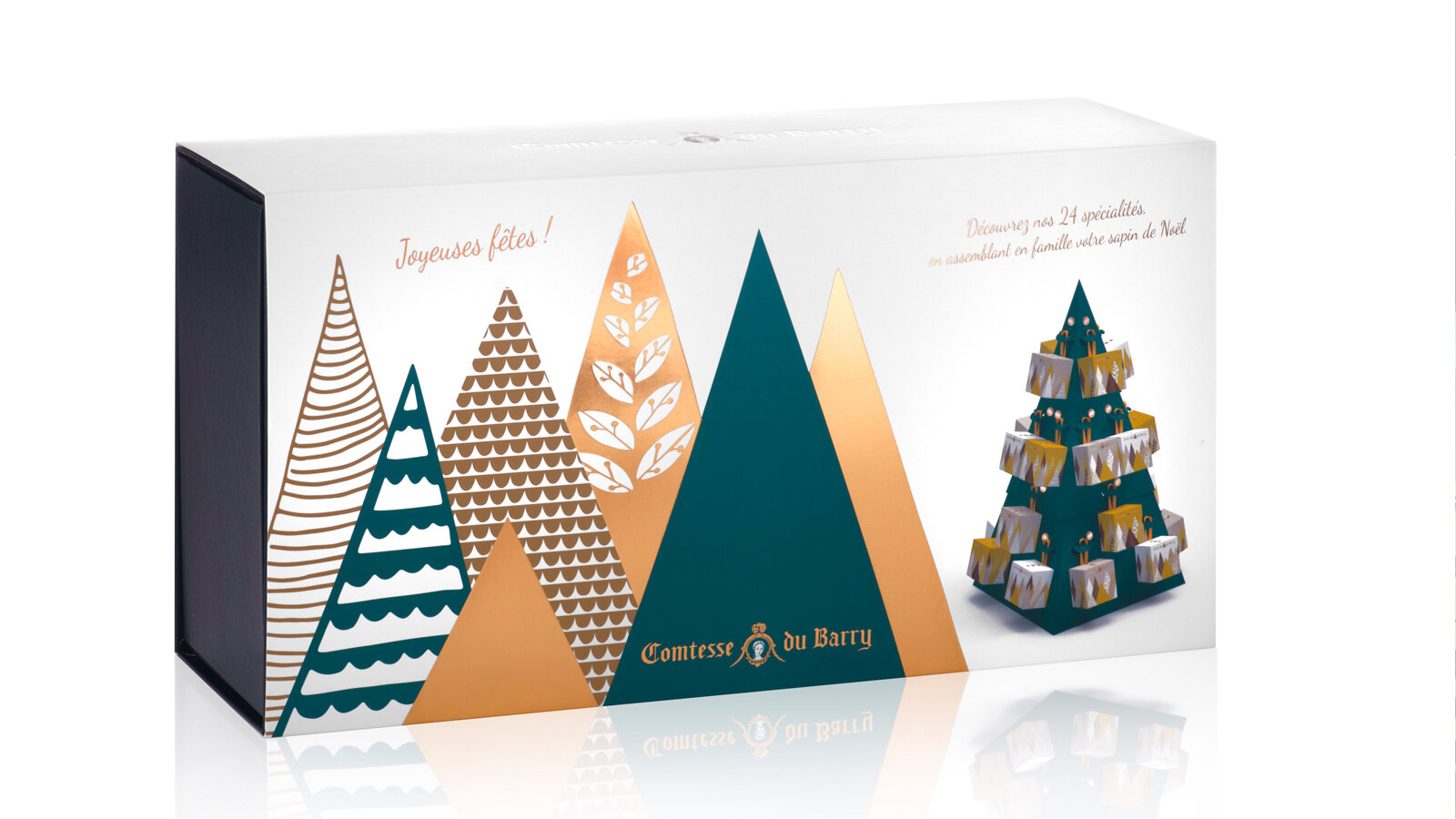
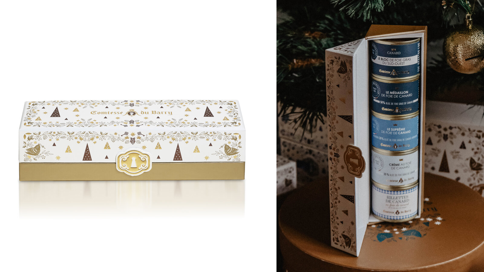
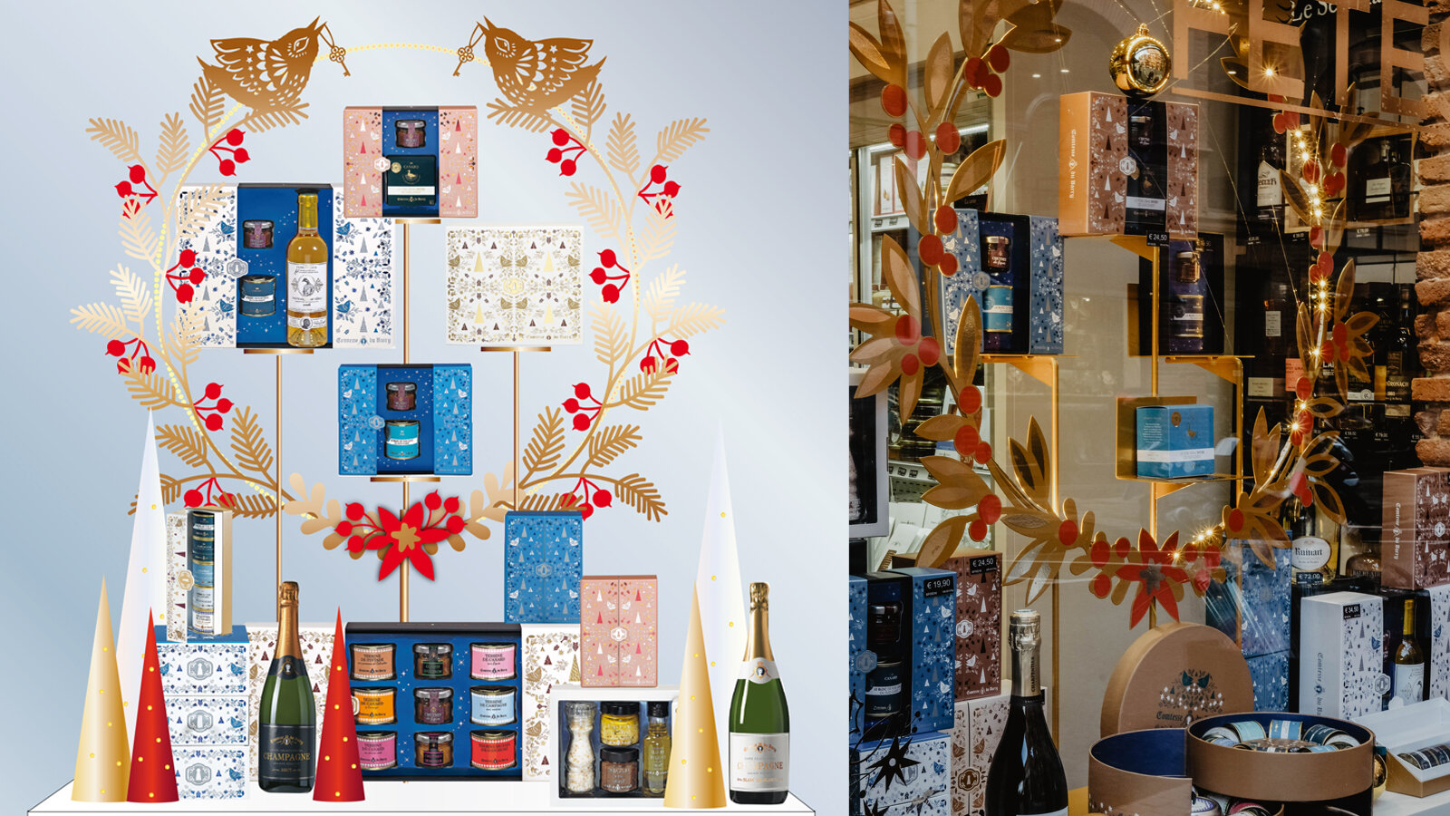
COMTESSE DU BARRY - DESIGN PACKAGING


PACKAGING DESIGN
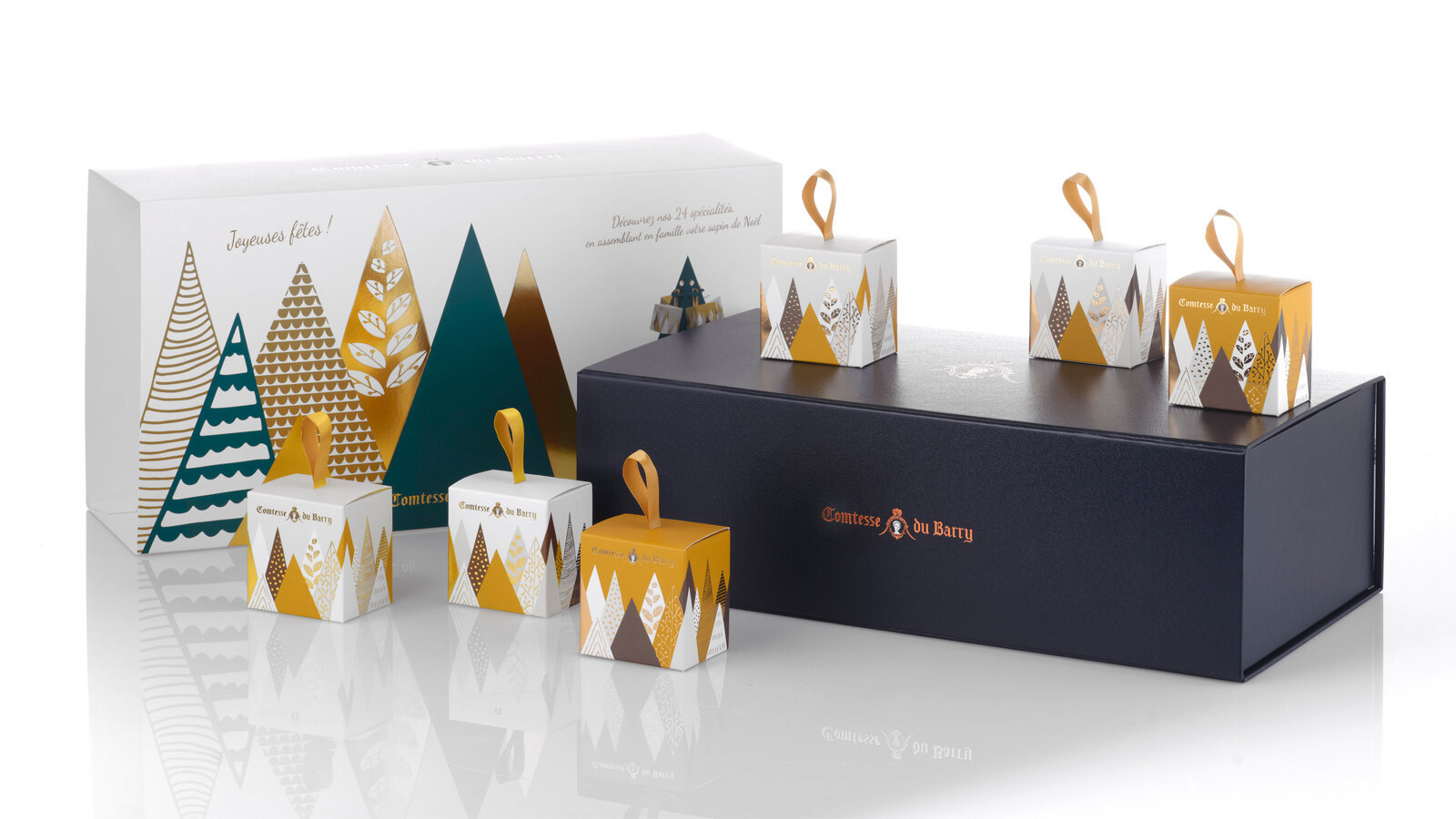
For the last five years, the Comtesse du Barry brand has entrusted us with the full design of its Christmas range. For Christmas 2022, we created a floral collection, interspersed with hints of gold and winter foliage.
Boxes adorned with custom illustrations that offer a whole range of exceptional, gourmet French products.
A colourful collection in which each box has a different design, floral composition and colour harmonies.
Our goal has always been to create durable gift boxes that, once empty, can be reused at any time of year. The 2022 advent calendar offers 24 house specialties presented in a reusable wooden tray. The Sweet Bento box can be transformed into a pretty jewellery box. The Collection Box can be used as a tea box.
Assignments:
Volume design
Illustrative and Graphic Design
LENÔTRE - PACKAGING DESIGN
PACKAGING DESIGN
“Patisserie, you know, isn’t made to feed people, but to give them something sweet to share.” Gaston Lenôtre
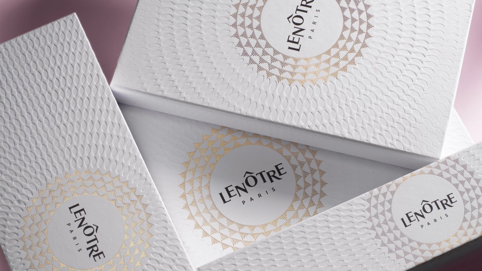
In 2019, Maison Lenôtre redesigned its brand platform and identity to establish its new signature “Maison Parisienne de la Gourmandise” and to bring a breath of fresh air to this firmly established player in the world of French gastronomy.
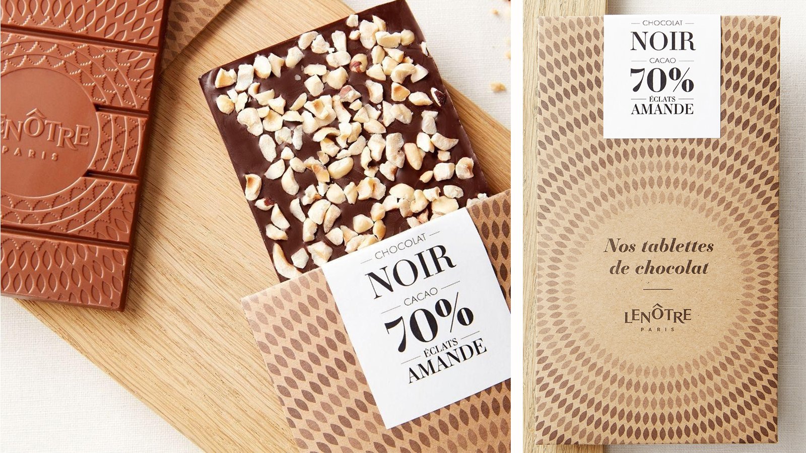
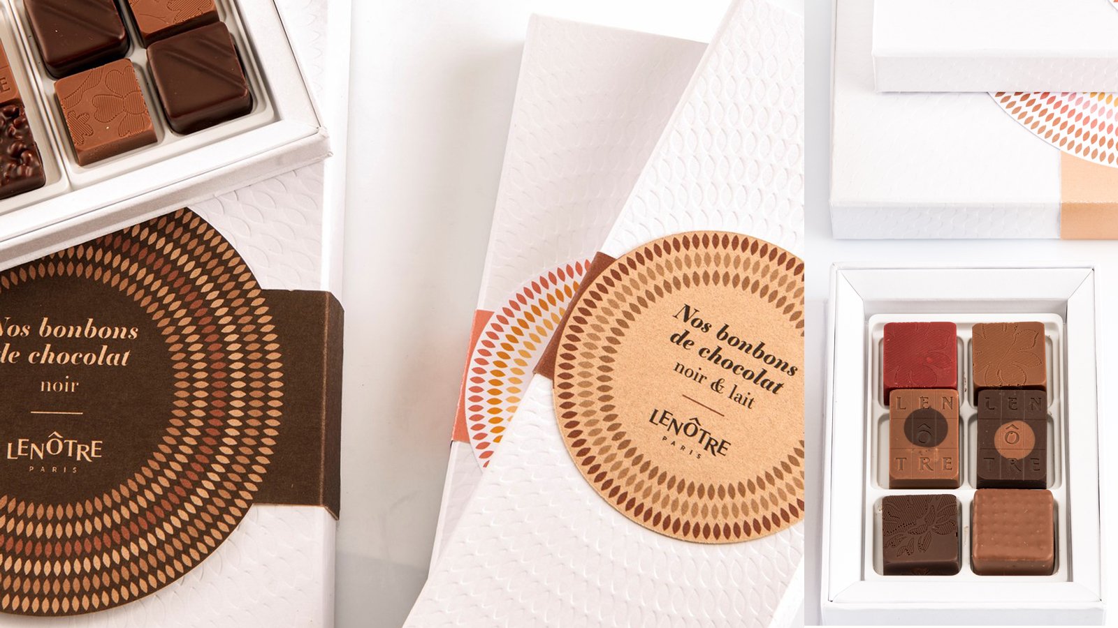
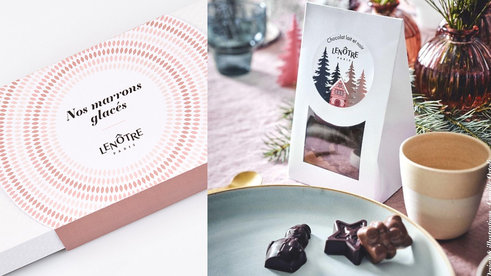
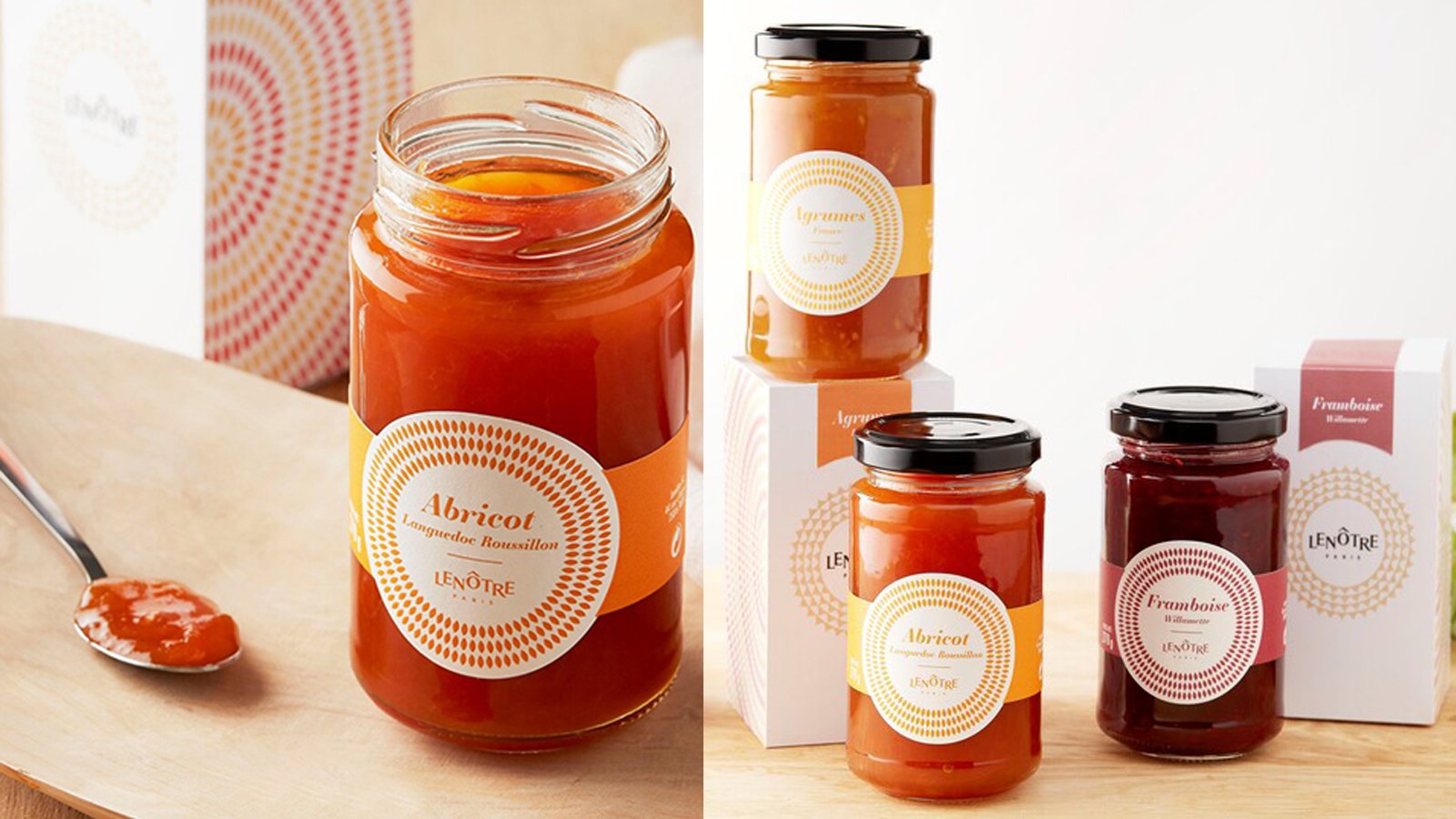
Maison Lenôtre asked us to completely redesign its packaging range, with the aim of restating Lenôtre’s traditional expertise and embodying the new brand platform. To creatively use the different resources and design potential to meet the specific objectives of each product line (accessibility/celebration).
The agency suggested translating this new identity across the range to give the new packaging a real personality and a unique character while staying on-brand. The packaging was designed with an eye for detail in terms of the choice of materials and subtle finishing touches. The packaging design reinforces and enhances the brand’s new visual identity in keeping with its gourmet creations.
Developed packaging
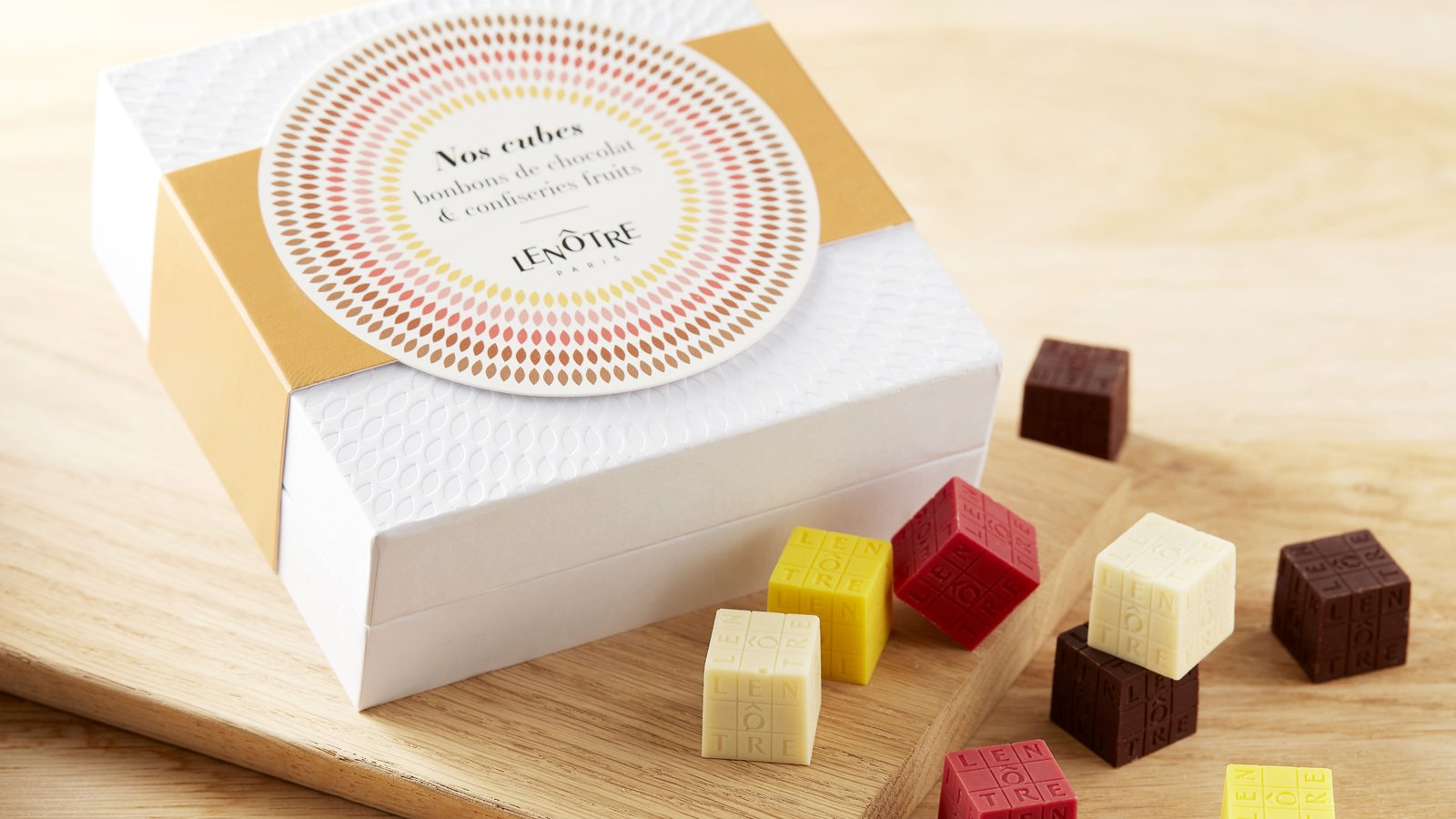
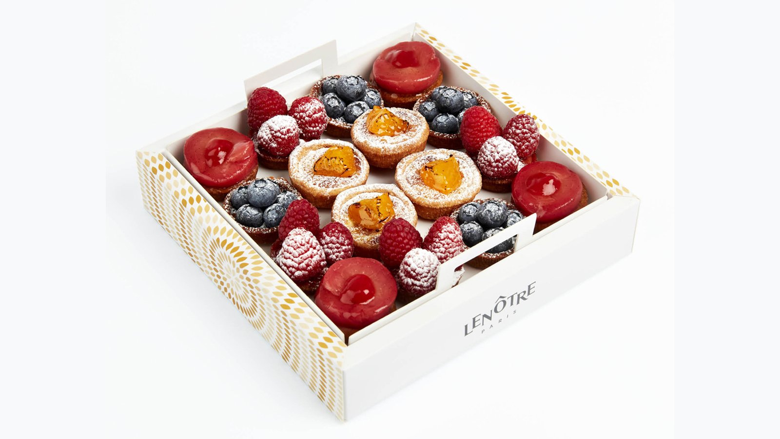
Confectionery bags : a simple folding technique that reflects the artisanal side of the brand while also being modern. The ears of wheat on the side of the packaging are part of the design while at the same time being part of the folding. This clever bag has two possible sizes due to the way it is folded.
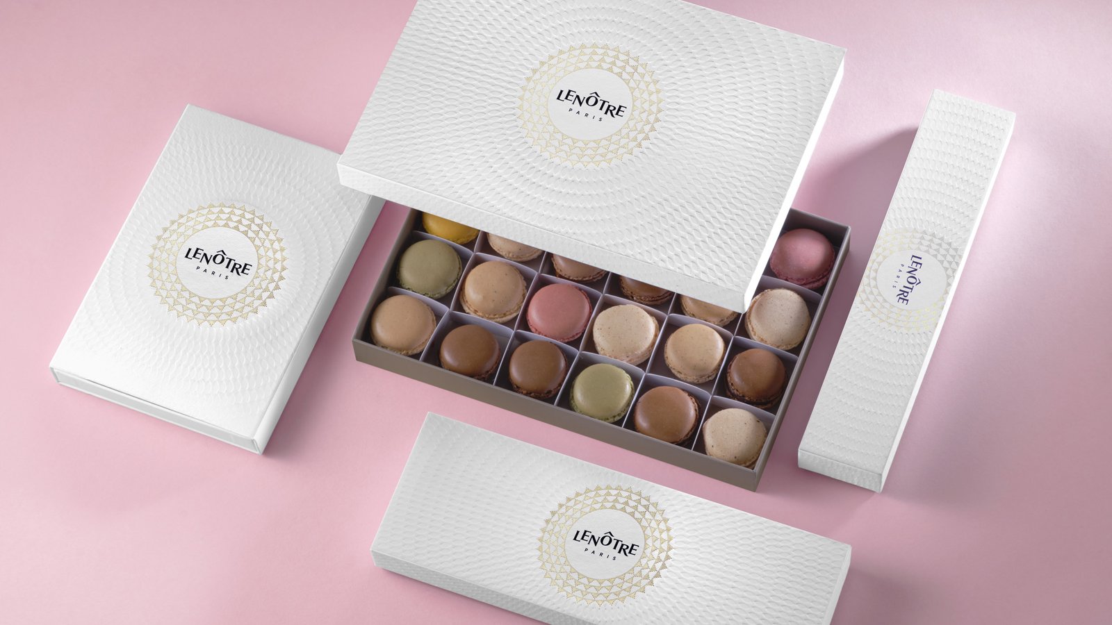
Macarons range : the macaron is the icon of Maison Lenôtre, its trademark and its source of pride. Redesign of all formats to showcase the product and its many flavours.
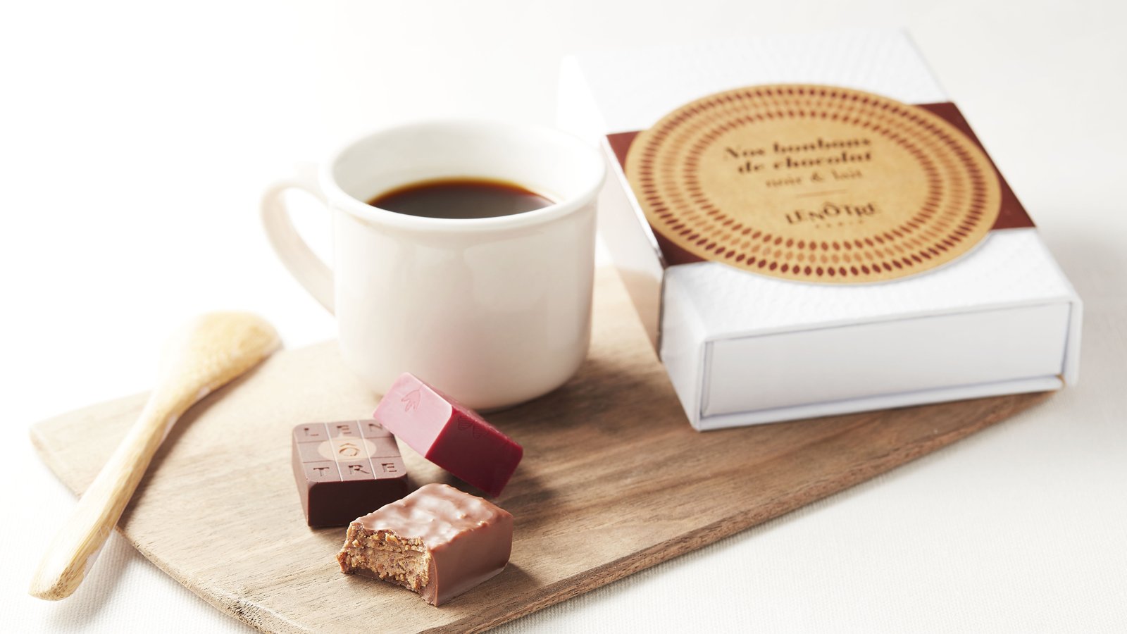
Chocolate bar packaging
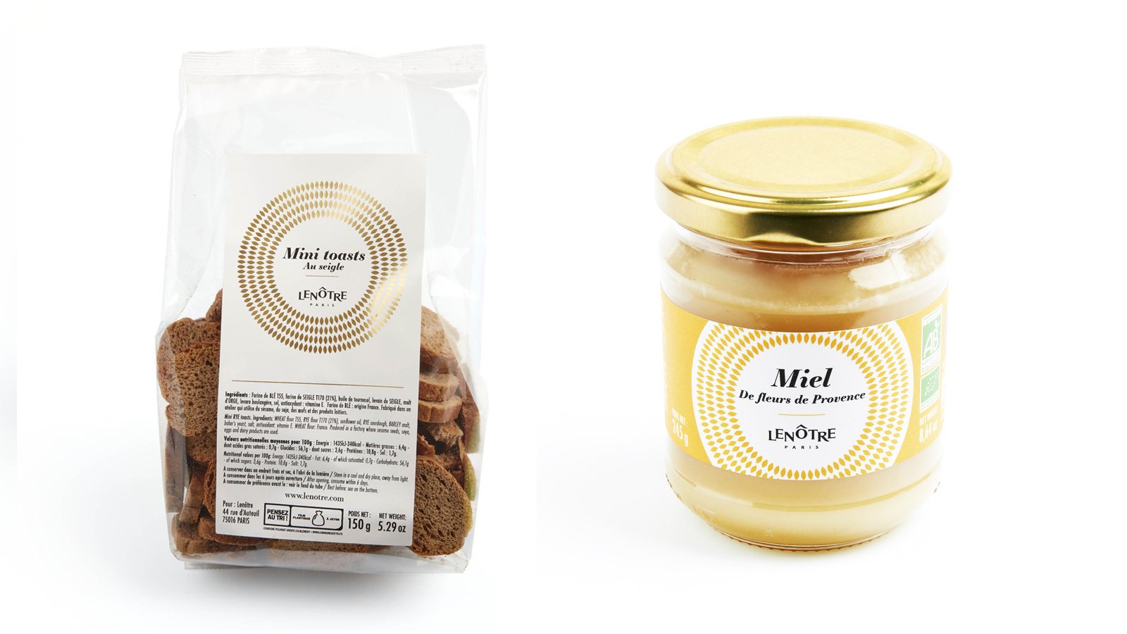
Bags, patisserie packets
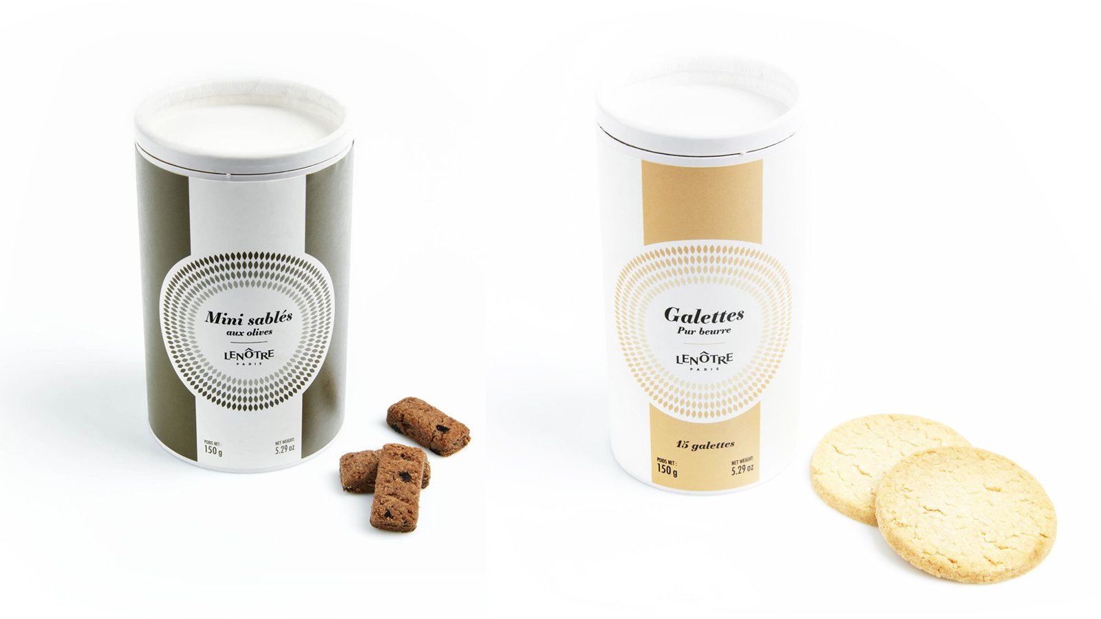
Biscuit gift box
Jam rang
Product personalisation rings
Assignments :
Packaging Design
COMTESSE DU BARRY – CHRISTMAS 2021


PACKAGING DESIGN
A culinary journey inspired by a Christmas classic!
As every year, the Comtesse du Barry brand entrusted us with the full design of its Christmas range.
For 2021, we opted for a collection inspired by the famous classical ballet, The Nutcracker.
The story of “The Nutcracker and the Mouse King” and Tchaikovsky’s ballet melts away
the barriers between childhood, dreams
and reality. The success of the story has made The Nutcracker a Christmas icon.
The boxes with their decoration inspired by the imagination and the magic of Christmas hold a selection of refined and exquisite products that the brand has earned its reputation for.
A brightly coloured collection in which each box is different and helps to recreate the story of The Nutcracker, with characters from the ballet or individual details of their beautiful costumes.
Get into The Nutcracker spirit with our
2021 boxes.
Assignments:
Packaging design
Graphic design
COMTESSE DU BARRY - CHRISTMAS 2020


DESIGN PACKAGING
A gourmet tour in an enchanted forest.
As every year, we have been charged with the entire creation of the Christmas range of La Comtesse Du Barry.
Pour 2020, we designed a magical world in which good food and creativity combine to express the best of French produce in its compositions.
An enchanting range of forest-themed gifts that carry the eater off on a festive journey. It is an invitation to escape to the enchanted forest.
Unusual advent calendars, enchanting receptacles, refined specialties from the land and the sea... each product undergoes stringent selection and is painstakingly worked in an ode to Epicureanism that varies pleasures and delights the palate.
Sweet calendar: every tree hides a gourmet chocolate to make the wait up to Christmas as delicious as possible. The calendar stands as a decoration, and a new tree emerges every day to create an enchanted forest.
Savory calendar: Advent calendars are traditionally thought of as something you open every morning. But why not, in a slight twist, leave the surprise for the evening hour?
This Advent calendar takes the form of a 48 cm high cardboard Christmas tree to assemble. It will blend perfectly with your Christmas decorations. 24days of waiting, with 24 little packages to open and discover the best specialties from France.
Foie gras, porcini mushrooms and truffles gift box: a numbered limited edition containing the sweetness of foie gras, the delicate aroma of porcini mushrooms and the power of truffles in a pyramid-shaped box with a contemporary iridescent forest decoration.
Assignments:
Packaging design
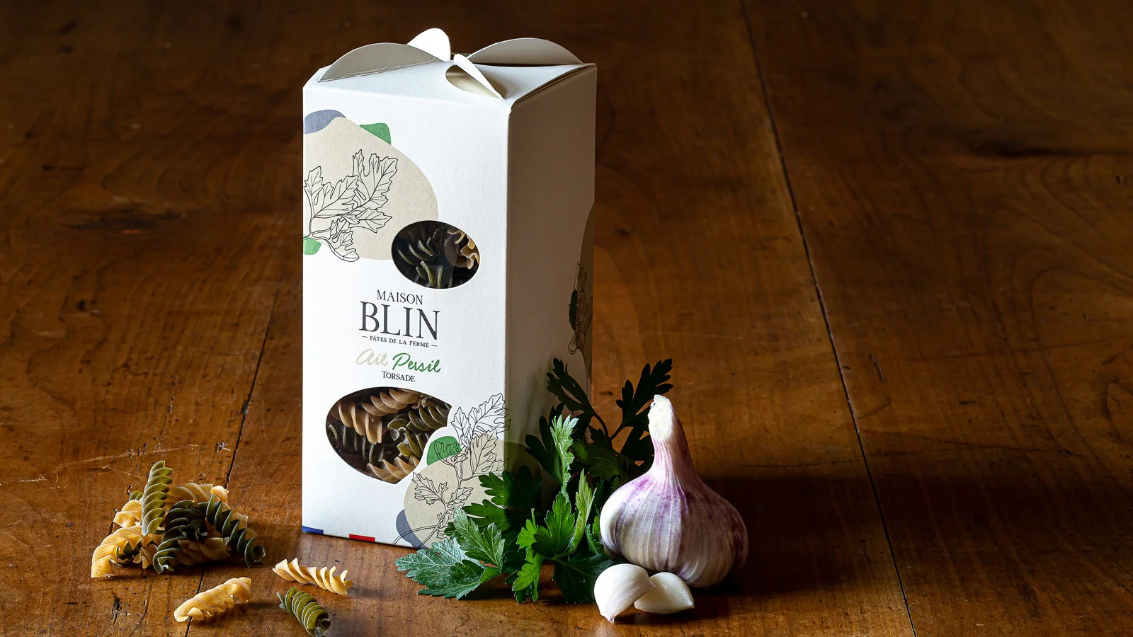
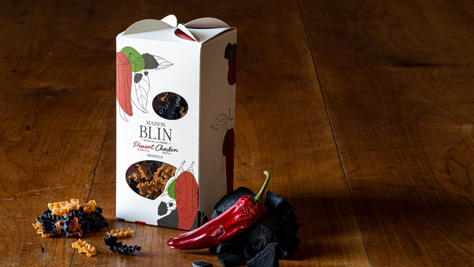
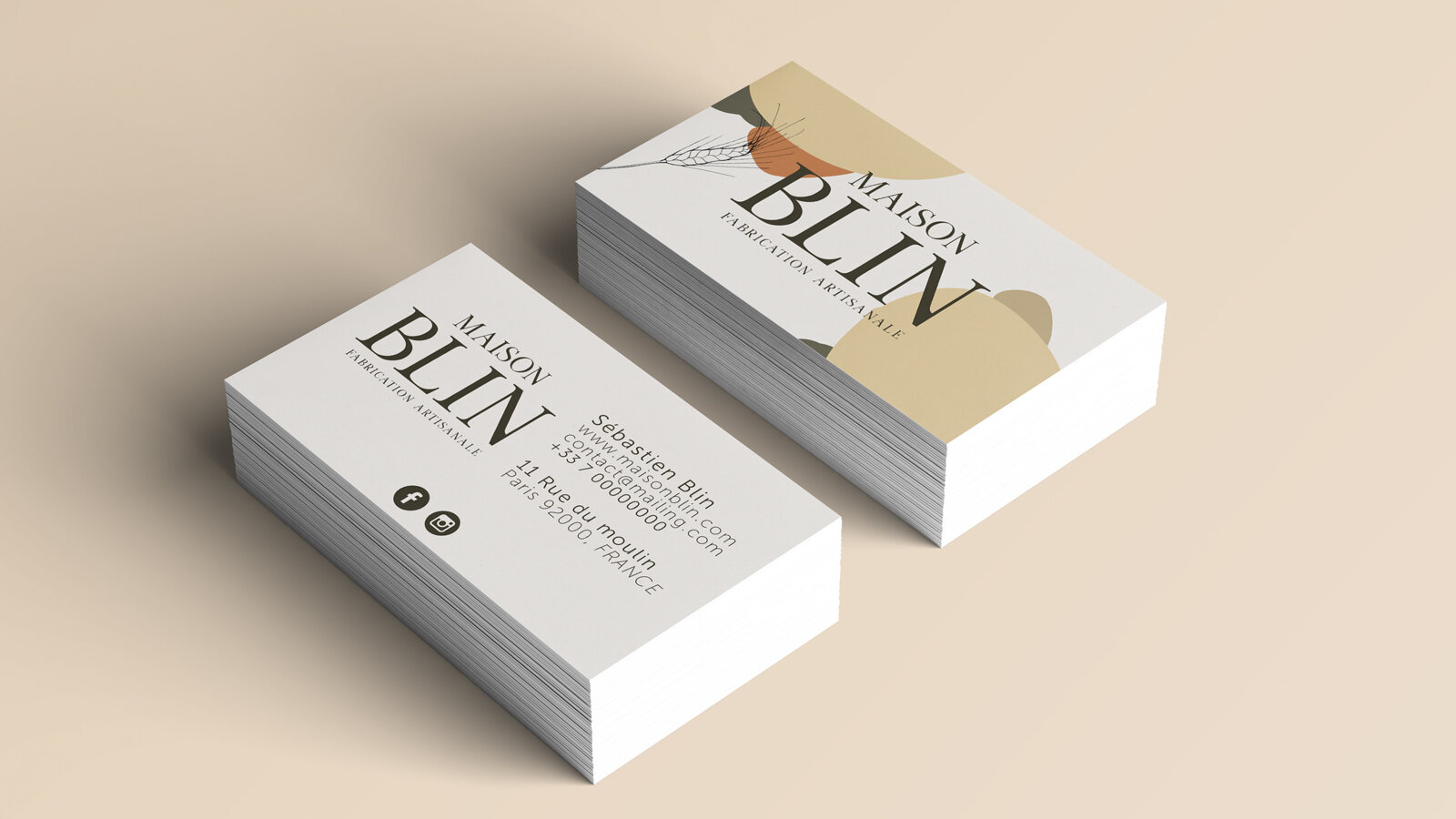
MAISON BLIN ARTISAN PASTA


GLOBAL DESIGN
Sébastien Blin asked the agency to develop a packaging concept that stands out from current trends by highlighting the traditional and innovative aspects of his products. He has just created his brand of flavoured pasta made in Beauce, France. His ambition is to sell his products through all the premium grocery stores in Paris, in a spirit of short local marketing circuits, since his farm is located a mere 50 km from the capital.
Brand name creation. We have opted for an authentic name, both traditional and modern, which uses the client’s last name. The addition of the word “Maison” reflects know-how and reliability, and does not limit the range to pasta.
While creating the packaging, we were looking for something simple, elegant and easy to identify, which stands well apart from the competition with a signed folded part on the top of the package that evokes windmill sails, since the wheat is milled in a nearby mill. The product can be seen through windows that are shaped to convey identity and blend in with the graphics.
For the graphics that identify Maison Blin, we continued with the combination of modernity and tradition, drawing inspiration from the simple recipes of the products. The drawing of one of the ingredients in an engraving style and graphic spots of colour to symbolise the other ingredient come together to express the concept of the brand: dual taste.
The result is a clean design and a product that can be understood at first glance.
This graphics style will be used on all the advertising material of the brand.
All the images were taken directly in the Maison Blin farm, in natural light to stress the genuine and natural side of the brand.
Which ones would you choose?
www.maisonblin.fr
Assignments:
Brand strategy
Naming
Brand identity
Packaging design
Iconography
Web design
APERITIF KITS FROM LA MAISON KYRËGAL


GLOBAL DESIGN
APERITIF KITS combining spreads and crackers with a tasting ritual for food lovers.
The aim was to develop packaging with a strong identity that would reflect an original and innovative concept of ready-to-eat foods served with an aperitif.
A shape and packaging that clearly sets apart the product by making the kit unique as well as practical, attractive and almost playful. Aimed at a wide audience and to be taken away wherever you want, at home, with family or friends or on an adventure like a picnic in the wild, etc. Gift packaging to make the product a real treat-yourself buy which encourages you to share it and get together with others.
Each APERITIF KIT includes complementary flavours based on cookies, a spread and a condiment. Products preserved in three glass containers accompanied by two wooden spatulas. Cardboard case covered with custom illustrations playing with three foodie openings, embellished with a practical handle to transport the product in perfect harmony with the transportable side of the box.
Our agency has also designed a tasting tray that elegantly carries the three festive foods that will go with the aperitif drinks. Creates a real moment of relaxation and simple culinary pleasures.
These boxes, distributed in wine shops and delicatessens, come in three traditional designs (fish, meat and vegetables) symbolising the local region. Three motifs, three indulgent illustrations and “good mood” colour coding to clearly present each design and each complementary flavour.
Separate kits with overall coherence, making you want to discover all the “symphonies of flavours”.
Assignments:
Brand identity
Packaging design
Product design
COMTESSE DU BARRY - CHRISTMAS 2019


DESIGN PACKAGING
As every year, for the festivities, the Maison Comtesse du Barry has entrusted the 2S agency with the creation of its Christmas range, from the box set to the creation of the product catalogue, up to merchandising. A delicious collection that invites you to enter its exquisite world...
Creation of a box set shape, dressed with a custom-made illustration on the Christmas theme. Search for a colourful, festive and refined universe throughout the range.
Creation of a graphic and gourmet Advent calendar, representing a cityscape with 24 small bright windows to open, each containing a selection of chocolates.
Creation of the business gift catalogue, in accordance with the theme developed on the box sets.
Design of the store window, the graphic design worked in volume becomes a glorifyer display in gold metal and with touches of red.
Assignments:
Packaging design
Edition - Creation of the product catalogue
Store window design
BONJOUR BRAND IN COLLABORATION WITH T-MALL - MOONCAKE BOX SET


PACKAGING DESIGN
The idea of this box set was to reach the new middle class of 200 million young Chinese consumers and provide them with surprise and innovation with our French touch. A targeted communication strategy with the support of the Alibaba group to optimize traffic and attract the young Chinese generation. T-Mall and Bonjour Brand, commissioned the agency to create box sets for the moon festival. The agency has gone against new borders by collaborating on new products co-created by France and China.
Celebrated in mid-autumn, the Moon Festival is one of China's most important celebrations. Symbol of unity and gathering, it is also on this occasion that the moon cakes are offered. It was important in the design of the box set that it could be worn both during a parade organized by T-mall and by the consumer once the cakes had been tasted. This is why we have decided to give a new dimension to this traditional celebration by creating a box set that is modern, chic and luxurious.
To highlight this festive day, we have made the moon our muse to carry our box set. It is wire-shaped, lightweight and rigid at the same time, its golden metal design reveals the strong identity of this creation before revealing its content in an unexpected way. Inspired by the greatest Parisian Haute Couture fashion shows, this box set can be worn at arm's length to give its owner a determined and modern look. The leather finish contrasts with the modern graphics of the box set and offers it the attributes of a "luxury" accessory, targeting a young audience.
Assignments:
Packaging design
COMTESSE DU BARRY - DESIGN PACKAGING


PACKAGING DESIGN
Comtesse du Barry has been growing and evolving for more than a century. The Maison blew out this year its 100 candles. Such beautiful years during which the company imagined, conceived, produced and proposed French premium gastronomic delights.
On the occasion of its 100th anniversary, Comtesse du Barry assigns us many gourmet and festive innovations (from the packaging to the showcase) for its customers‘enjoyment.
Echoing the precious Art Deco motifs which symbolize the festivities of 1908,
the Christmas 2018 collector boxes open onto a world of elegance that fits perfectly with the iconic delicacies of the brand.
Gabrielle box
We created a prestige box to pay tribute to Gabrielle Dubarry, founder of the House : Gabrielle, an exceptional goose foie gras imagined in a limited edition. This signature foie gras is presented in a prestigious setting, the “secret trunk”.
Terrine box
There’s no doubt that the magic of the Christmas period can be found in its collection of terrine, fully redesigned with art deco patterned drawers.
Advent calendar
Over time, a new surprise is revealing each morning... In order to make the wait for Christmas a real pleasure, we imagined a graphic and gourmet calendar that takes the form of a shop as we could have found 110 years ago.
This openable calendar delivers all its delicious secrets and enhances the effect of surprise as each calendar contains a ticket to win.
Assignments:
Packaging design
Christmas Showcase Design
Production follow up
LA BALEINE A CABOSSE - GLOBAL DESIGN


GLOBAL DESIGN
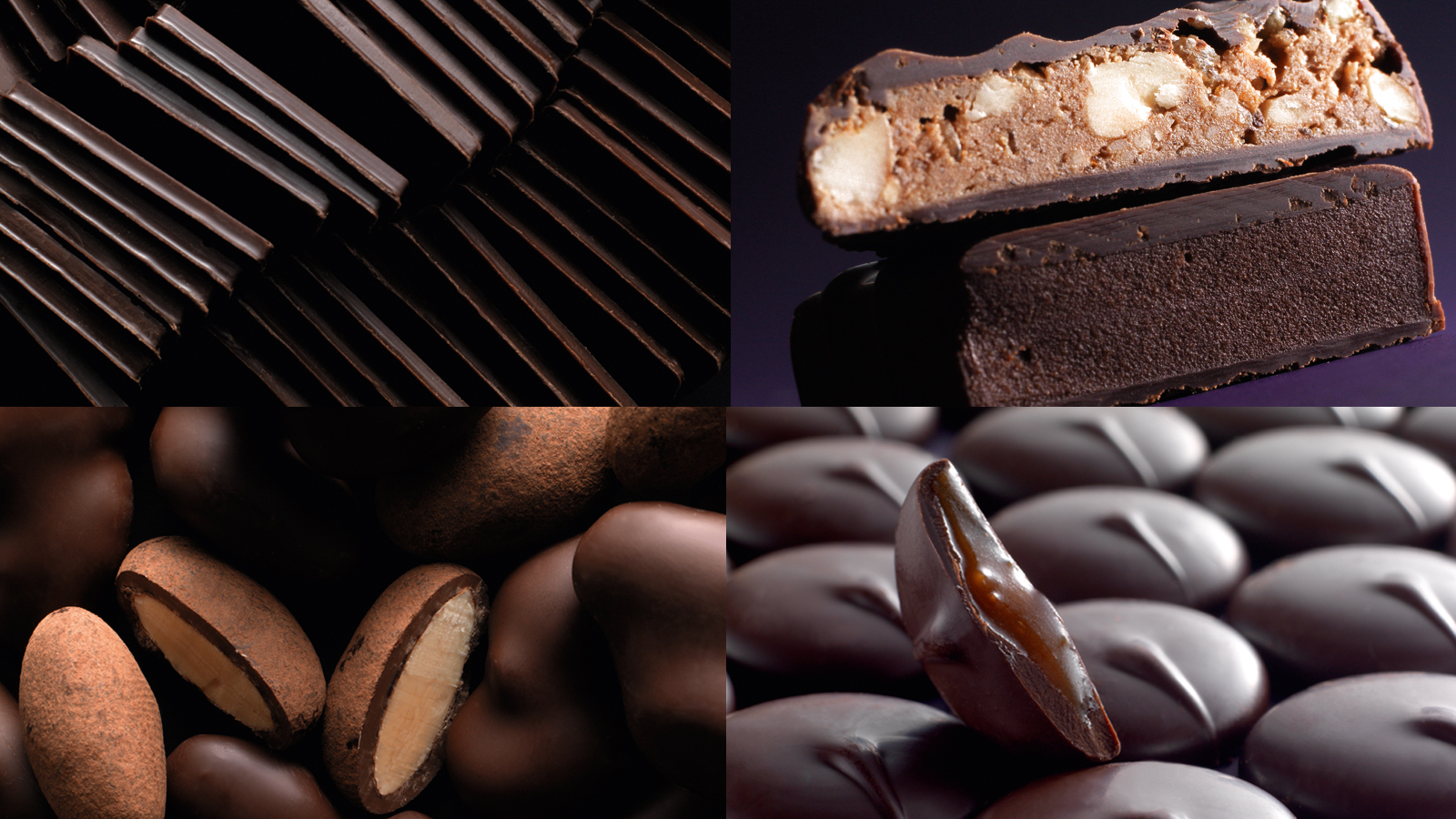
Claire and Aurélien did not know anything about cocoa until the day they decided to travel to Colombia. They discovered the richness and the variety of cocoa beans. Far from industrial chocolate, they threw themselves into the “bean-to-bar” concept (which means “from the cocoa bean to the chocolate bar”). They roast, crush, winnow and grind the cocoa beans within their store in Marseilles (France) to produce their own range of chocolates. The couple, passionate about their new profession, emphasize on homemade chocolate. In one chocolate bar, there is an explosion of flavors.
It is directly from Colombia that Claire and Aurélien contacted the 2S Global Design agency to help them for their project. Our mission was to develop the global design of the brand.
Why is the brand named La Baleine à Cabosse? (which means “The Whale with the hump” in French. “Bosse” means hump and “Cabosse” means cocoa bean.) In Tumaco, when coming back from a tour of cocoa plantations, the couple saw humpback whales. Their shape immediately reminded them of cocoa beans. That is how La Baleine à Cabosse was created, a legendary creature that traverses the Pacific waters looking for boats filled with cocoa. Apparently, if you see one of these whales from the shore, you are guaranteed to have a spectacular crop the following year.
By creating the identity of the brand, we brought life to the whale “à cabosse” who carries on her back trips from different regions of Colombia, the rising star of exceptional cocoa. The warm colors and raw materials make La Baleine simultaneously traditional and modern. The concept of the brand’s identity had to break with the traditional codes of chocolate factories and sweet stores.
The design of the chocolate bar was made so as to reinforce the story of the brand. We created a thin and wavy shape, making the squares of chocolate easy to cut and enjoyable to eat.
The packaging was conceived without any glue. It is a simple folding decorated by the atmosphere and the decor of the couple’s fabulous trip to Cordoba, Arauca and Tumaco, different regions of Colombia. 3 terroirs, resulting in 3 different flavors.
Still in an environment-friendly way, the box was also designed without any glue. It has the particularity of having an integrated handle to facilitate its transport. A box to offer or for oneself to compose with the products of the brand.
The universe of the store is shimmering and colorful, combining raw materials and different flat tints in harmony with the identity codes of the brand.
Assignments:
Brand strategy
Brand identity
Packaging design
Culinary design
Communication mediums
COMTESSE DU BARRY CHRISTMAS BOX AND ADVENT CALENDAR 2017


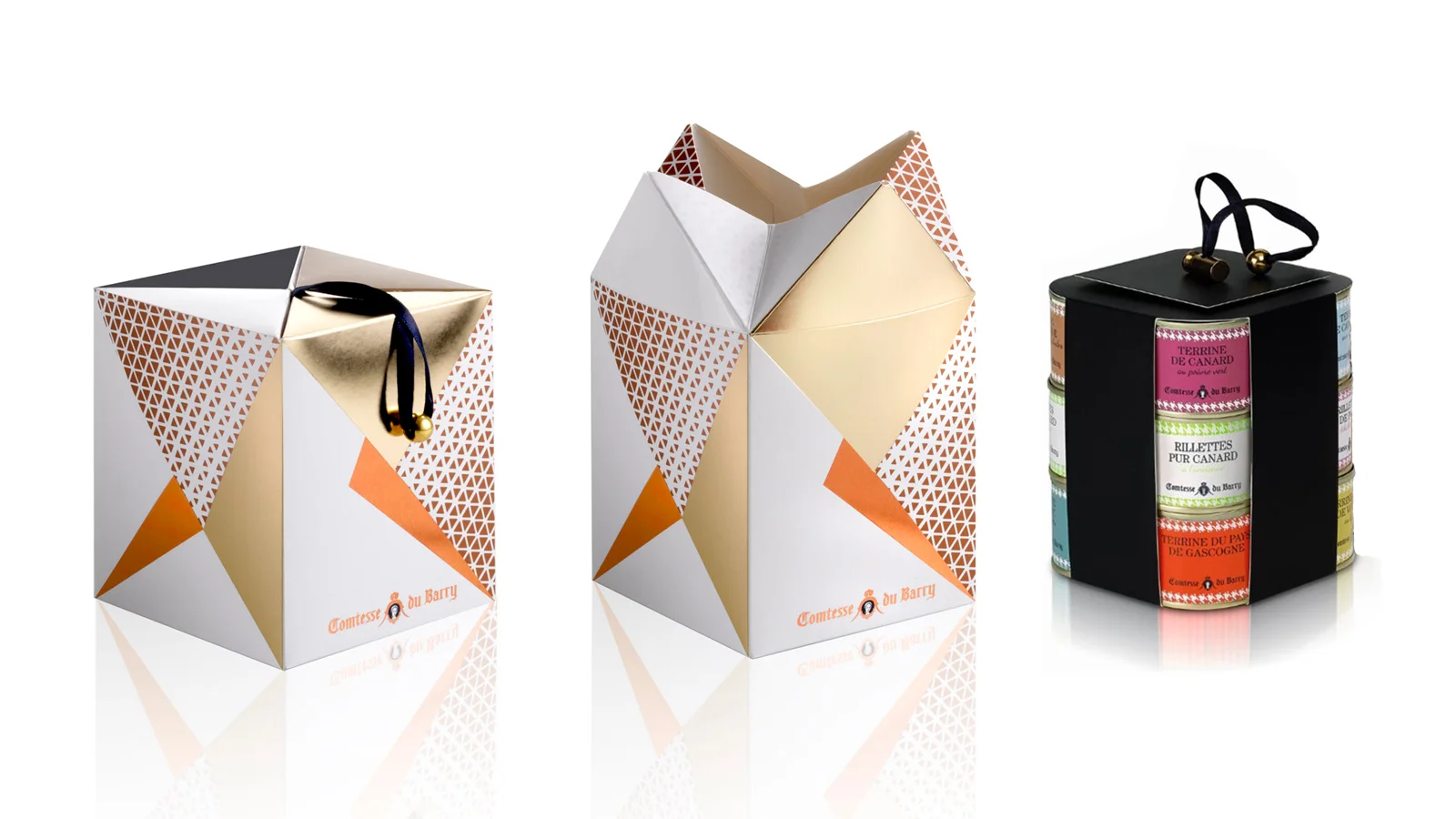
PACKAGING DESIGN
Being a gastronomy expert, Comtesse du Barry is renowned for its large choice of local products and foie gras specialties.
Christmas is that special time of the year in which we give cards, letters and presents that we wrap.
Through the art of presenting gifts, we tell our loved ones how much they mean to us. Comtesse du Barry wished to develop a range of unforgettable Christmas boxes that would be up to this moment.
In 2017, Comtesse du Barry immersed in the wonderful world of origami. This theme corresponds to its traditional inheritance and its two fundamental values: gastronomy and aristocracy.
Originally, origamis were made with quality materials by aristocrats who wished to present gifts that would show their benevolence to their addressee.
We conceived the range of Christmas boxes by developing a refined, chic and gourmet origami, like a gift that one would unwrap.
In perfect harmony with the institutional boxes of the brand, we created a combination of colors and luminous effects with a Christmas spirit.
This concept is developed on envelopes, ribbons, the press box and in particular the Comtesse du Barry Advent Calendar. The latter being an innovation for the brand, we chose to develop a noteworthy shape, linked to the main theme.
The calendar unfolds to reveal all of its graphics and its surprises in the style of a chic and gourmet origami.
Behind each square, a candy sagely awaits to be savored each day.
Assignment:
Packaging design
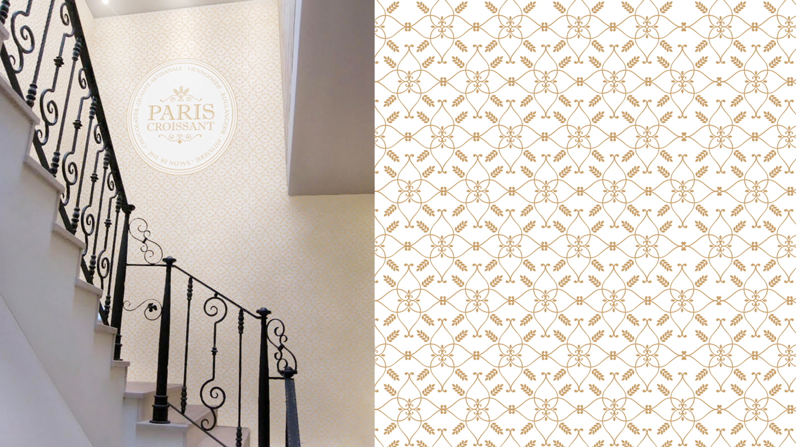
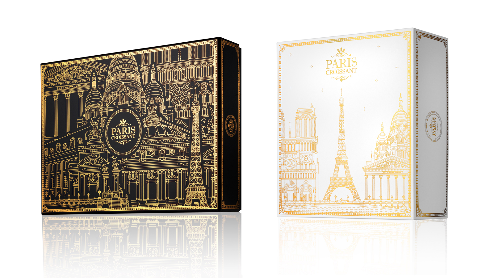
PARIS CROISSANT - GLOBAL DESIGN


GLOBAL DESIGN & COMMUNICATION
The SPC Korean group is an entity which mainly operates in the food industry, notably in the bakery and confectionary sectors and holds the Paris Baguette, Paris Croissant and Shany brands.
It entrusted us with the global design of their most premium brand, which counts more than 20 shops in Asia and worldwide: Paris Croissant.
Our mission relied on bringing our premium French touch to all of its communication medium.
Creation of a new identity for the Paris Croissant brand:
Paris being the French capital of bakery and pastry, we drew our inspiration from the ancient Parisian bakeries’ style to conceive the new Paris Croissant identity.
The typography has been refined through two approaches: tradition and modernity.
The wheat symbol is included to reinforce the brand’s universe. It has been graphically designed in several ways, including a pattern, which can be used either in print communication or in space design. The different versions of the logotype have been conceived for each communication medium to create a strong and coherent visual identity.
Creation of a new packaging identity:
Our concept: the French art de vivre. French people share a way of life inherited from their culture. They appreciate wandering, looking at historical monuments, having coffee, going shopping…
Going to Paris Croissant means stepping into the French culture. It is about taking the time to taste a good pastry in a decor that is built to immerse you in the heart of the French capital. It implies engaging oneself in tourism and discovering the city through the packaging specifically conceived to match with the brand’s universe.
We declined this new packaging and merchandising concept for the Christmas and Valentine’s Day festivities, selecting the most accurate monuments for each theme.
To establish coherence between the new brand image and the boutiques, SPC also entitled us with the decor of a flagship boutique in the French neighbourhood of Seoul: Seorae.
Assignments:
Branding strategy
Brand identity
Packaging design
Merchandising
Communication supports
Boutique design
LA MAISON DU CHOCOLAT


GLOBAL DESIGN
As true partners of Maison du Chocolat, we regularly develop global concepts (from packaging to merchandising) so as to energise a network of over 40 stores located in France and abroad.
Christmas Reindeer
For Christmas 2013, we designed a theme that inspired the Master Chocolate-maker's seasonal creation and that ran throughout the packaging and merchandising.
It followed Rudolph and his fellow Reindeer as they leapt into the magic of Christmas.
Assignments:
Creation of a motion display theme
Packaging Design
Window display design and store scenography
Technical finishing
Manufacturer recommendations
Production follow-up
PACKAGING Design
Treats and Delicacies
Creation of a graphic identity for this range of delicacies building the concept around the 'M' of 'Maison'.
Assignments:
Packaging design
Graphic presentation
Production monitoring
packaging DESIGN
Duo sets
Creation of an innovative labelling for each set (orange, coffee, etc.) while maintaining unity in the imagery so as to convey the effect of a range.
Assignments:
Packaging design
Graphic presentation
Production monitoring
PACKAGING DESIGN
White Day and Spring Box
A delicate, elegant and simple box on a pearly white background, named after the Japanese festival of 14 March.
The box features cherry blossom flowers that evoke the season, love and the exclusive recipe of these chocolates (tea and cherry blossom ganache).
Assignments:
Packaging design
Graphic presentation
Production monitoring
Photo copyright: Caroline Faccioli
PACKAGING DESIGN
Caviar and Vodka Box Set Development of an ephemeral box for the Christmas period based on new territories of tastes.
A round and elegant case outlining the graphic codes of an exceptional product: caviar.
Adorned with a black embossed paper, the objective was to awaken curiosity and offer the customers a new tasting gesture.
Assignments:
Packaging design
Graphic design
Production monitoring
Design Merchandising
Home-made gift sets
Creation of a concept around ribbons for the interior and exterior presentation of corporate gift sets.
Assignments:
Concept creation
Shop Window and Scenery design
Technical finishing
Manufacturer recommendations
Production monitoring
Design merchandising
Tamanaco
A concept drawing on the world map to illustrate the idea of a “rite of passage journey across the origins of ganache truffle”, offered by the new Tamanaco range.
Assignments:
Concept Board
Window display design and store scenography
Technical finishing
Manufacturer recommendation
Production follow-up
ABANICO - CHOCOLATS DE CRÉATION


GLOBAL DESIGN
Global design conceptualisation built around the fan (abanico in Spanish) to bring to the fore their online brand, its exclusive distribution network and to express their leitmotiv, "l'art de la dégustation", the art of tasting.
Assignments:
Brand name
Graphic identity
Packaging design
Copywriting
Iconographic charter
Artistic direction for website and blog
ARÔMES & GOURMANDIZ


GRAPHIC IDENTITY & PACKAGING
The expression through imagery of the concept “one drop is enough” for a tailor-made culinary flavourings brand, made up of fifteen separate items.
Assignments:
Logotype and graphic identity
Packaging
Printed materials
YVES-MARIE LE BOURDONNEC - CRAFTSMAN BUTCHER


GLOBAL DESIGN
Creation of a graphic convention (in gold and dark granite) which conveys the two specialities of the famous "meat sculptor" (maturation and cutting up), as well as his premium positioning. Rendering this identity across all media types.
Unique packaging concept, breathing new consumer life into the traditional dishcloth.
The three shops can be found at:
- 172, avenue Victor Hugo 75116 Paris
- 43, Rue du Cherche-Midi 75006 Paris
- 4, rue Maurice Bokanowski 92600 Asnières sur Seine
Assignments:
Graphic identity
Logotype
Graphic and visual charter (photographer Eric Deniset)
Publishing
Packaging design
Publishing
Press releases
Website
Commercial Structure
TUBIC - TOTEM TRAVELLER FLASKS
PACKAGING DESIGN
Design of sampling flasks for spirits, oils, rare vinegars and spices, aimed at professionals and easy to transport and personalise. Creation of the brand name "Totem", a unique yet universal ritual object evocative of travel and discovery.
Assignments:
Naming
Logotype and graphic design
Finishing concept
Technical finishing
Decor and communication design
(commercial publishing)