LA BALEINE À CABOSSE - PACKAGING DESIGN


TASTING BOX

PACKAGING DESIGN

Embark on a taste adventure with our latest creation for La Baleine à Cabosse: a "Chocolate World Tour" tasting box, in which every detail is carefully crafted to offer you a delightful experience.

To bring this tasting a touch of originality, we designed a unique cardboard tray, providing a dynamic presentation of the chocolate discs. This arrangement instantly arouses the desire to indulge. The staggered paper wedge ensures a good protection for the chocolates during transportation, guaranteeing a preserved tasting experience.

Inside this chocolate gift box, as pleasant as it is playful, you will discover a collection of 20 discs from 10 carefully selected regions.

A detailed booklet guides this exploration, displaying the unique features of each region. To refine your palate, a flavor wheel is printed on the back of the booklet to identify those taste nuances that often escape you, adding an even more sensory dimension to your tasting experience.

Assignments :
Packaging Design

COMTESSE DU BARRY - CHRISTMAS 2020


DESIGN PACKAGING

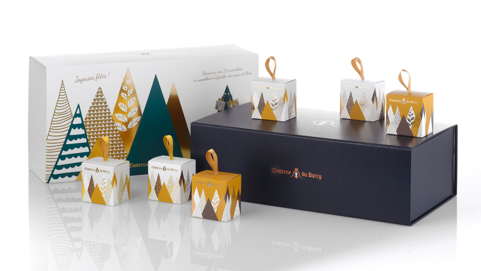
A gourmet tour in an enchanted forest.

As every year, we have been charged with the entire creation of the Christmas range of La Comtesse Du Barry.

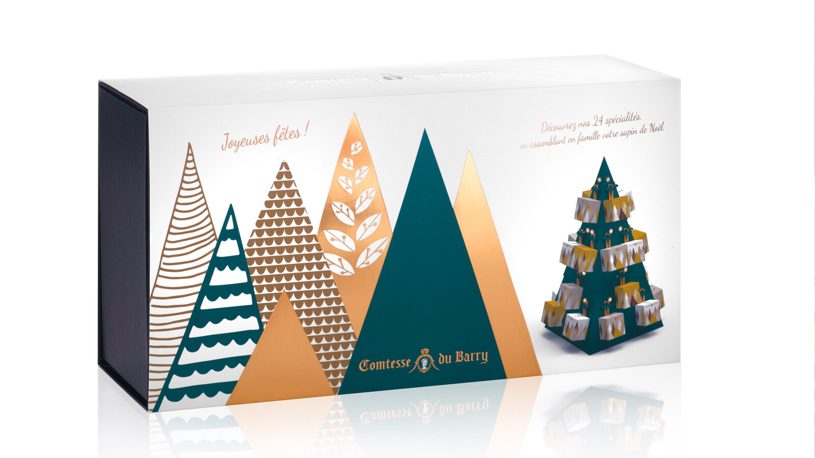
Pour 2020, we designed a magical world in which good food and creativity combine to express the best of French produce in its compositions.

An enchanting range of forest-themed gifts that carry the eater off on a festive journey. It is an invitation to escape to the enchanted forest. 

Unusual advent calendars, enchanting receptacles, refined specialties from the land and the sea... each product undergoes stringent selection and is painstakingly worked in an ode to Epicureanism that varies pleasures and delights the palate. 

Sweet calendar: every tree hides a gourmet chocolate to make the wait up to Christmas as delicious as possible. The calendar stands as a decoration, and a new tree emerges every day to create an enchanted forest. 

Savory calendar: Advent calendars are traditionally thought of as something you open every morning. But why not, in a slight twist, leave the surprise for the evening hour?

This Advent calendar takes the form of a 48 cm high cardboard Christmas tree to assemble. It will blend perfectly with your Christmas decorations. 24days of waiting, with 24 little packages to open and discover the best specialties from France.

Foie gras, porcini mushrooms and truffles gift box: a numbered limited edition containing the sweetness of foie gras, the delicate aroma of porcini mushrooms and the power of truffles in a pyramid-shaped box with a contemporary iridescent forest decoration. 

Assignments:
Packaging design

MAISON BLIN ARTISAN PASTA


GLOBAL DESIGN

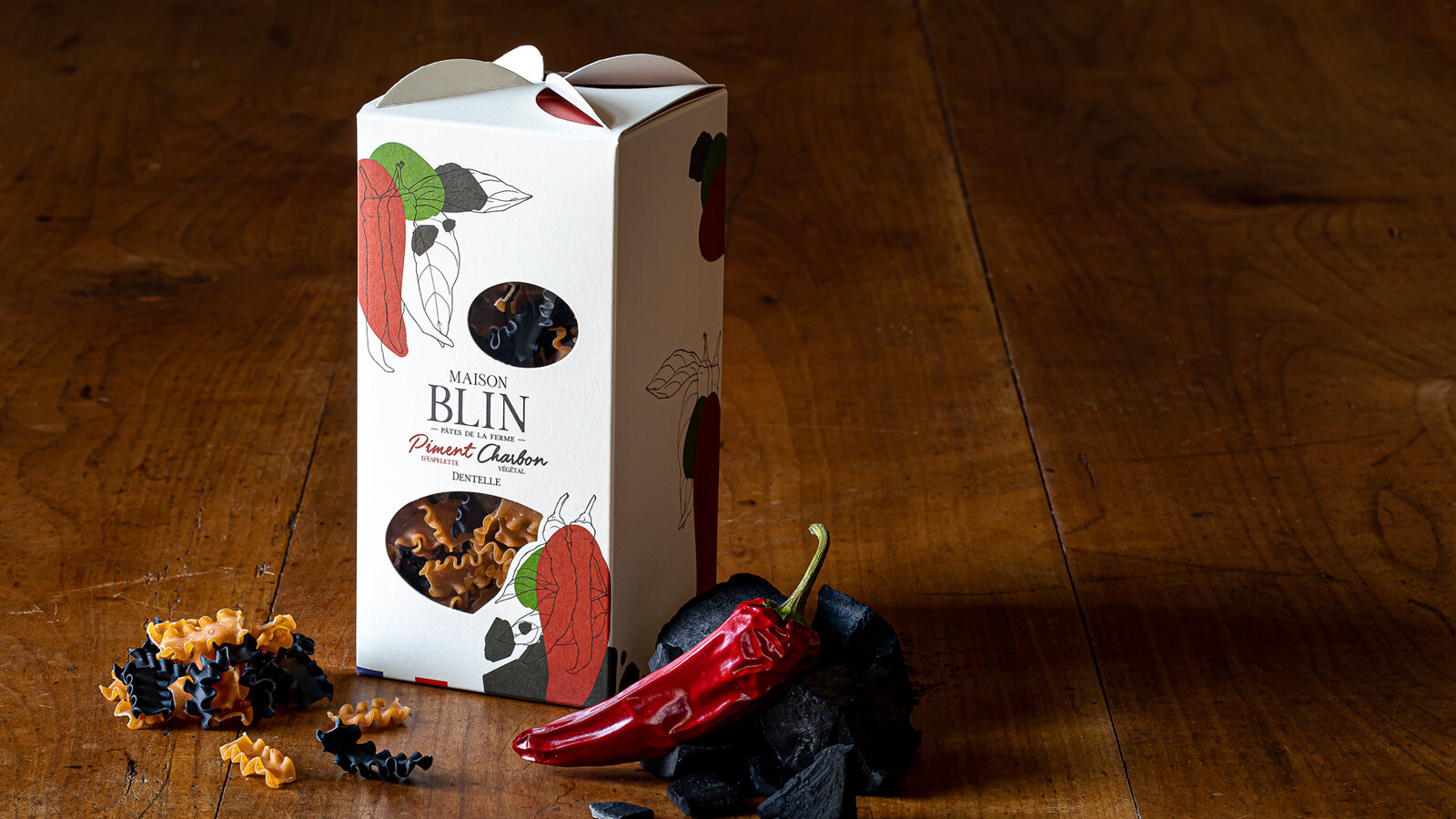
Sébastien Blin asked the agency to develop a packaging concept that stands out from current trends by highlighting the traditional and innovative aspects of his products. He has just created his brand of flavoured pasta made in Beauce, France. His ambition is to sell his products through all the premium grocery stores in Paris, in a spirit of short local marketing circuits, since his farm is located a mere 50 km from the capital.

Brand name creation. We have opted for an authentic name, both traditional and modern, which uses the client’s last name. The addition of the word “Maison” reflects know-how and reliability, and does not limit the range to pasta.

While creating the packaging, we were looking for something simple, elegant and easy to identify, which stands well apart from the competition with a signed folded part on the top of the package that evokes windmill sails, since the wheat is milled in a nearby mill. The product can be seen through windows that are shaped to convey identity and blend in with the graphics.

For the graphics that identify Maison Blin, we continued with the combination of modernity and tradition, drawing inspiration from the simple recipes of the products. The drawing of one of the ingredients in an engraving style and graphic spots of colour to symbolise the other ingredient come together to express the concept of the brand: dual taste. 

The result is a clean design and a product that can be understood at first glance.

This graphics style will be used on all the advertising material of the brand.

All the images were taken directly in the Maison Blin farm, in natural light to stress the genuine and natural side of the brand.

Which ones would you choose?
www.maisonblin.fr

Assignments:
Brand strategy
Naming
Brand identity
Packaging design
Iconography
Web design

APERITIF KITS FROM LA MAISON KYRËGAL


GLOBAL DESIGN

APERITIF KITS combining spreads and crackers with a tasting ritual for food lovers.

The aim was to develop packaging with a strong identity that would reflect an original and innovative concept of ready-to-eat foods served with an aperitif.

A shape and packaging that clearly sets apart the product by making the kit unique as well as practical, attractive and almost playful. Aimed at a wide audience and to be taken away wherever you want, at home, with family or friends or on an adventure like a picnic in the wild, etc. Gift packaging to make the product a real treat-yourself buy which encourages you to share it and get together with others.

Each APERITIF KIT includes complementary flavours based on cookies, a spread and a condiment. Products preserved in three glass containers accompanied by two wooden spatulas. Cardboard case covered with custom illustrations playing with three foodie openings, embellished with a practical handle to transport the product in perfect harmony with the transportable side of the box.

Our agency has also designed a tasting tray that elegantly carries the three festive foods that will go with the aperitif drinks. Creates a real moment of relaxation and simple culinary pleasures.

These boxes, distributed in wine shops and delicatessens, come in three traditional designs (fish, meat and vegetables) symbolising the local region. Three motifs, three indulgent illustrations and “good mood” colour coding to clearly present each design and each complementary flavour.

Separate kits with overall coherence, making you want to discover all the “symphonies of flavours”.

Assignments:
Brand identity
Packaging design
Product design

COMTESSE DU BARRY - CHRISTMAS 2019


GLOBAL DESIGN

As every year, for the festivities, the Maison Comtesse du Barry has entrusted the 2S agency with the creation of its Christmas range, from the box set to the creation of the product catalogue, up to merchandising. A delicious collection that invites you to enter its exquisite world...

Creation of a box set shape, dressed with a custom-made illustration on the Christmas theme. Search for a colourful, festive and refined universe throughout the range.

Creation of a graphic and gourmet Advent calendar, representing a cityscape with 24 small bright windows to open, each containing a selection of chocolates.

Creation of the business gift catalogue, in accordance with the theme developed on the box sets.

Design of the store window, the graphic design worked in volume becomes a glorifyer display in gold metal and with touches of red.

Assignments:
Packaging design Edition - Creation of the product catalogue Store window design

SHISEIDO BOX SET- FUTURE SOLUTION LX LIMITED EDITION - PACKAGING DESIGN


PACKAGING DESIGN

Creation of a reusable premium box set to celebrate the 10th anniversary of the Future Solution range.

The box set contains 3 creations inspired by the culture and botanical myths of Japan, designed to restore the complexion to its original radiance overnight.

The packaging had to convey the premium positioning of the range and its strong link to its Japanese origins. We have chosen to dress it with a full moon in negative on the sheath and in positive on the case by adding a touch of gold glitter in hot stamping. The deep matte black contrast and the glitter effect visually and to the touch, complete the sensory experience of the skin care ritual from the first contact.

This box has been designed according to the delicate art of Japanese packaging, the Tsutsumu, with noble materials and a luxurious festive touch evoking the 10th anniversary of the range.

Assignment :
Packaging design

BONJOUR BRAND IN COLLABORATION WITH T-MALL - MOONCAKE BOX SET - PACKAGING DESIGN


PACKAGING DESIGN

The idea of this box set was to reach the new middle class of 200 million young Chinese consumers and provide them with surprise and innovation with our French touch.

A targeted communication strategy with the support of the Alibaba group to optimize traffic and attract the young Chinese generation. T-Mall and Bonjour Brand, commissioned the agency to create box sets for the moon festival. The agency has gone against new borders by collaborating on new products co-created by France and China.

Celebrated in mid-autumn, the Moon Festival is one of China's most important celebrations. Symbol of unity and gathering, it is also on this occasion that the moon cakes are offered. It was important in the design of the box set that it could be worn both during a parade organized by T-mall and by the consumer once the cakes had been tasted. This is why we have decided to give a new dimension to this traditional celebration by creating a box set that is modern, chic and luxurious.

To highlight this festive day, we have made the moon our muse to carry our box set. It is wire-shaped, lightweight and rigid at the same time, its golden metal design reveals the strong identity of this creation before revealing its content in an unexpected way. Inspired by the greatest Parisian Haute Couture fashion shows, this box set can be worn at arm's length to give its owner a determined and modern look. The leather finish contrasts with the modern graphics of the box set and offers it the attributes of a "luxury" accessory, targeting a young audience.

Assignments:
Packaging design