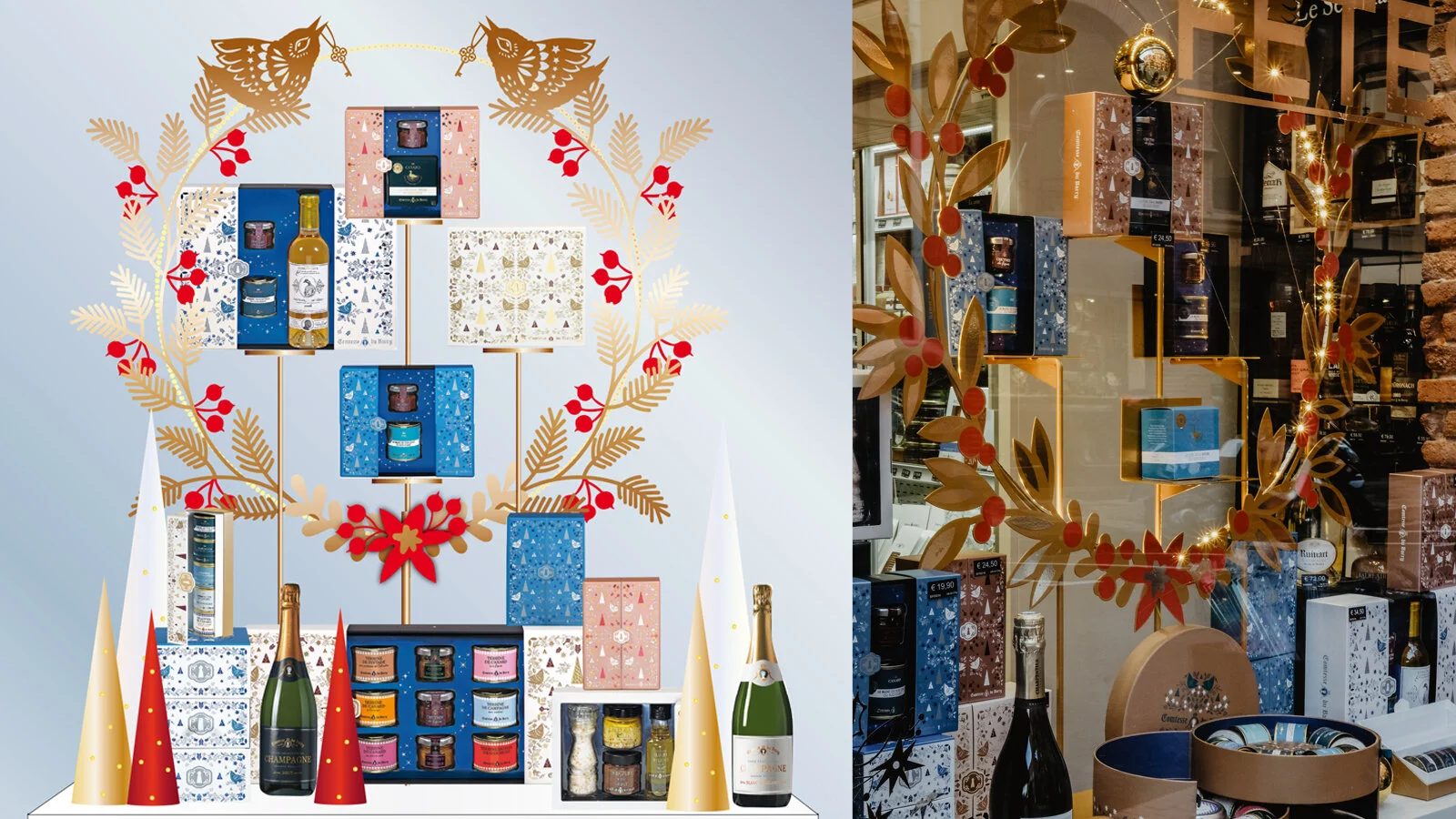
COMTESSE DU BARRY - CHRISTMAS 2020
/


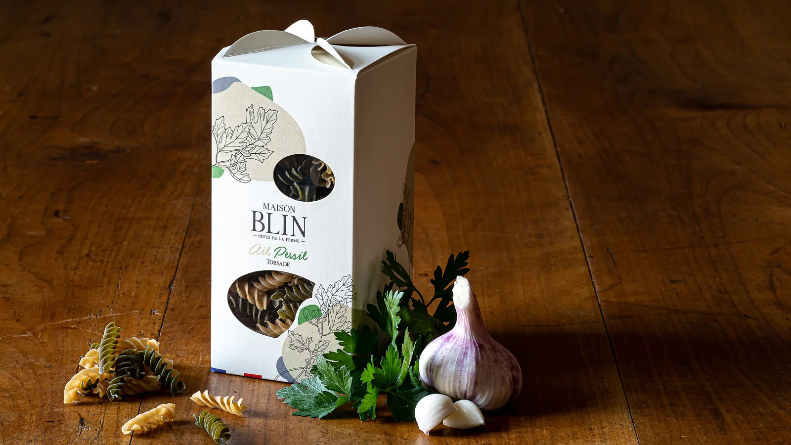
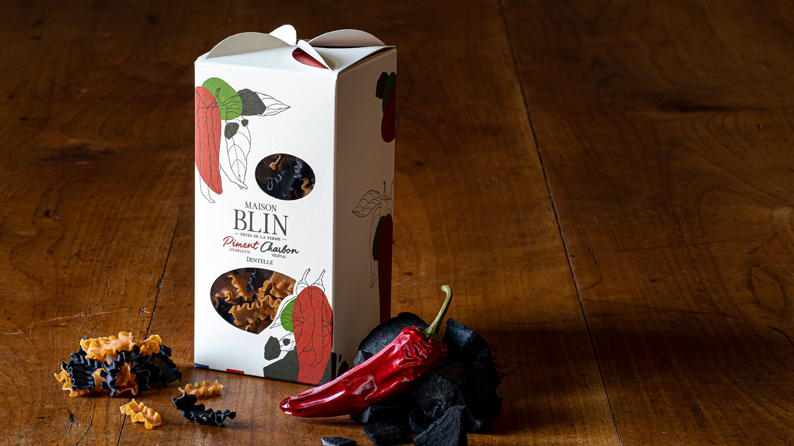
DESIGN PACKAGING
A gourmet tour in an enchanted forest.
As every year, we have been charged with the entire creation of the Christmas range of La Comtesse Du Barry.
Pour 2020, we designed a magical world in which good food and creativity combine to express the best of French produce in its compositions.
An enchanting range of forest-themed gifts that carry the eater off on a festive journey. It is an invitation to escape to the enchanted forest.
Unusual advent calendars, enchanting receptacles, refined specialties from the land and the sea... each product undergoes stringent selection and is painstakingly worked in an ode to Epicureanism that varies pleasures and delights the palate.
Sweet calendar: every tree hides a gourmet chocolate to make the wait up to Christmas as delicious as possible. The calendar stands as a decoration, and a new tree emerges every day to create an enchanted forest.
Savory calendar: Advent calendars are traditionally thought of as something you open every morning. But why not, in a slight twist, leave the surprise for the evening hour?
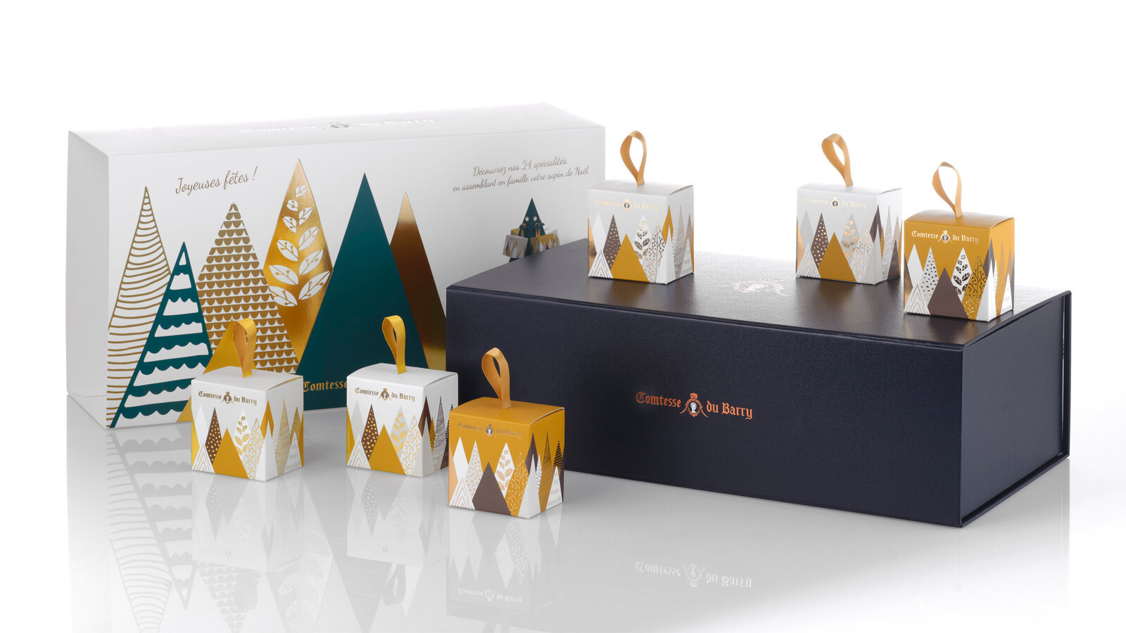
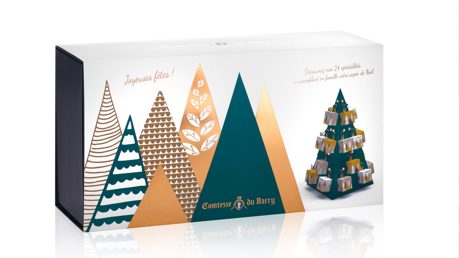
This Advent calendar takes the form of a 48 cm high cardboard Christmas tree to assemble. It will blend perfectly with your Christmas decorations. 24days of waiting, with 24 little packages to open and discover the best specialties from France.
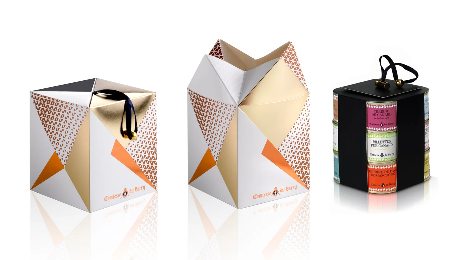
Foie gras, porcini mushrooms and truffles gift box: a numbered limited edition containing the sweetness of foie gras, the delicate aroma of porcini mushrooms and the power of truffles in a pyramid-shaped box with a contemporary iridescent forest decoration.
Assignments:
Packaging design