
GLOBAL DESIGN
Maison Vendôme draws its essence from the elegance of the French Renaissance.
Its original inspiration stems from the legend of Diane de Poitiers, favorite of King Henri II, a symbol of absolute beauty and a way of life where refinement and mystery intertwine.
According to the legend, Diane would ritualistically immerse her diamond jewelry into her wine before drinking it, convinced that the purity of the gemstone—symbol of immortality and perfection—would infuse the liquid, granting it an almost mystical aura.
For her, this wine became an elixir of beauty and light, a secret of eternity that sustained her radiance and youth. It is said that she passed away at sixty-six with the appearance of a young woman.
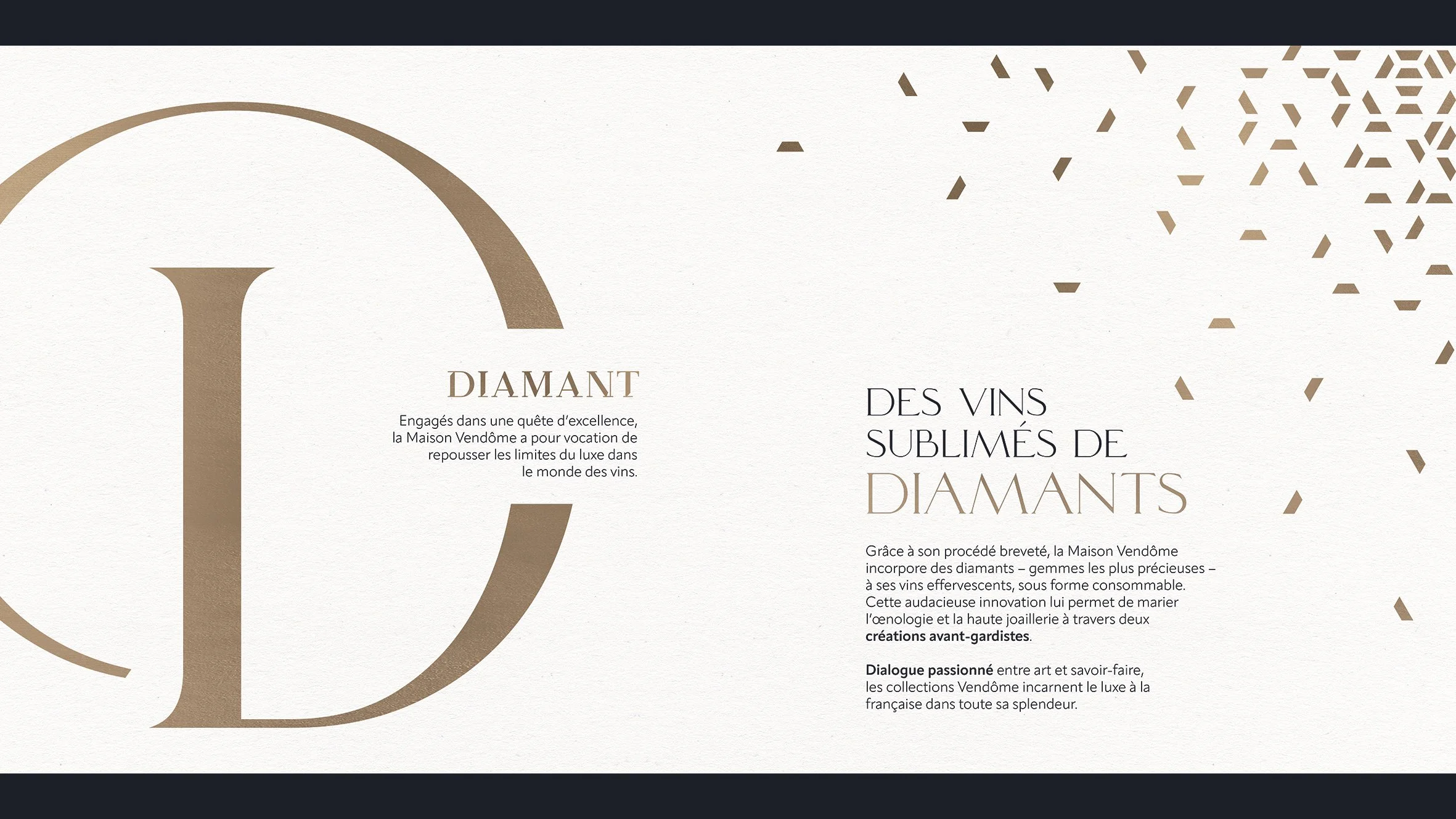
Today, Maison Vendôme reinterprets this myth through a unique innovation, merging oenology with high jewelry.
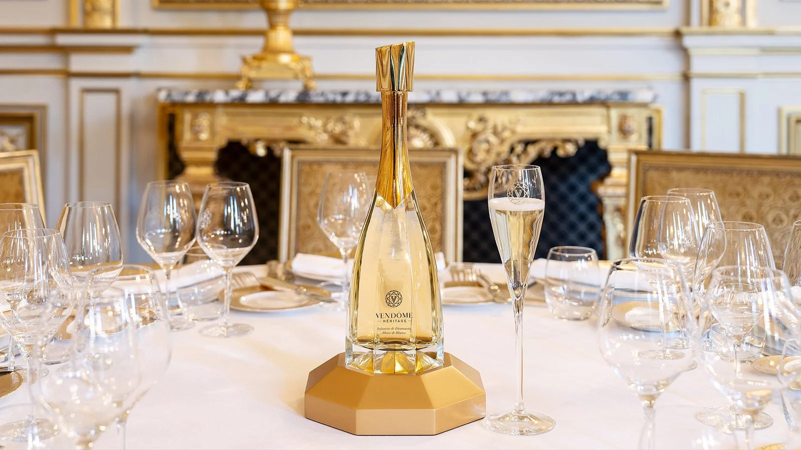
Through a patented and certified process, the House incorporates natural diamonds, in a consumable form, into its sparkling wines. The result is an exceptional cuvée, made exclusively from Chardonnay and produced in highly limited quantities.
This rare combination transforms the very structure of the wine: diamonds interact with CO₂ to create an effervescence of unparalleled purity—finer, brighter, almost crystalline.
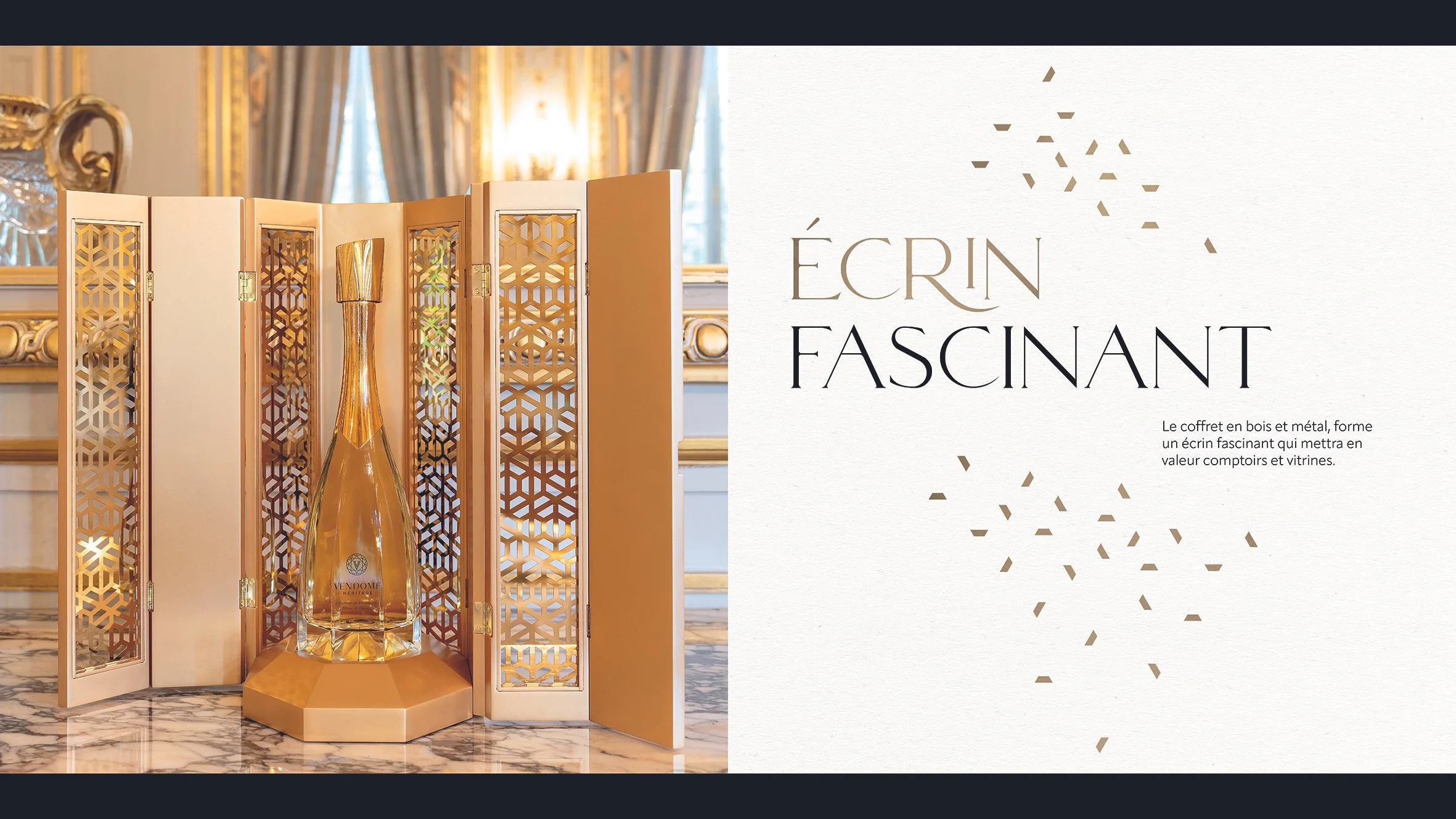
Our creation for Vendôme Héritage expresses this boldness through a glass design conceived as a true piece of jewelry.
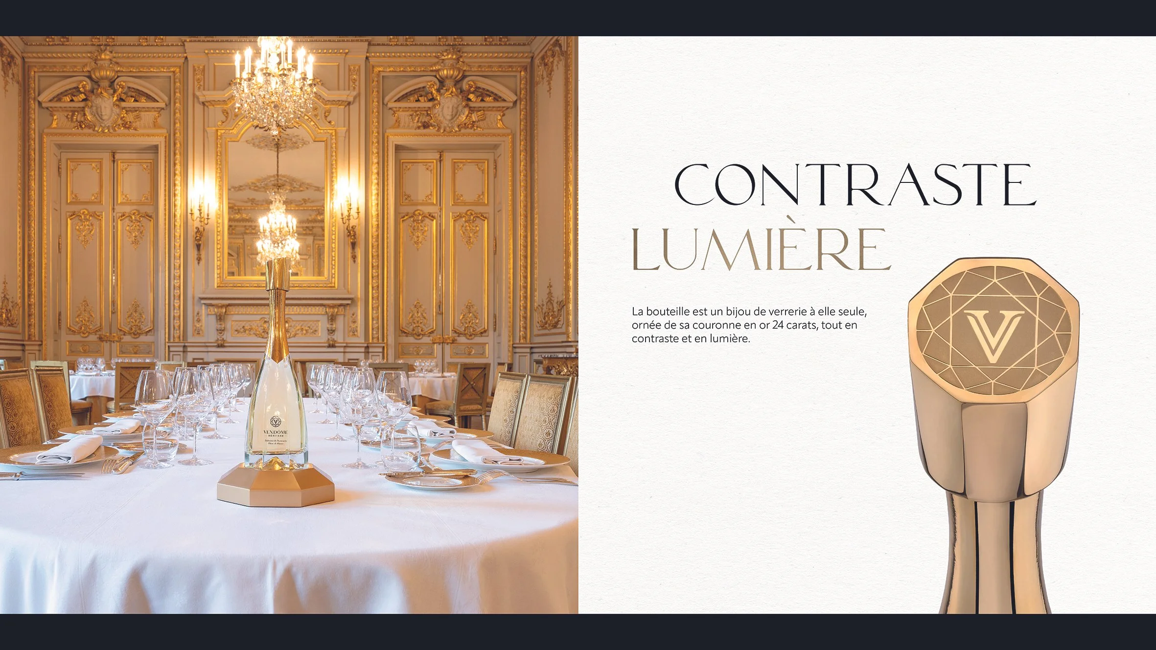
The base of the bottle, cut like a diamond, reveals the color of the wine—alive and shifting with the light.
The hexagonal shape of the bottle engages in dialogue with the sculpted diamond base, each structuring the other within a shared language of lines and light.
A tapered gold lacquering, flowing from the neck to the base, extends the verticality of the form and enhances the perception of light—like a stream of gold connecting the closure to the glass body.
In place of a traditional foil capsule, we designed a jewel-like closure mounted directly onto the wirehood, giving the bottle a presence that is both precious and contemporary.
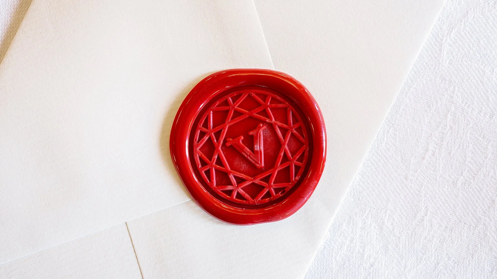
The logo, inspired by the geometry of a diamond, generates a signature pattern that runs throughout the visual identity. It is echoed on the prestige box, whose die-cut structure reveals the bottle through a subtle interplay of light.
Through its slender silhouette and tapered gold finish, the bottle evokes a jewel sculpted in light.
A design in which every detail expresses the spirit of Maison Vendôme: precision, rarity, brilliance, and French elegance.
Scope of Work:
Brand Strategy
Glass Design
Visual Identity
Packaging Design
Premium Gift Box
Brand Book
Iconography
CHAMPAGNE JACQUART - SIGNATURE RANGE
PACKAGING DESIGN
In 1964, a visionary collective of passionate winegrowers came together in Reims to found Maison Jacquart, driven by the desire to offer a champagne that was modern, generous, and free-spirited. Over the decades, the House has established itself as a defining figure in the mosaic of Champagne, embodying a unique collaborative spirit and an unwavering commitment to quality.
Today, Champagne Jacquart’s Signature cuvée reveals the full finesse of its Chardonnay — expressing freshness, elegance, and balance.
What sets Jacquart apart is its seamless blend of innovation and craftsmanship, radiating a luminous style.
Our creation for Champagne Jacquart focuses on the very essence of the word “Signature” — a visual seal that embodies the House’s elegance and modernity.
This new range highlights the refinement and precision of the blends through a radiant motif, conceived as a contemporary engraving that reflects both strength and delicacy in every cuvée.
The interplay of embossed textures and metallic tones — silver, gold, and rosé — enhances the identity of each reference while reinforcing the unity of the range.
The House's emblem, subtly brought to the fore, serves as a reminder of the boldness and high standards that have defined Jacquart since its creation.
With this new “Signature”, the House reaffirms its positioning: a modern, luminous, accessible, and refined champagne, designed to elevate life’s most beautiful celebrations.
Assignments:
Range Identity
Primary packaging design
LONGUETEAU - EXCELLENCE RHUM CUVEE

PACKAGING DESIGN
We had the honour of designing the packaging for this unique white rum cuvée, born from a collaboration between Maison Excellence Rhum and the Longueteau distillery.
A true product of exceptional craftsmanship, this white rum originates from Plot No. 9, made from a meticulous selection of red sugarcane (R-579), harvested and distilled in March 2022.
For this cuvée's design, we created an illustration that merges two worlds:
On one side, the iconic monuments of Paris, symbols of elegance and heritage that reflect the identity of Excellence Rhum, a flagship boutique in Paris’ 6th arrondissement.
On the other, the Creole architecture of traditional Guadeloupean homes, paying tribute to the roots of the Longueteau distillery.
These two worlds are woven together into a refined and sophisticated line art fresco, where each architectural element blends seamlessly with the others.
The result is a unique and coherent visual landscape — halfway between Paris and Guadeloupe — that elevates the identity of this cuvée and offers a visual experience honouring the richness of both cultures.
When the packaging is placed side by side, the illustration extends into a complete fresco, visually uniting the timeless elegance of Paris with the authentic spirit of Guadeloupe. Two identities merging into one singular vision.
Assignments :
Packaging design
Iconography
ARRANGE BLARD - BOURBON POINTU COFFEE
Limited Edition – Bourbon Pointu Coffee
A creation inspired by the treasures of La Réunion.
We had the pleasure of assisting Maison Arrangé Blard in crafting its limited edition featuring Bourbon Pointu coffee, drawing inspiration from the family’s heritage and the rich cultural landscape of La Réunion.
Bourbon Pointu, a rare and highly sought-after coffee variety known for its exquisite notes, is the heart of this new creation. Considered one of the island’s most prized treasures, this prestigious coffee is grown at high altitudes on the slopes of Piton des Neiges. It inspired us to develop an immersive and sensory design.
Inside the box, an illusion of immersion is created, where the bottle appears to be surrounded by coffee beans, evoking the sensory fusion of rum and Bourbon Pointu’s aromas. This design highlights the value and richness of the product, while the box’s edge introduces this limited edition as the first in a forthcoming series.
Every detail has been carefully considered. The carafe is adorned with a custom-designed motif inspired by the Maison’s logo, reinforcing the brand’s identity while adding a touch of elegance to the bottle’s collar.
A unique series, produced in just 974 copies, celebrating the core essence of La Réunion.
Assignments:
Packaging design
Visual identity
Production follow-up


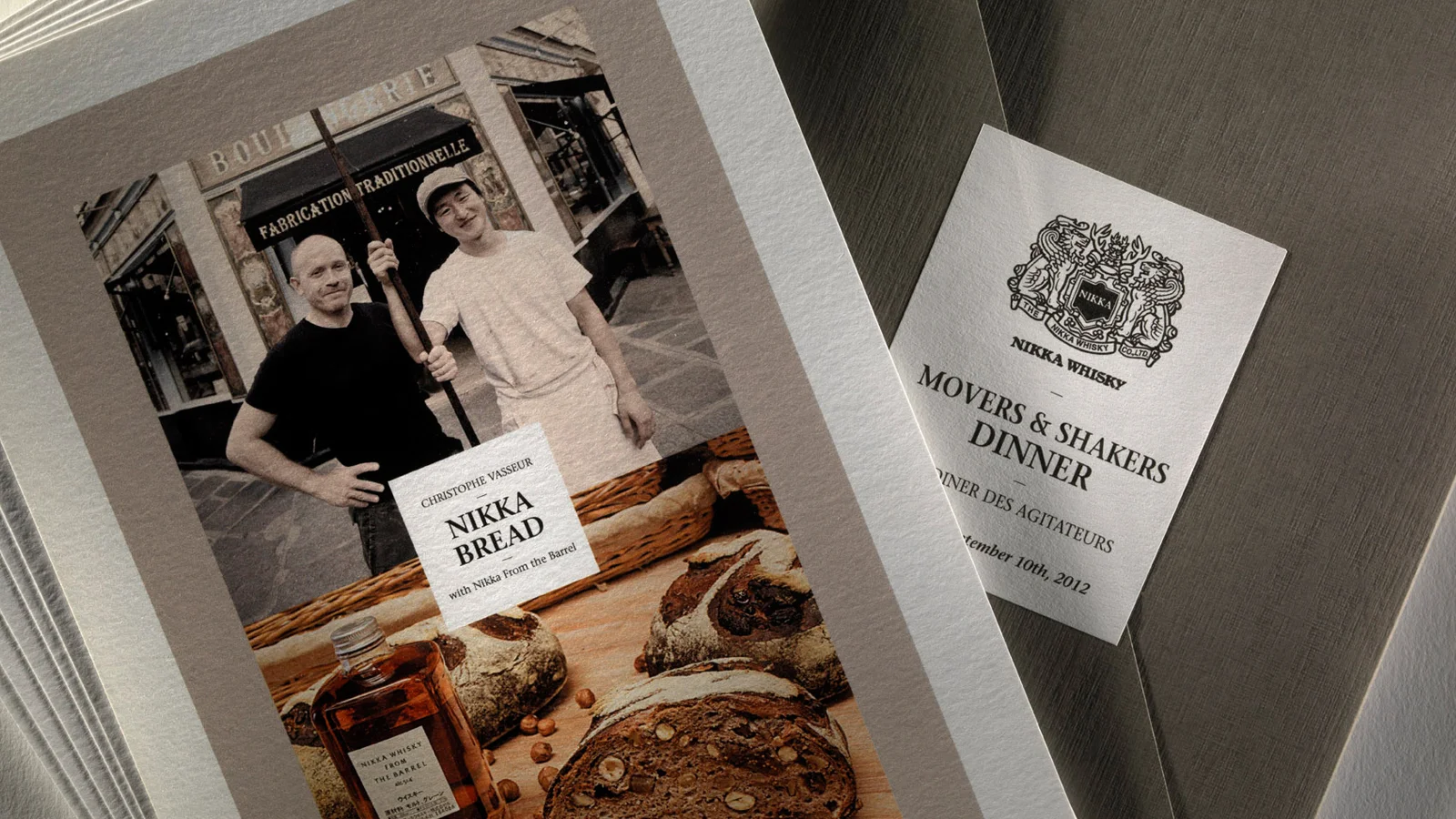
PACKAGING DESIGN
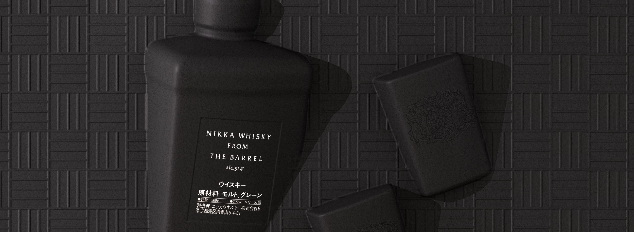
To celebrate its 90th anniversary, Nikka Whisky entrusted us with the creation of a new edition of the 'Nikka From the Barrel' gift box, renowned for its rich and complex aromatic and flavor profile.
We chose to reinvent the experience of this iconic whisky by harnessing the full potential of molded cellulose, creating a bold new gift box. By breaking away from traditional conventions, we opted for an unconventional and dynamic presentation of the products, perfectly aligned with the avant-garde and timeless spirit of Nikka. This gift box fully embodies the distinctive and unique character of this iconic whisky.
Elegant and understated in its black casing, it seamlessly integrates into the Nikka From the Barrel range, crafted from 100% recycled and natural materials, made up of 70% sugarcane derivatives and 30% bamboo.
Available at La Maison du Whisky.
Assignments :
Packaging design
Technical plan
Production monitoring
RUM NAVI - FRENCH RUM


DESIGN PACKAGING
NAVI rum draws on the art of blending four iconic terroirs: Barbados, Jamaica, Martinique, and Guadeloupe, each contributing its unique aromatic character. A smooth and accessible blended rum, perfect for enhancing the complexity of cocktail flavors.
The design is inspired by the stars that once guided navigators on their journeys. The constellations, essential to sailors crossing the Atlantic, symbolize the maritime heritage and the prosperity of the rum trade.
This packaging pays tribute not only to the historic connection between sky and ocean but also to the spirit of travel and exploration, inviting us to rediscover authentic flavors.
Two blends embody the soul of NAVI:
Cassiopée: A delicate blend of barrel-aged rums, combining finesse and indulgence, composed of three rums from Barbados, Jamaica, and Martinique.
Andromède: A more premium version, based on the same blend but with different proportions, enriched with an aged Guadeloupean rum, offering greater depth and complexity.
The target audience for these new gems: lovers of exotic spirits and mixology.
Assignments:
Brand Identity
Packaging Design
NOBLESSE - ARTISANAL AND ORGANIC LIQUOR RANGE
GLOBAL DESIGN
In 1882, Michel Noblesse founded a distillery in Hasselt, Belgium, becoming famous for his genever "Ouwe Karel." Unfortunately, after World War II, the company had to close its doors in 1950, but the story didn't end there.
In 2017, 67 years later, Guillaume and Edouard Noblesse, his descendants, reignited the family legacy. They relaunched the brand, respecting artisanal and organic traditions, determined to preserve the brand's heritage, quality, and authenticity.
What sets Noblesse apart is its authentic family history dating back to 1882.
The agency will draw from this rich history to create a strong and coherent brand identity.
The concept aims to honor the Noblesse ancestors by reinterpreting their old recipes with a modern touch. The idea is to create a collection of products reminiscent of a recipe book, with each product representing a chapter of this story.
- Use of rotating labels to personalize the spine per product, while maintaining a consistent range identity.
- Selection of a straight bottle to resemble the shape of a book.
- Use of a common typography and specific colors for each product range (chocolate, coffee, etc.).
Visual identity:
- Creation of a new visual identity inspired by the past but with a modern treatment.
- Use of historical elements like the crown, eagles, and the iconic date of 1882.
The project aims to create a unique and distinct brand identity by leveraging the rich and authentic history of the Noblesse family.
Assignments:
Global design
Brand concept
Brand identity
Packaging design
REMI LANDIER - COGNAC IDENTITY
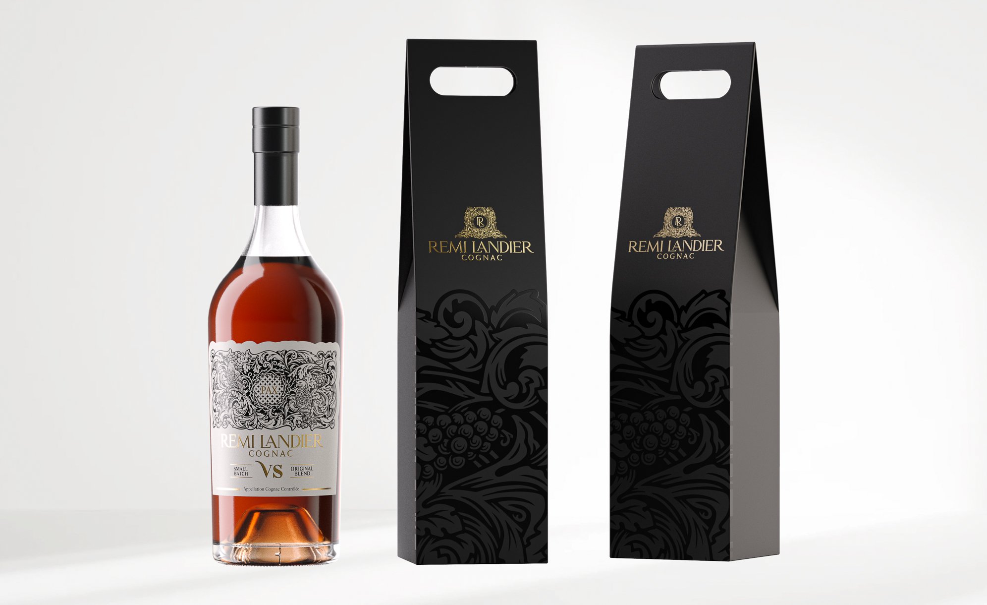
PACKAGING DESIGN
5 GENERATIONS
OVER 250 YEARS OF HERITAGE
Rooted in the unique terroir of Fins Bois, cherished by the Benedictine monks of the Abbaye Royale de Bassac for over 250 years, Rémi Landier is a family-run cognac house established in 1890 on these exceptional lands in the Cognac region.
Our creation focuses on the symbol of "PAX," a Benedictine emblem meaning "PEACE." This symbol reflects a monastic tradition linked to the Abbaye Royale de Bassac, built around the year 1000. The monks established a farm there at the beginning of the 18th century, producing cognac in the heart of Fins Bois. This farm was acquired by Rémi Landier in the mid-20th century.
By incorporating this emblem on their labels, the Rémi Landier house honors a unique cultural heritage, while emphasizing the harmony and tranquility that characterize their cognacs.
Assignments:
Graphic identity
Illustration
Primary and secondary packaging design
THROUGH THE GRAPEVINE - COGNAC IDENTITY
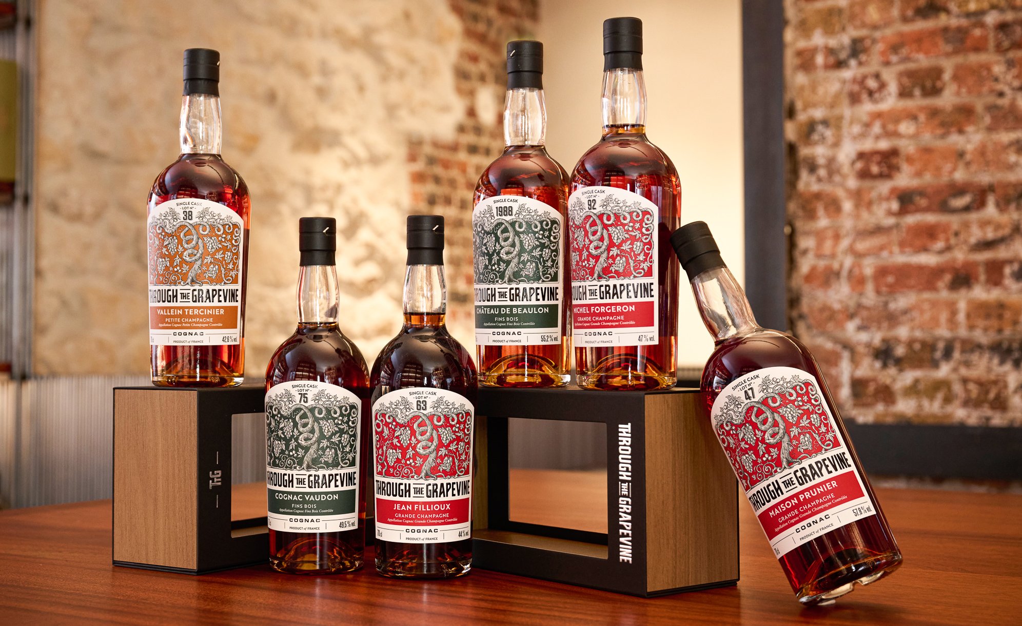
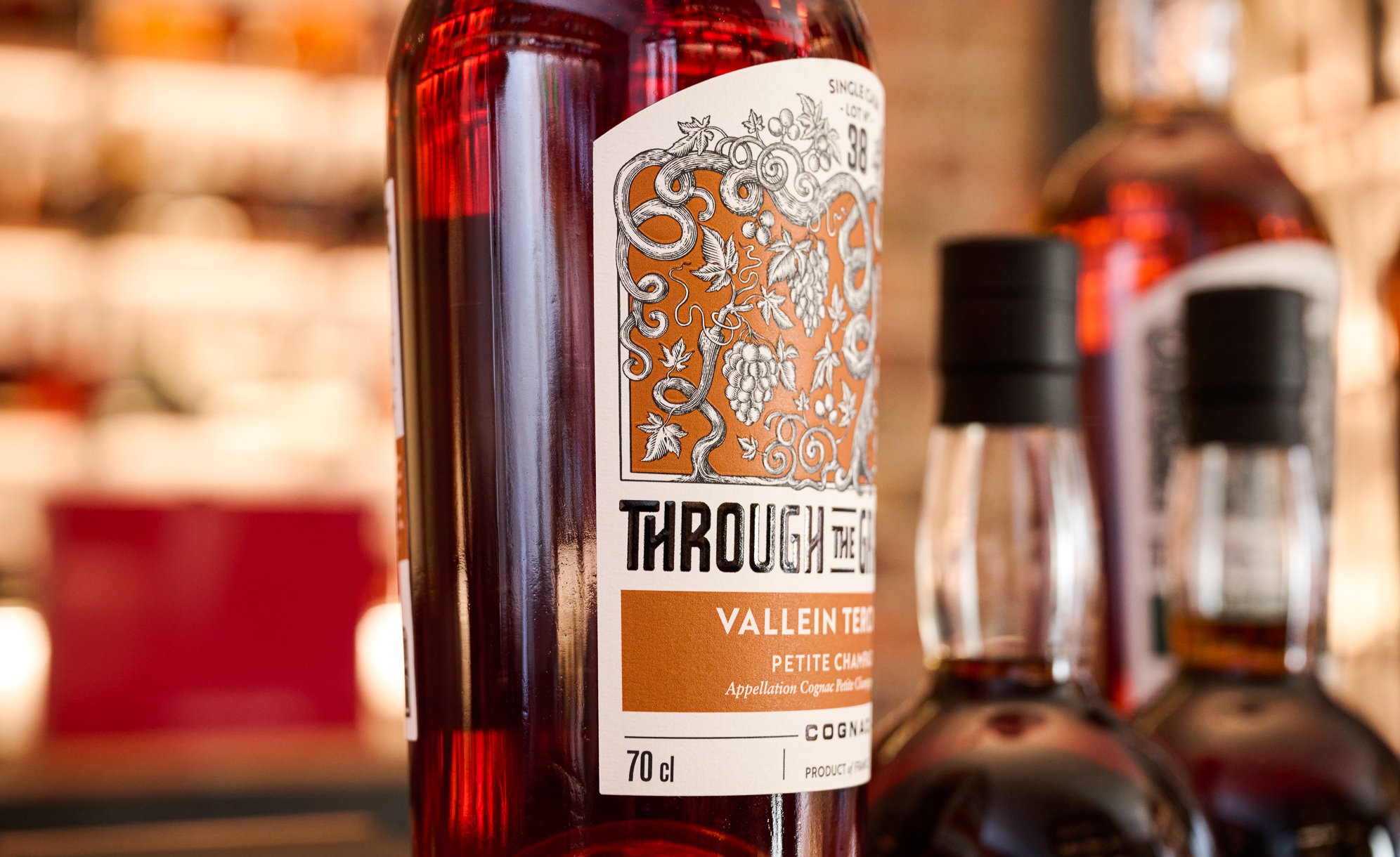


PACKAGING DESIGN
Through the Grapevine (TTG) is a range of independently bottled cognacs, designed to highlight the talent of small producers. Since its launch in 2016, this collection has celebrated the Cognac terroir with unique vintages, sourced from single casks or small batches from exceptional estates. By offering single-cru and primarily cask-strength cognacs, TTG seeks to reveal the authenticity of the region's traditional craftsmanship.
We were tasked with redesigning the identity of the TTG range, with a particular focus on creating a new logo and developing custom illustrations. The use of varied hues depending on the different houses, the meticulous work of fine engraving illustrations, and the attention to print finishing give the range a distinctive authenticity with a touch of modernity.
Assignments:
Graphic identity
Illustration
Primary and secondary packaging design
MINUTY - MOBILE BAR DESIGN


FURNITURE DESIGN
The creation of the institutional Minuty mobile bar combines minimalist and functional design. It elegantly showcases products while keeping other items chilled in the ice bin.
At the back of the bar, storage shelves are included for optimal organization. It is designed on wheels to facilitate easy movement.
The choice of materials is understated, in line with the brand's code, featuring a white base accented with a touch of brushed aluminum.
Assignment :
Furniture Design
NIKKA WHISKY - CELLULOSE SET

PACKAGING DESIGN
Following the success of the Nikka From the Barrel Silhouette launched last year, we are pleased to present a new version: the silhouette box, which includes two glasses and a pourer. This unique edition follows an eco-responsible approach, made from entirely natural materials and from 100% recycled materials (70% sugarcane derivatives and 30% bamboo).
Assignment:
Packaging Design
ERIC BORDELET - CALVADOS BOX


PACKAGING DESIGN
Eric Bordelet has lived a full life before joining the elite world of cider. He spent many years as a sommelier at L'Arpège, alongside renowned figures in the wine industry.
His passion for wines and spirits led him to take the leap and retrain as a "cider maker." He settled at the Château de Hauteville, located in the Mayenne department, south of Normandy, his family's region of origin.
Eric Bordelet contacted our agency to highlight his exceptional batches, among which is a Calvados hors d'âge that has patiently aged for 25 long years in a barrel.
To showcase these precious creations, we designed a box that reflects the iconic features of his bottles. Dressed in an elegant mix of materials, black grained leather and copper were chosen for the apple version, while the pear version features a brass hue. This combination of materials, with both matte and shiny finishes, was designed to highlight the nobility of the contents and the elegant, characteristic curve of the box.
For the pear box, we chose to reverse the curve, thus giving each edition its own identity. Both boxes, although bearing the same brand signature, each embody their own personality, reflecting the diversity of the gustatory treasures contained in Eric Bordelet's creations.
Assignement:
Packaging Design
CASTAN DISTILLERY - VILANOVA WHISKY


GLOBAL DESIGN
An artisan distiller for three generations in Occitanie, with skills passed down from father to son.
The story of Distillerie Castan is closely tied to the family history. It all started with the grandfather, Gilbert, followed by the father, and today, the son continues the tradition. At the heart of this story is an old red copper still dating back to 1929, which accompanied grandfather Gilbert on his travels throughout the Tarn region, producing smooth and fine spirits.
Produced by Sébastian Castan, Vilanova is a French whisky from the third generation of an artisan distillery. The hallmark of the distillery is producing only single cask whiskies with unique characteristics. Crafted artisanally, Vilanova is an excellent French whisky.
We were tasked to redesign the brand identity of Distillerie Castan, as well as its Vilanova whisky range.
Identity of Distillerie Castan:
We created a crest representing all facets of the house activities. The shape of the crest is inspired by the coat of arms of the Occitanie region.
Highlighting barley cultivation: the farm and distillery. The barley is grown by the Castan family on their ancestral lands.
Water sourcing: the distillery draws its water from a depth of 110 meters, sourced from a natural spring that gives Vilanova whisky its unique character and taste.
Aging: The Vilanova range offers different aging types: in old white wine barrels and French oak, as well as in old red wine barrels and French oak.
Identity and Packaging Design for the Vilanova Whisky Range:
To highlight the strengths of this range, we chose black and white photographs that tell the brand's story, combined with colorful and modern graphics representing the new generation.
Berbie: The first Single Malt distilled by Distillerie Castan (photo of the barley cultivated by the family).
Gost: A unique edition aged in old Bourbon barrels (photo of the barrel).
Roja: The heart of this story lies in an old red copper still (photo of the still).
Terrocita: Refers to the land of the region (photo of the region).
Argile: Reminding of the clay soil of Occitanie and the use of spring water (photo of the spring).
Gilbert: Collection #1 is the result of a blend of historic barrels, carefully selected among the finest signatures, aged in the distillery's cellars. A tribute to the founder of the distillery, Gilbert Castan.
https://distillerie-castan.com/
Assignments :
Brand Identity
Packaging design
MINUTY – ICE BUCKET


PRODUCT DESIGN - BUCKET AND BASIN
Minuty, emblematic wines in Provence for over 80 years with gourmet aromas. A pale rosé wine with crystalline reflections.
The vineyard of Château Minuty is located on the hillsides of the villages of Gassin and Ramatuelle, overlooking the Gulf of Saint-Tropez. It benefits from a temperate maritime climate and highlights southern grape varieties.
Minuty approached us to design their signature bucket. A design that is both aesthetic and functional, with modern, sleek, timeless lines reflecting the reminiscent of Minuty’s wines.
A minimalist design that aligns with the brand’s image by a simple curve reminiscent of the movement of a wave, a creation in motion playing on an infinite curve. When used, the bottle appears to be resting on the sand.
Bucket available in two sizes.
Assignments:
Product Design
Production Follow-up
KARUKERA - RUM IDENTITY


PACKAGING DESIGN
KARUKERA launched a new range of agricultural rum punches from Guadeloupe.
Passed down from generation to generation, the recipes of the Karukera house combine freshly cut tropical fruits, vanilla, and agricultural rum from Guadeloupe.
Three flavors:
Maracuja/Passion fruit, Mango/Passion fruit, and Victoria Pineapple.
A design that we wanted to illuminate with sunshine and good vibes, with custom illustrations created with real illustrative distinction, full of colors and modernity.
An ode to celebration and sharing that brings a breath of fresh air to the world of ready-to-drink punches.
A punch that will stand out on every table, at every party.
Assignments:
Packaging Design
Production Follow-up
MINUTY - 2/3 BOTTLE BOX


PACKAGING DESIGN
Château Minuty was restored as early as 1930 by Gabriel Farnet. He replanted the entire vineyard and elevated Château Minuty to its "Cru Classé de Côtes de Provence" designation in 1955.
Since 1990, it's been the third generation, Jean-Etienne and François Matton, who have taken over the management of this prestigious property. The wines of Château Minuty now bear a distinctly Provençal signature with the transition from Carignan and Ugni Blanc to Grenache and Rolle.
We created a triangular-shaped packaging, with a groundbreaking and minimalist design that reflects the brand.
The packaging is adaptable to all Minuty bottle formats. With the insert that can be reversed, a 3-bottle packaging can be transformed into a 2-bottle one depending on the customer's request.
Assignments:
Packaging Design
Production Follow-up
NIKKA WHISKY - LIMITED EDITION BOX


OBJECT DESIGN - PACKAGING DESIGN
Iconic Whisky from Nikka Whisky distillery, From The Barrel is an extremely complex blended whiskey created for its richness and full of flavors.
It’s daring. It’s challenging. It’s imposing.
The agency has created this second life packaging worthy of its image. The bottle is placed in a stainless steel case that transforms into an ice bucket and can be reused indefinitely.
This box was launched in a limited edition.
Assignments:
Object design
Packaging design
Graphic design
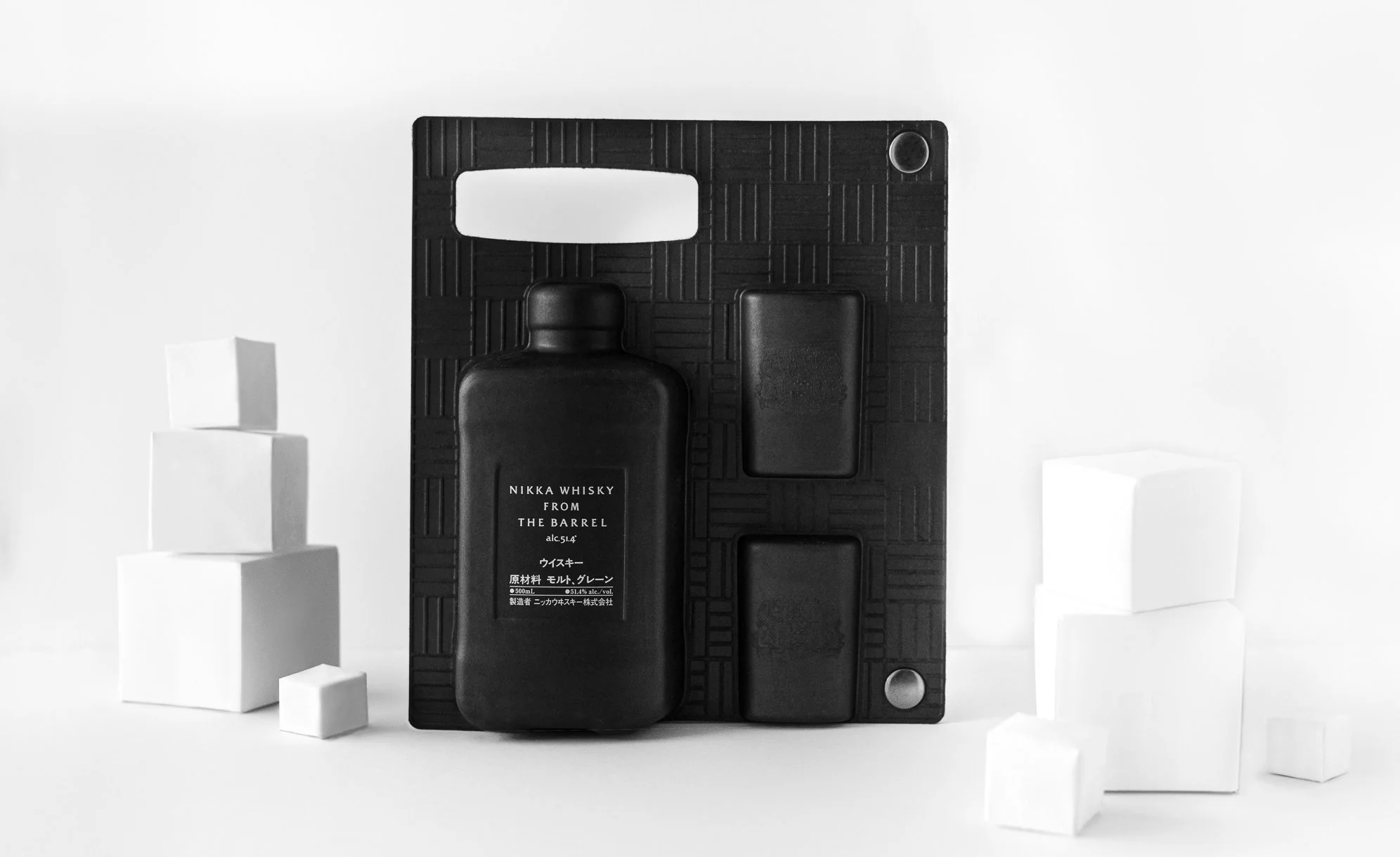
NIKKA WHISKY - SECOND SKIN BOX


PACKAGING DESIGN
The art of enhancing an iconic product.
Given this innovative material and the production process, molded cellulose seemed to us the ideal technique to highlight this iconic product of the Nikka brand.
The possibilities offered by this technology are vast. The mold itself dictates the purpose of the product. The packaging becomes the silhouette of the Nikka From The Barrel bottle.
In addition to the fully recyclable nature of the material, the challenge was to introduce design and aesthetics into this new technology.
With an unmistakable/unparalleled signature, this packaging elevates the originality of the blended whisky with its iconic design.
Available at “La Maison du Whisky”.
Assignments:
Material sourcing
Packaging design
Production Follow-up
HÉRIOSE - FRENCH WHISKY
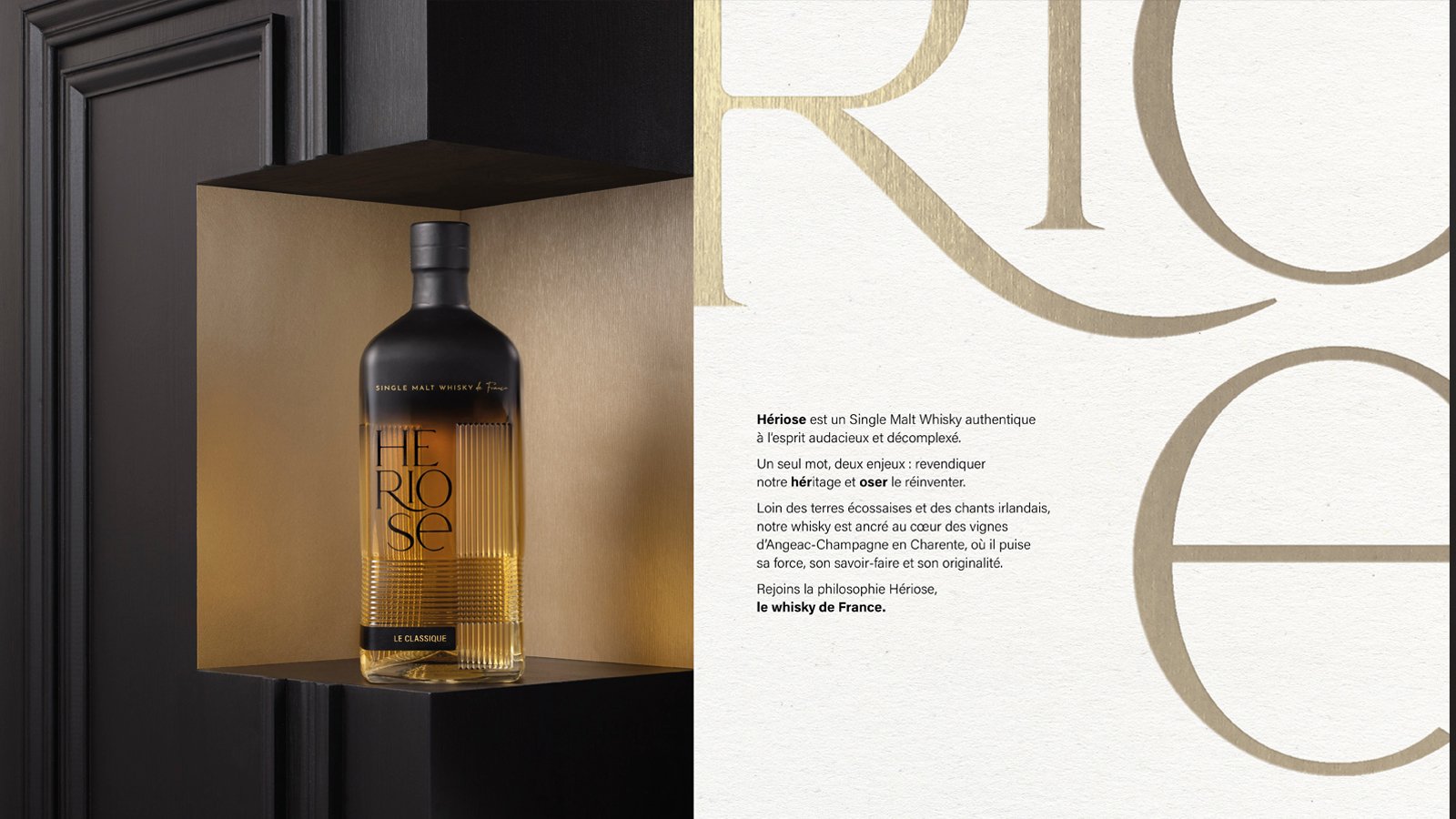
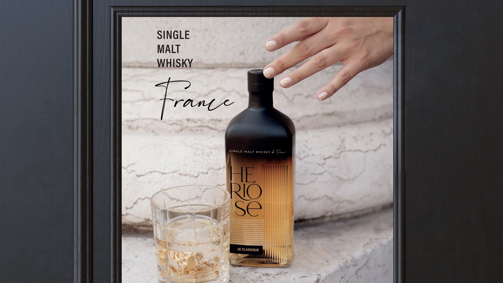
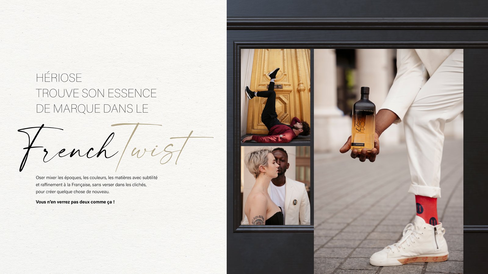
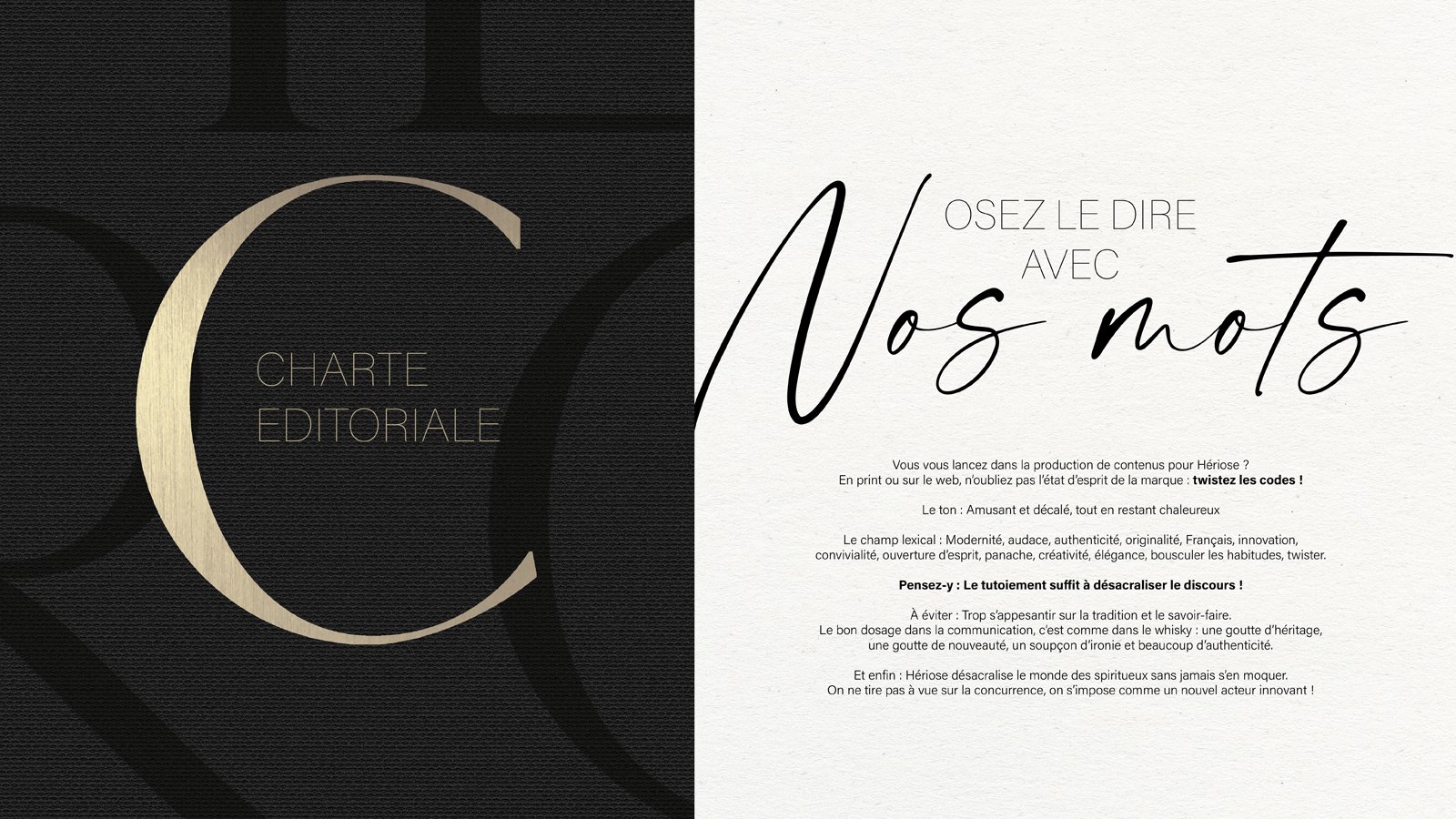


GLOBAL DESIGN
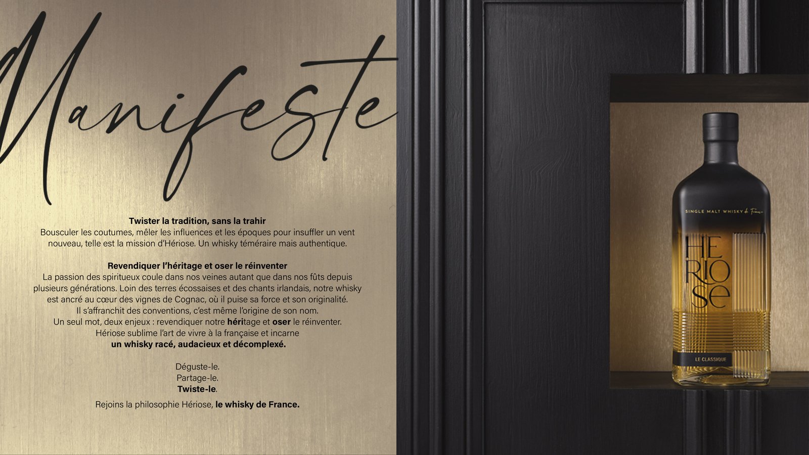
Maison Boinaud reached out to us with a vision to revolutionize the spirits industry, while honoring French traditions. This century-old House of Cognac has taken on the task of launching a French whisky distilled in a “charentais” pot still.
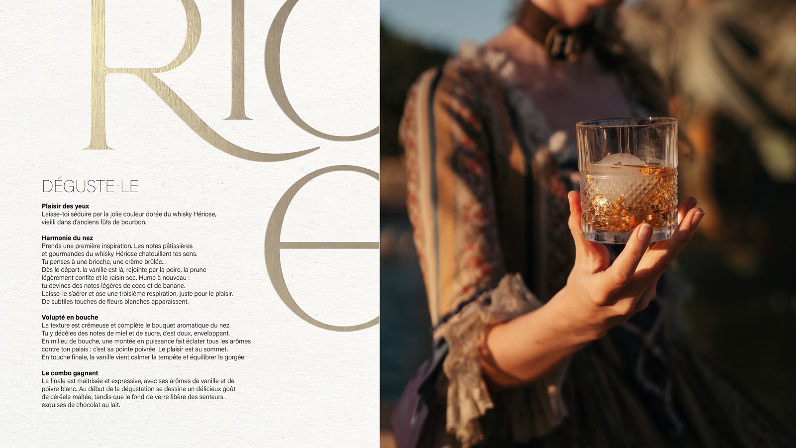
Our journey began with envisioning the universe of this new brand. One-of-a-kind whisky, connected to the “savoir-faire à la française'' but breaking conventions: an authentic Single Malt Whisky with a daring and uninhibited spirit.
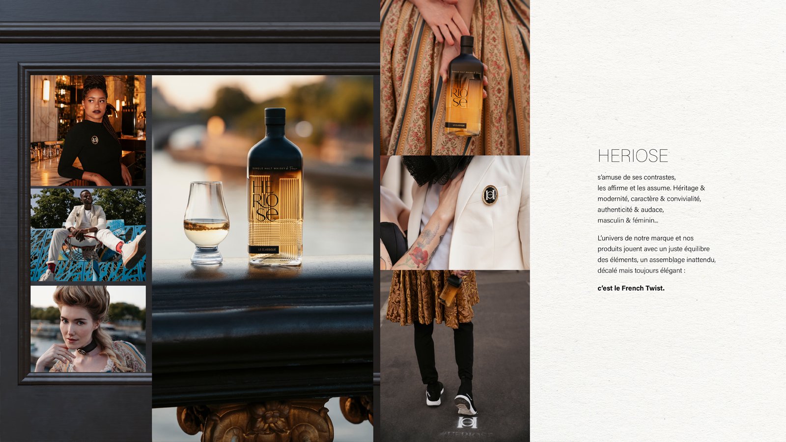
Our concept: the “French Twist”. Shaking up the heritage to bring out the unexpected.
The “French Twist” concept embodies audacity in pairings, styles, shapes, and materials, all executed with simplicity to convey a forward-thinking vision. The brand revels in its contrasts, embracing and proudly displaying them: heritage & modernity, character & conviviality, authenticity & boldness.
The brand’s universe is the perfect balance of all these elements, an unexpected fusion that is simultaneously unconventional and elegant.
The brand needed a name that would echo its essence, and thus Heriose was born. A single word with dual purpose: combining the words ‘héritage’ and ‘oser’ (to dare): promoting its heritage yet daring to reinvent it. Far from Scotland’s landscape and Irish ditties, this whisky finds its roots in Angeac-Champagne, the heart of vineyards in southwest France.
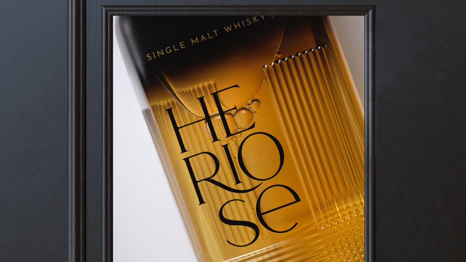
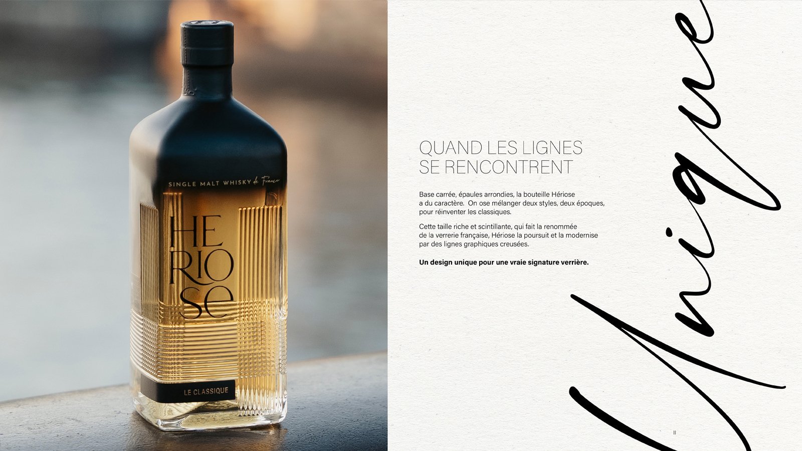
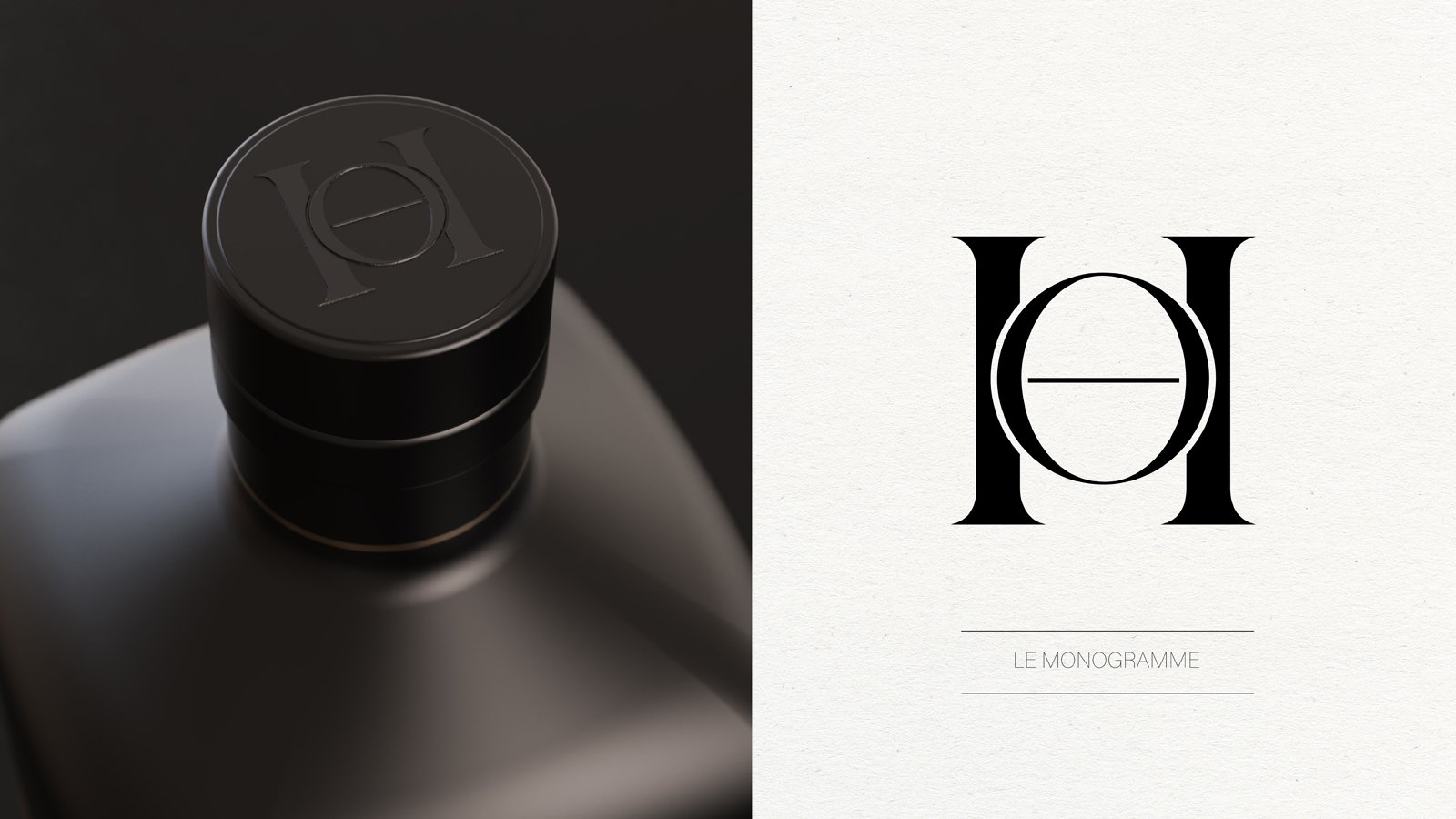
Continuing this fusion of styles, the unveiled glass bottle design emerges as a pivotal element of the brand image.
With its square base and rounded shoulders, Heriose bottle exudes character. We dared to blend two eras and two aesthetics, reinventing the timeless elegance of French glassmaking. The intricate and luminous cut, emblematic of French glassmaking, is reimagined and modernized by Heriose with bold graphic lines.
A unique twist for a distinctive signature bottle.
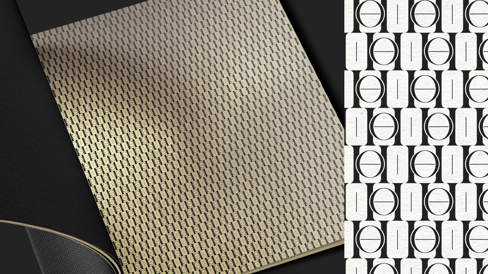
The Heriose logo boldly proclaims its individuality loud and clear. Divided in three lines and mixing diverse typographies, the bold logo stands tall and elegant. The visual imagery and branding guidelines emphasize the fusion of materials, textures, and atmospheres to evoke the unexpected. Heriose plays the card of “mix & match”.
And no brand launch is complete without communication! We crafted an entire visual and narrative universe for Heriose, from the brand manifesto to the brand book, press releases, and brochure texts. We defined a tone that is both unconventional and respectful, seasoned yet youthful, open-minded yet coherent. The customer is invited to partake in a unique experience, to challenge conventions. Each distinctive and refined communication piece makes Heriose stand out.
Heriose is not just a whisky; it's an unparalleled experience in every aspect of communication.
“Taste it. Share it. Twist it. Join the philosophy of Heriose, the French whisky.”
Assignments:
Brand Concept
Brand Strategy
Naming
Glass Design
Corporate Identity
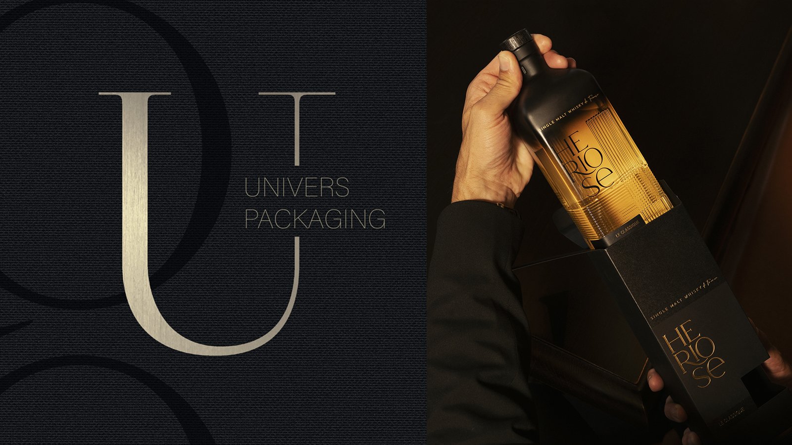
Packaging Design
Brand Book
Iconography
Design & Copywriting
CA LE DOU - RUM MAMZEL
PACKAGING DESIGN
Ça lé dou, a family-run business founded in 1996 in Étang-Salé on the island of La Réunion, specializes in producing 100% natural spiced rum. They launched the Rhum Mamzel line and dehydrated fruit sachets to let people make their own spiced rum at home.
Their products capture the essence and flavors of La Réunion by using local fruits and spices like sugar cane, Bourbon vanilla, and Victoria pineapple, offering a unique and authentic taste experience.
We were tasked with redesigning the brand identity of Mamzel rums, as well as its packaging range for dehydrated fruits. We created a significant illustration, honoring the women of Réunion and celebrating their cultural heritage. The label design was carefully crafted to harmonize with the shape of the bottle, thus offering a coherent and attractive aesthetic. Each flavor in the range was personalized with custom illustrations, accompanied by thorough research of the hues to faithfully reflect the unique characteristics of each aroma.
For the dehydrated fruits, we designed custom secondary packaging in the shape of a house, with vibrant colors representative of Réunion. This distinctive design creates a strong and attractive visual dynamic in local markets, thereby strengthening the brand’s presence and its connection to the Réunion terroir.
Assignments :
Brand Identity
Packaging design
Graphic design
Illustration
SOBER SPIRITS - ALCOHOL-FREE SPIRITS
GLOBAL DESIGN
Sober Spirits stands as one of the pioneering French brands offering alcohol-free spirits crafted from real liqueurs. Its rum and gin, with flavors true to nature, align with the growing trend of zero-alcohol beverages.
Forget the intoxication, as long as we have the taste.
Sober Spirits approached the agency to create the brand universe for this new range. Our creative concept, The Collage, rejects all doctrines and normative models, defying rules. It transports, disrupts, destabilizes, and seeks to provoke unlikely encounters. The collage breaks free from a realistic description of reality. The fragments used lose part of their identity but gain a new, equally identifiable one. A concept mirroring this new brand of alcohol-free spirits, adaptable across all communication platforms. Iconography and graphic guidelines blend themes, textures, and images.
Our choice of a simple bottle aligns with the design norms of spirit glassware. It was essential for Sober Spirits to be identified as an alternative to spirits and visually belong to their category.
Assignments:
Brand Strategy
Graphic Identity
Packaging Identity
Iconography
Instagram Guidelines
CAMUS COGNAC - DARK & STORMY
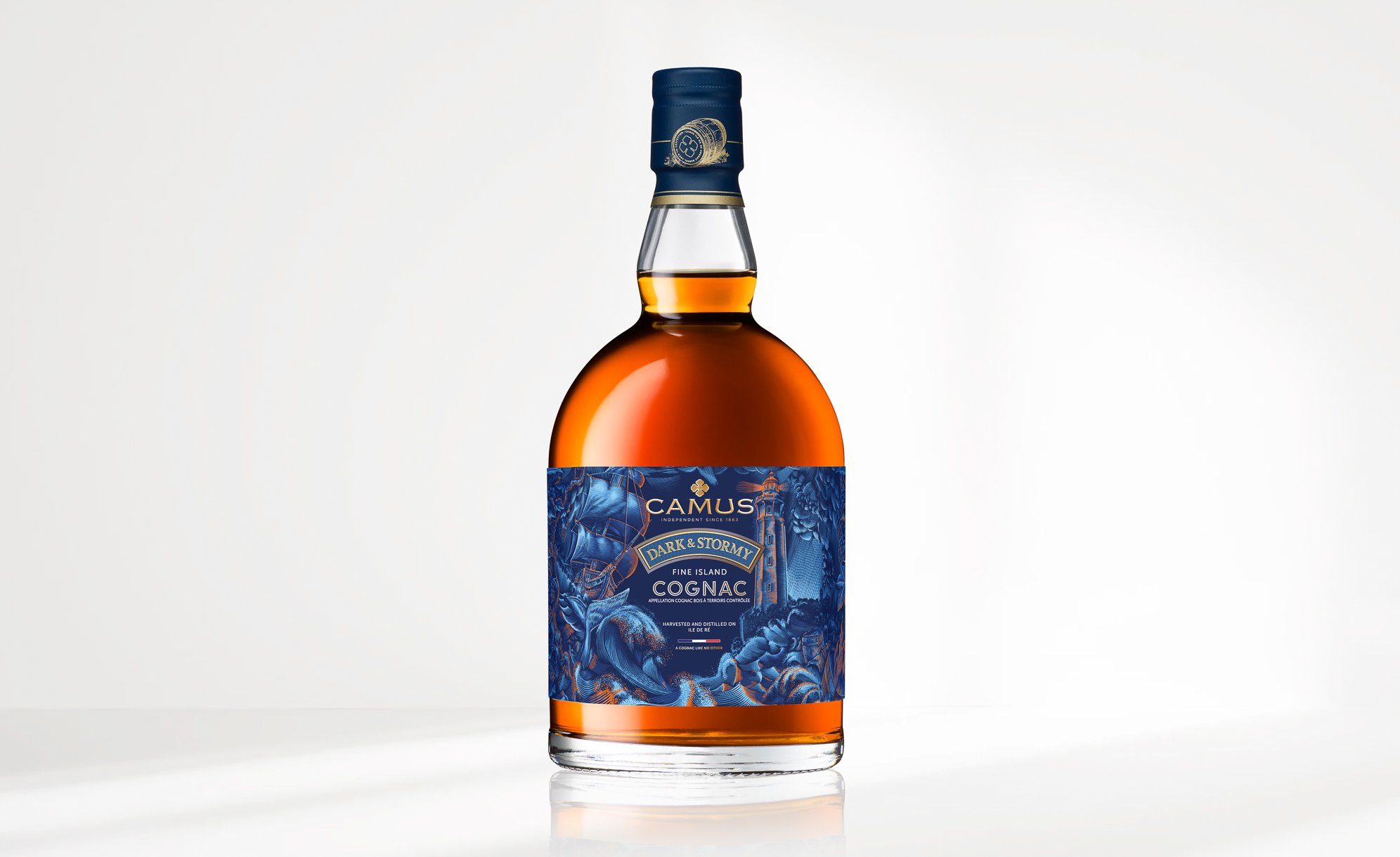
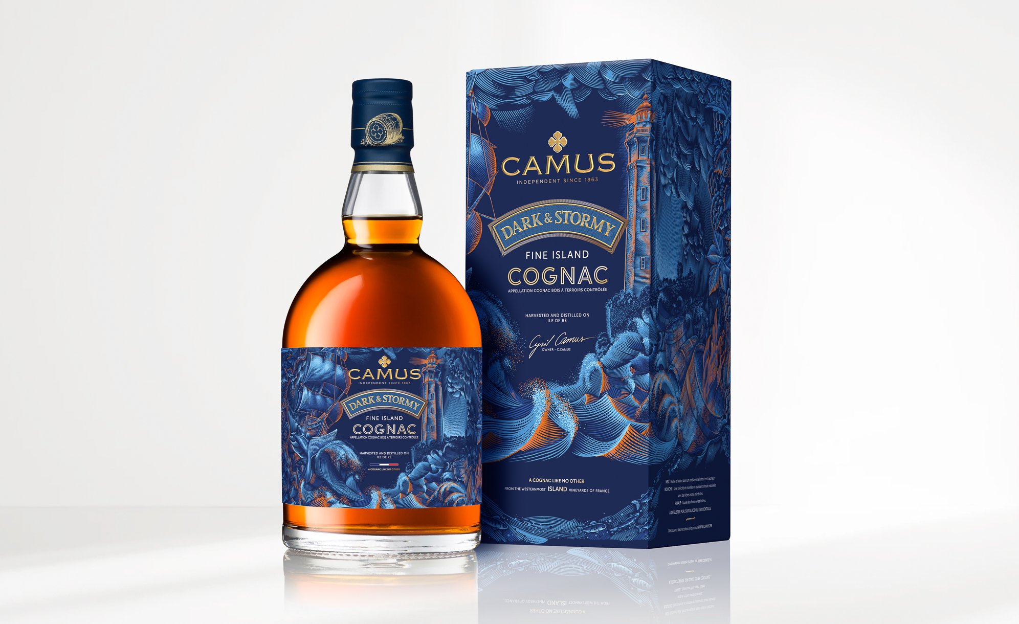
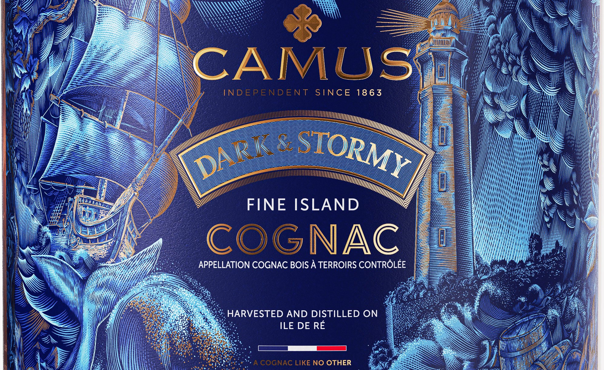
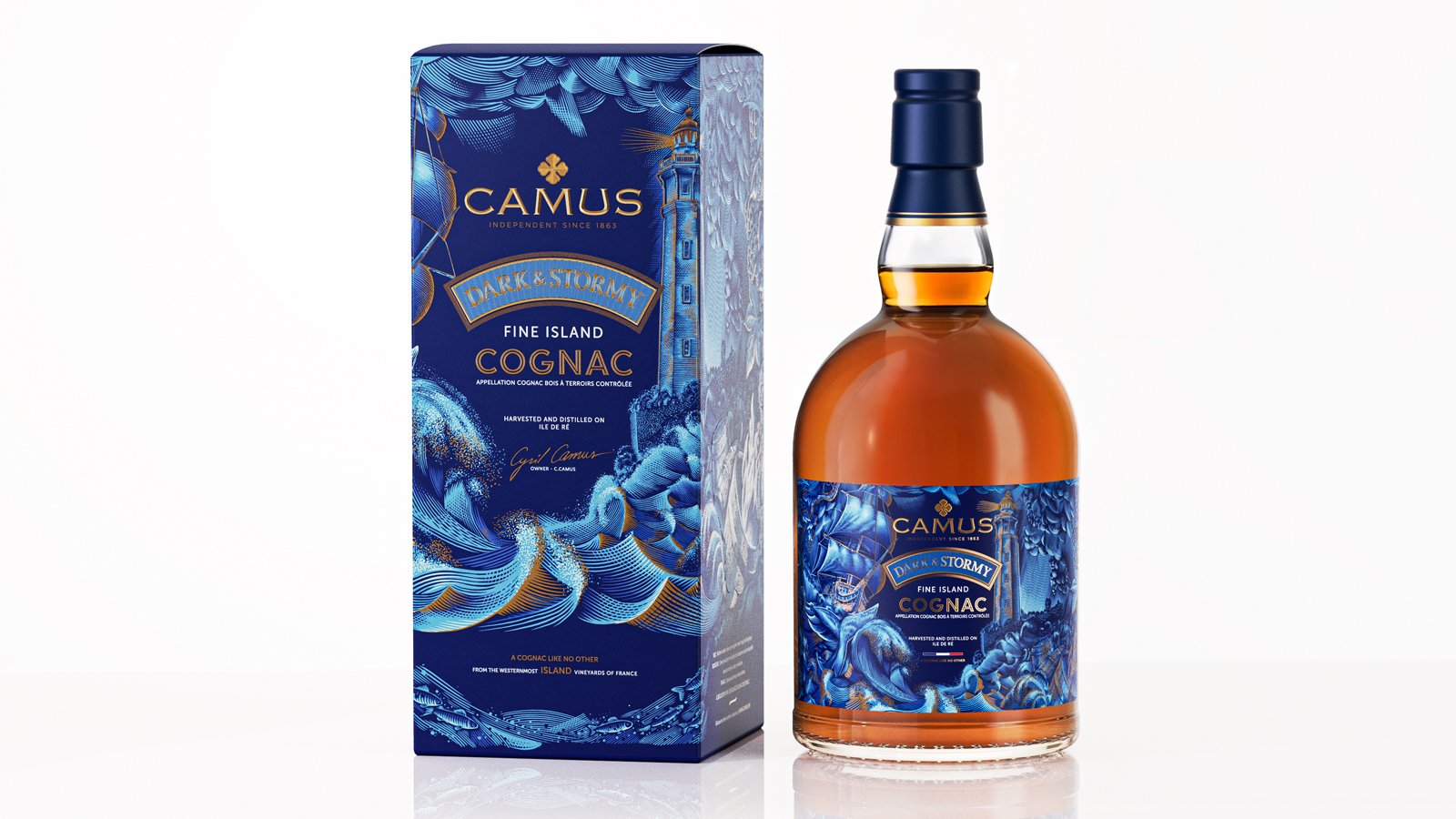
PACKAGING DESIGN
Camus House has created Dark & Stormy, a unique cognac born from a historical storm on the island of Ré.
The island, located not far from the Cognac region, occasionally experiences storms of such magnitude that ocean water floods its vineyards. The limestone and sandy soils were temporarily saturated with salt and minerals. In 2010, a major storm occurred, and Camus used the grapes harvested that year to produce a cognac with extraordinary maritime characteristics. To tell this extraordinary story, we collaborated with illustrator Yroslav Shkriblyak, who captured the impetuous spirit of the ocean through his style on the label and packaging.
This illustration shows each element of the island naturally displayed.
To create the packaging, we envisioned the primary and secondary packaging as a second skin, providing a unique sensory experience for this exceptional cognac.
Assignments :
Graphic identity
Illustration
Primary and secondary packaging design
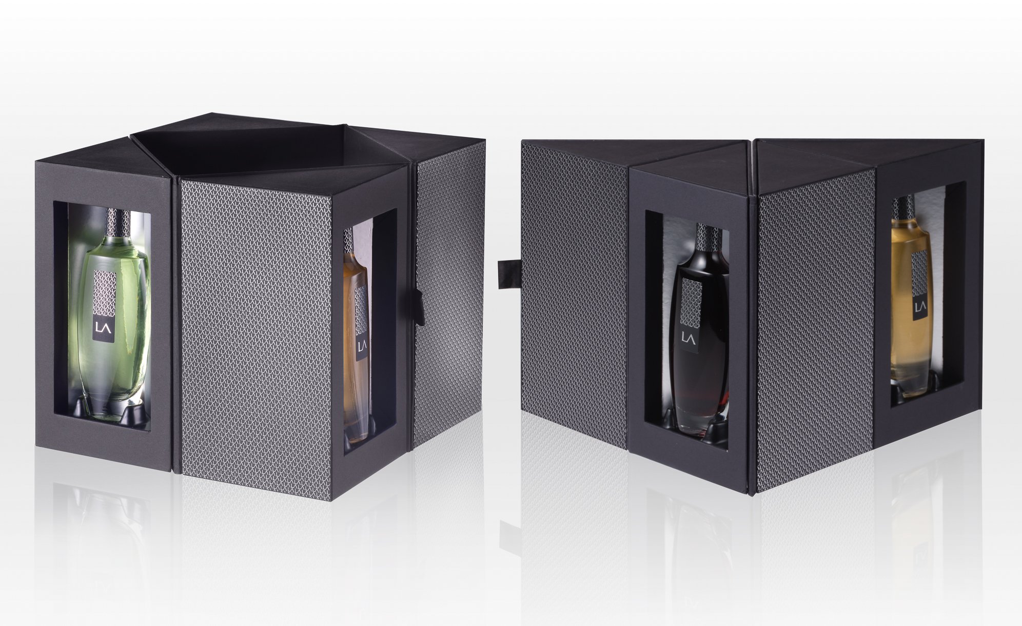
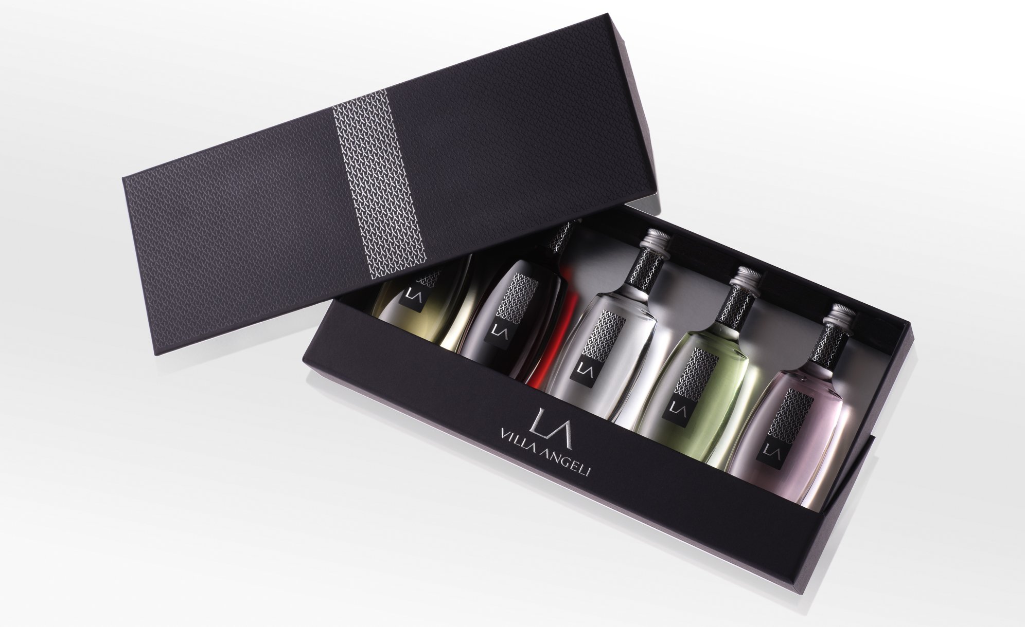
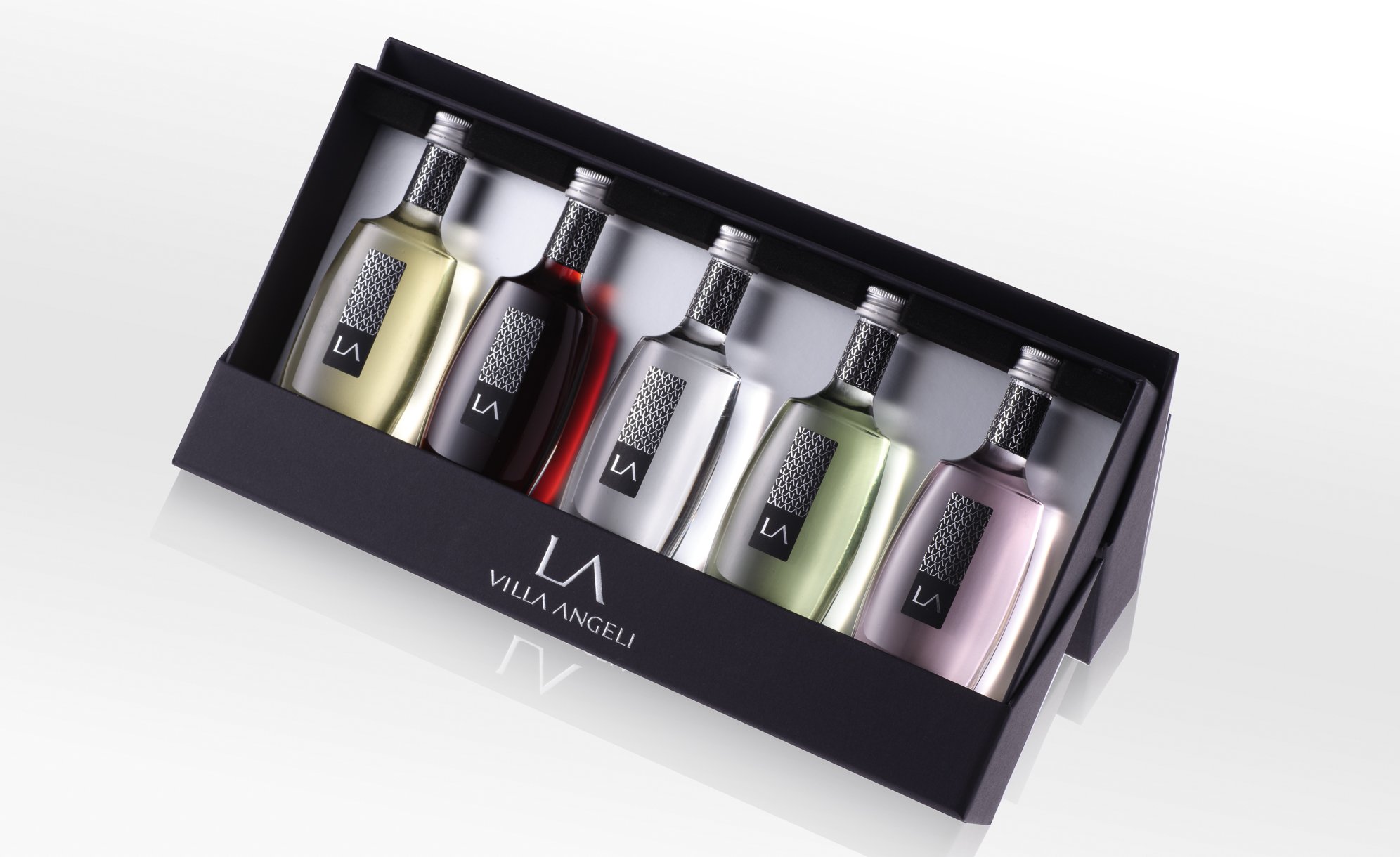
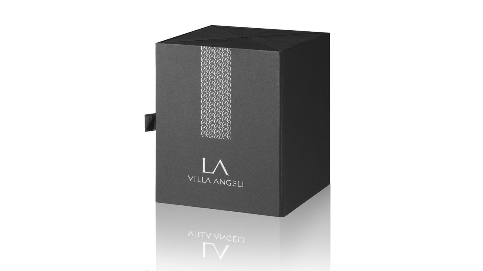
LA VILLA ANGELI – CORSICAN LIQUEUR BOX
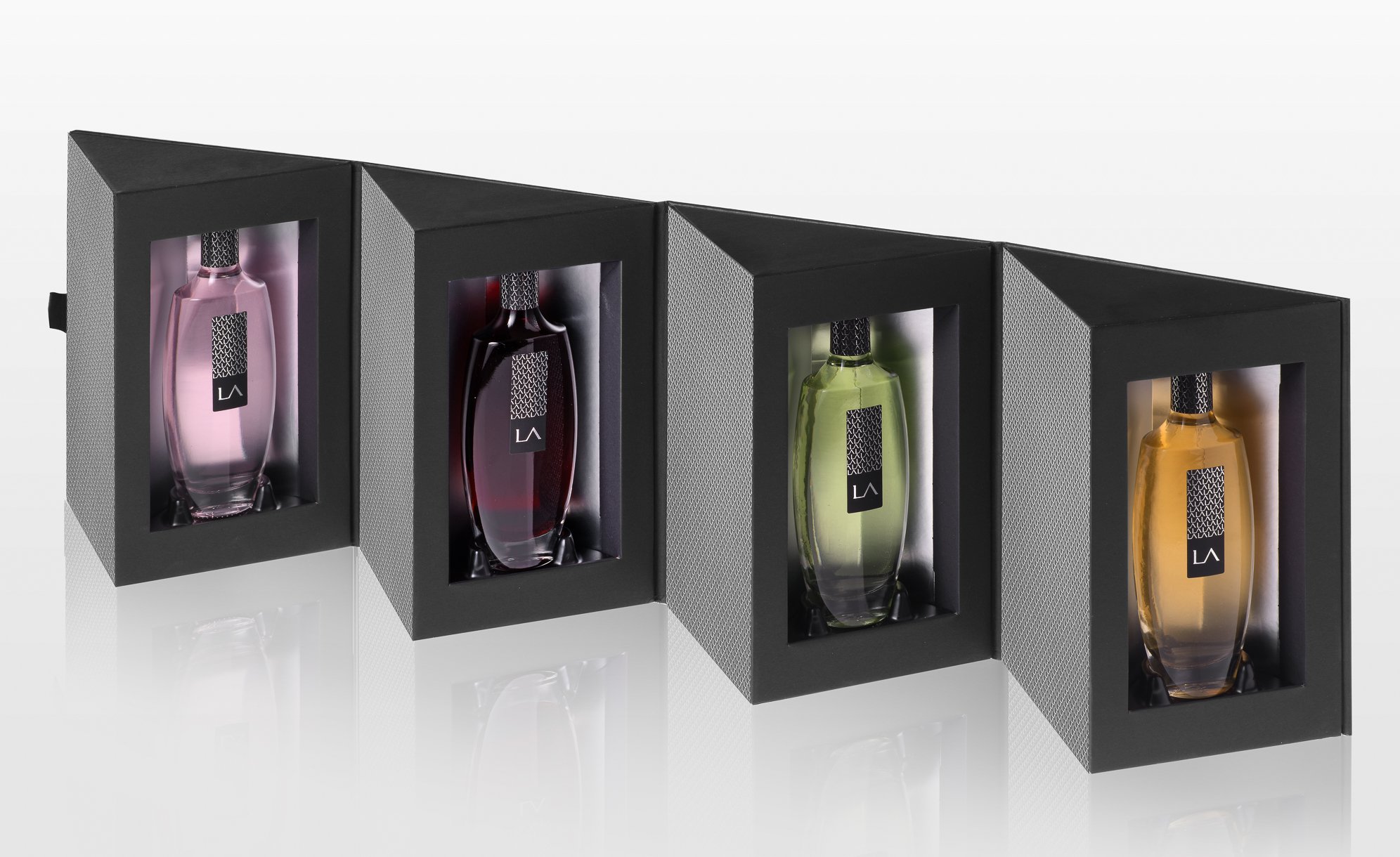
PACKAGING DESIGN
This estate, located on the lands of Antiparti, was created by Albert Mizael in the 1960s. Since 2000, it has been run by his children, including Guy Mizael. Together, they have completely restructured the vineyard and revived this Corsican family property with great motivation and ambition.
The agency was commissioned to develop the graphic identity of La Villa Angelli wines on 5 miniature liqueurs and create 3 sets combining different presentation techniques to reveal the art and manner of offering the emblematic liqueurs. The agency wanted to showcase Corsican liqueurs in an original and premium way, far from old clichés.
3-Liqueur Set (Clementine, Myrtle, Lemon):
A playful and practical set so that tourists can easily take home a souvenir of the “Isle of Beauty”.
4-Liqueur Set (Clementine, Myrtle, Lemon, Citron):
Designed for wine merchants, this premium set comes in a variety of shapes depending on how it is folded. When unfolded, it proudly displays the 4 liqueurs. Through multiple combinations, the set can also adopt rectangular, triangular, or overlapping diamond shapes.
5-Liqueur Set (Clementine, Myrtle, Lemon, Citron, Eau de Vie):
Designed for BtoB, the agency created this set with a dual function. Thanks to the lid, it transforms into a display stand, enhancing the presentation of the 5 liqueurs.
Assignments:
Adaptation of the existing visual identity on the miniatures
Packaging Design
CONQUÉRANT SPIRITS - NORMAN ORGANIC GIN


GLOBAL DESIGN
In the heart of the ancient lands occupied by the famous William the Conqueror, Duke of Normandy and King of England, two childhood friends decided to launch their brand of spirits. They turned to the agency to help them create the entire brand universe.
In Swiss Normandy and Calvados, the two friends produced unique and organic gins. In the gardens of their priory and abbey respectively, they grow the ingredients necessary for their production.
Passionate about history, the environment, and the beauty of the different landscapes of this region, the two partners wanted to express the nobility of the places and the uniqueness of the tastes.
Conquérant Spirits is its name, proudly embodying the brand universe and its graphic environment. The design exudes strength and character, mirroring the illustrious historical figure it celebrates.
Assignments:
Brand strategy
Naming
Brand identity
Packaging design
Production Follow-up
MAISON AYALA - LE BLANC DE BLANCS 2012


PACKAGING DESIGN
The quintessence of Chardonnay, the emblematic grape variety of Maison AYALA.
Great aromatic freshness, silky texture, and pure line: the codes of AYALA Champagne style are perfectly embodied by the new identity of the House's emblematic cuvée, LE BLANC DE BLANCS 2012, both in terms of its organoleptic characteristics and its packaging.
LE BLANC DE BLANCS 2012, an iconic cuvée within the AYALA Champagne range, stands out with its new look: a transparent bottle featuring an exclusive shape of the House, a round label design enhancing the readability and visibility of the bottles, and an innovative design for a new case.
A new exclusive block for this cuvée has been specially created to reinforce the identity of this iconic reference in the range.
Extension of this identity to other communication media.
Assignements :
Graphic identity of the cuvée
Packaging creation
Extension of the identity to communication media (ambient photos, press announcement, press kit, product sheets)
G.H.MUMM CHAMPAGNE - BOX
PACKAGING DESIGN
Faithful to its pioneering spirit, Maison MUMM reinvents its iconic bottle through avant-garde design. The MUMM Grand Cordon bottle thus enhances the Pinot Noir, the House's emblematic grape variety.
The aim of creating this package, intended for press and corporate use, was to enhance and make easily identifiable the bottle design while respecting the brand's DNA.
The creation of a sleek packaging within luxury codes with red ribbon embedded in the Grand Cordon cuvée bottle is visible through a window carved on the facing of the closed box. It opens by sliding like a drawer to reveal, against a red background, the iconic champagne of Maison MUMM, which remains true to the motto of its founder Georges Hermann Mumm: "Only the best."
Printing on soft-touch matte black paper, embossing, hot stamping.
Interior of the packaging is red on gold polyester paper to add depth to the color.
Assignments :
Packaging design
Graphic design
Production follow-up
EXCELLENCE RHUM - RHUM DU MONDE


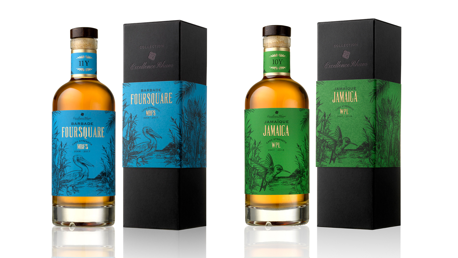

PACKAGING DESIGN
As a family-owned enterprise, Excellence Rhum honors the authenticity of rums from around the world and the expertise of traditional distilleries.
For the creation of the “COLLECTION” range, we established a brand identity and a graphic universe for the first four aged rum cuvées, boasting powerful tasting notes.
Our concept, centered around prominent elements from four Caribbean islands, depicts the history and identity of each rum variety. By selecting unique elements from each local culture, we distinguished these cuvées with an animal serving as the ambassador and emblem of each island, integrated into elements of the local environment.
The blend of vibrant colors and intricate illustrative work in fine engraving gives the range a real authenticity with a touch of modernity. The choice of colors was made to highlight the color and origin of each rum.
Assignments :
Brand identity and graphic universe
Packaging design
Production follow-up
SAINT JAMES - RUMS
PACKAGING DESIGN
SAINT JAMES agricultural rums, known worldwide for their exceptional quality, are the result of a long history of passion, expertise, and know-how since 1765. Made from pure sugar cane juice, SAINT JAMES Rums benefit from the A.O.C of Martinique (Appellation d’Origine Contrôlée/ Controlled Designation of Origin), reflecting their deep connection with the plantation terroir while ensuring quality.
Our mission was to create a common packaging for the three SAINT JAMES references, adapted to the Long Island 70 cl.
We designed a luxurious, minimalist packaging with a window on the front to keep the front label of the brand visible. The graphic design is consistent with the packaging of the three bottles to create a cohesive range effect. The window is designed to extend to the side, creating a strong packaging identity and highlighting the shape of the bottle.
The "neutral" marking ensures adaptability across all three references. Printed on matte black paper with embossing, hot stamping, and selective varnish. The interior of the packaging is gold to enhance the rum.
Assignments :
Graphic & Packaging design
Production follow-up
AIKAN - WHISKY


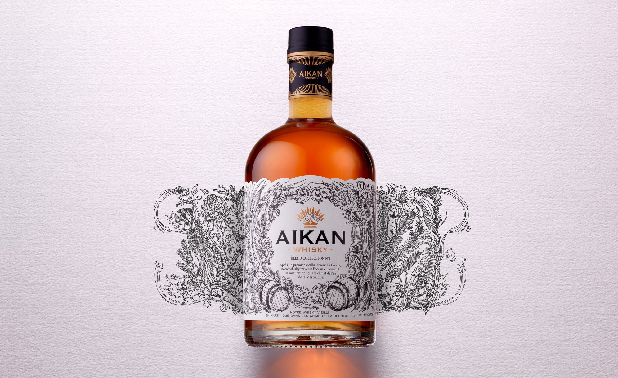


GLOBAL DESIGN & COMMUNICATION
AIKAN is a whisky distilled and matured in France and Scotland, which then crosses the ocean to arrive in the Caribbean Sea. It is on the island of Martinique, at the foot of a spring emerging from Montagne Pelée, that the distillation continues. Then, the whisky ages in oak barrels in the cellars of the J.M. rum distillery.
AIKAN means "marriage" in Arawak, the language of the first Amerindians who inhabited Martinique. We chose the union of two cultures as the key element to build the visual identity of the brand, which will be applied across all its communication materials. The identity of AIKAN is the result of two climates and two eras, drawing inspiration from the time of the Amerindians, the first inhabitants of Martinique.
We highlighted the marriage of these intertwined worlds through an illustrative style that is simultaneously ancient, contemporary, and representative of the cultural blend between Europe and Martinique.
The logo, featuring an Amerindian feather headdress and incorporating a fleur-de-lis, explicitly referring to this cultural marriage.
This message is reinforced and hidden on the back of the label with an illustration of a union between a European woman of the era and an Amerindian man. (Printed on the adhesive label with front and back design).
Assignments:
Brand strategy
Brand identity
Packaging design
Communication materials
Iconography
Motion design
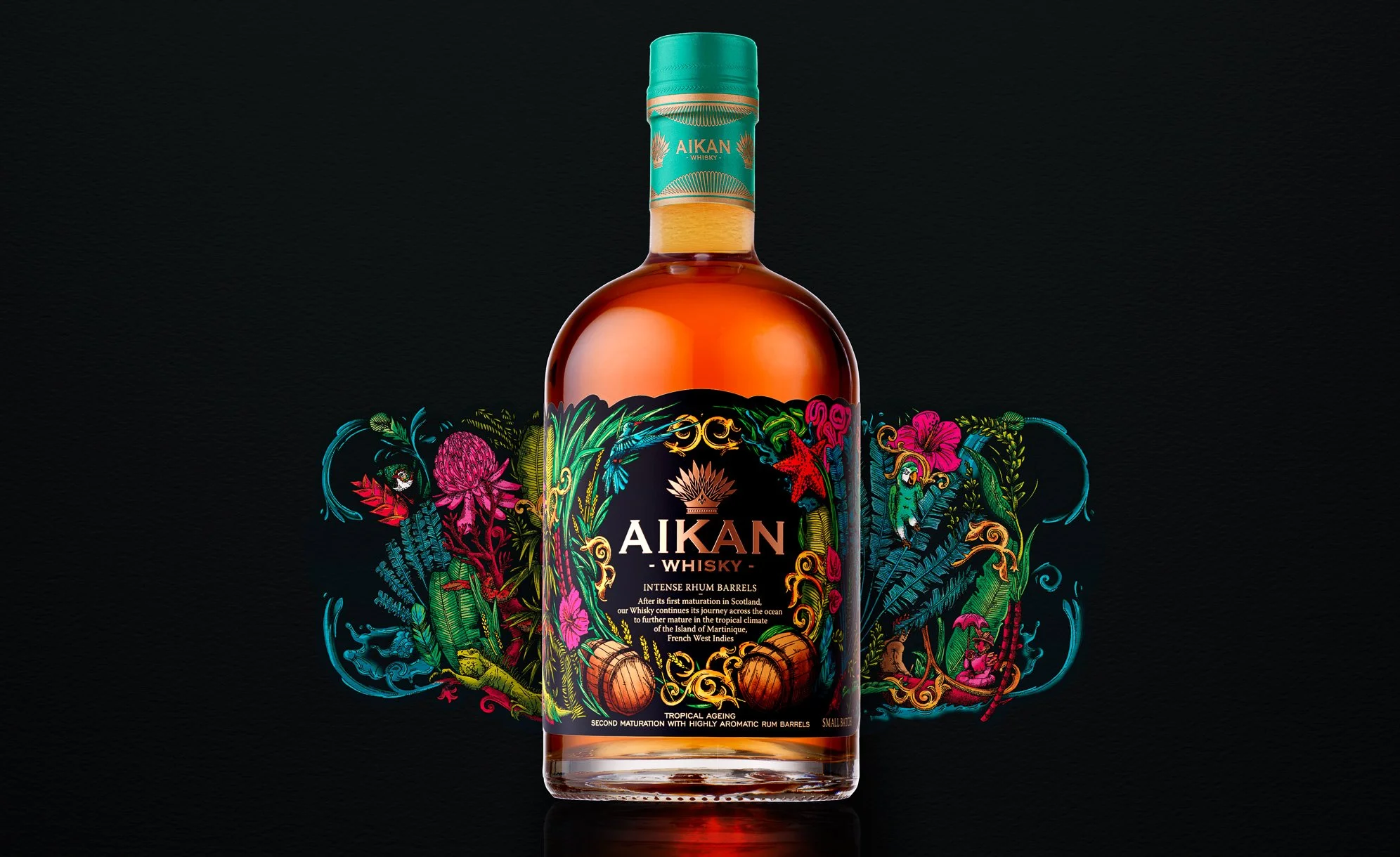
AIKAN INTENSE, THE FIRST WHISKY AGED IN GRAND ARÔME RHUM BARRELS!
Aikan, well-known among rum and whisky enthusiasts for its whiskies distilled in Scotland and then aged in Martinique.
We present its fourth product : Intense Rhum Barrels. Featuring a new colorful design, this unique whisky offers intense notes of tropical fruits and French pastries.
Assignments:
Brand identity
Packaging design
Illustration colorization


AIKAN COCKTAILS
Variation of the brand's graphic universe on two new products. Aikan Cocktails are 100% natural cocktails made from Scotch whisky aged in Martinique and passion fruit or pineapple.
Assignment:
Packaging design
ROCHE MAZET - COLLECTOR ACCESSORY


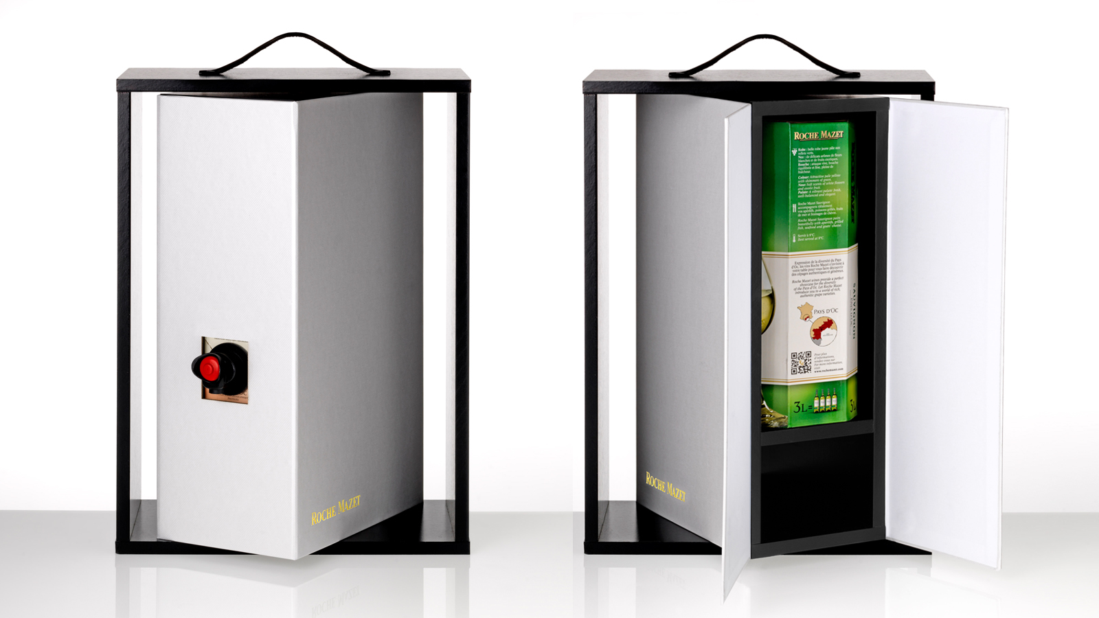
PACKAGING DESIGN
ROCHE MAZET, a brand part of the Castel Frères group, is a family-run business producing wines from the Pays d’Oc, sharing its passion for the French terroir since 1998.
For the summer of 2017, we created an innovative collector's accessory box that enhances its Bag-In-Box range with a precise meaning and function while aligning with its values: quality wines accessible to all.
We aimed to go beyond practicality, adding a special touch that highlights its uniqueness and creates shared enjoyment around this accessory. Thus, we designed an innovative box to be used for all 7 ROCHE MAZET wine references: 2 reds, 2 whites, and 3 rosés.
After examining existing solutions in the wine and spirits sector, we focused on several key criteria:
- Making it unique, practical, aesthetic, and fun for a wide audience in various situations.
- Practical, thanks to a carry handle and elevation that facilitates pouring without tilting the BIB or the accessory.
- Aesthetic, with its clean and simple design, it can be placed on any table, from chic buffets to summer picnics.
- Fun, with a rotating function that surprises during shared moments, making it easy to insert the BIB and access the tap, all while remaining true to the brand's spirit.
Assignments :
Packaging design
Photography
NIKKA JAPANESE WHISKY


GLOBAL DESIGN & COMMUNICATION
For this whisky born from the union of a bold Japanese and his Scottish muse, the goal was to captivate a broader European audience.
Straddling tradition and innovation, our concept based on the principle of origami perfectly illustrates the connection between these two cultures and establishes a new communication territory.
Through folding, the choice of material, and custom-designed decorations, we express each category while creating a cohesive range, allowing for infinite variations across all communication platforms for the NIKKA WHISKY brand.
Find out more about it on NIKKA EU : click here
Assignments:
Strategy (positioning and communication territory)
Brand identity
Packaging design
Iconographic and packaging guidelines
Artistic direction
Iconography and videos (Eric Deniset)
Communication materials
Concept and writing
Public Relations & Press (Agence Source - Pauline Mayot)


TASTING BOX - PACKAGING DESIGN
NIKKA BOX
Inspired by himitsu-bako (secret boxes once carried by Samurais) and origami, the NIKKA BOX presents the six iconic whiskies of the brand in various ways thanks to an original box that transforms into a mini-bar to display at home.
Assignments:
Graphic & Packaging design
Production follow-up
NIKKA FROM THE BARREL (NFTB)
With each new edition, we rethink the box.
The design :
For the case of this best-selling Japanese whisky in France, with 51.4% alcohol, we chose a rather masculine and modern design, in harmony with the bottle.
The setup :
It is similar to that of the NIKKA BOX: a discreet facing with a surprise effect. A part of the pack rotates upon opening to present the bottle, the pourer, and the glasses.

NIKKA - PURE MALT BOX
The Pure Malt Spice Rack Trilogy is a true homage to these 3 whiskies, blends of single malts from Yoichi and Miyagikyo. This collector's trilogy is the last chance to taste the peatiest whisky in the NIKKA range.
The set presents the 3 Pure Malts in a wooden spice rack specifically adapted to the distinctive shape of these bottles, reminiscent of spice racks found in kitchens, complete with 3 measuring spoons useful for not mixing whiskies during tasting.
Once the bottles are empty, the spice rack can be used to store all kinds of ingredients such as flavored olive oils, exotic spices, or homemade syrups.
PURE MALT - RED - BLACK - WHITE
With each new edition, the challenge for our agency is to find a way to differentiate the 3 products by creating a surprise effect.
The Japanese pattern :
A customization was created using the same pack, featuring a specific Japanese pattern for each whisky.
The tasting notebook :
Each product has a different cover for the tasting notebook, which is visible through a window on the front.
The tasting set :
Designed with a wooden serving tray that fits perfectly into the box's door, and a rounded end to make it easier to handle.
PACKAGING DESIGN
A packaging true to the created identity, combining discovery and origami to reveal the art and manner of offering a bottle.
Assignments:
Graphic identity
Illustration
Graphic design and packaging
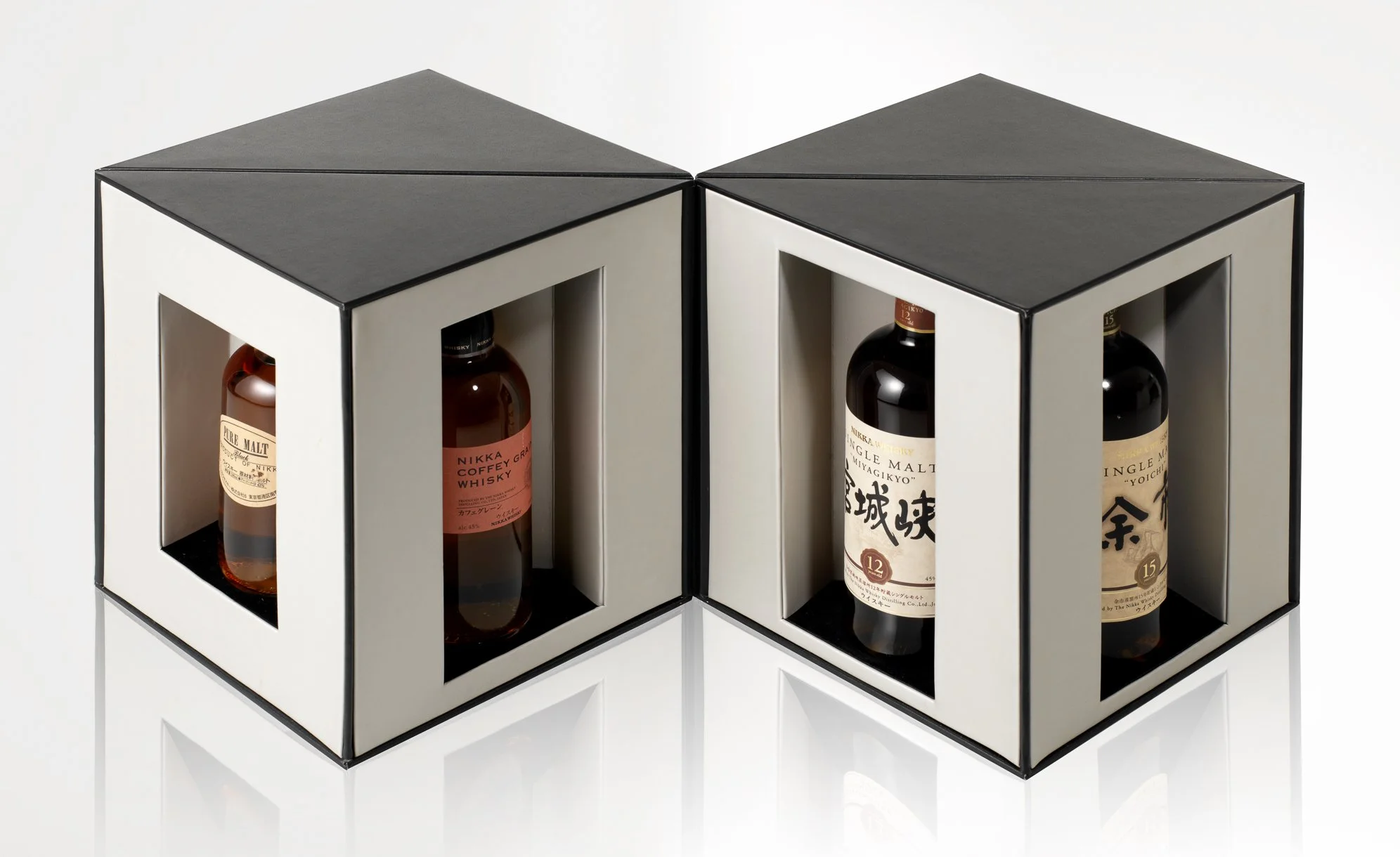
MIYAGIKYO - YOICHI - TAKETSURU
Two opposing folds for two different distilleries: Miyagikyo and Yoichi.
As for Taketsuru, we mixed folds from Miyagikyo and Yoichi since it is a blend of these two whiskies.
NIKKA - THE GRAIN
Packaging design for THE GRAIN from the Discovery limited collection of Nikka.
NIKKA - THE GRAIN
Packaging design for THE GRAIN from the Discovery limited collection of Nikka.
NIKKA - 12 YEARS OLD
A very stately, 'old school' box created in harmony with the design of the NIKKA WHISKY bottle for this 12-year-old edition.
NIKKA - TAILORED
The Nikka Tailored, Nikka's premium blend, perfectly embodies the craftsmanship, culture, and expertise of this historic Japanese house. This whisky, carefully and precisely crafted, is mainly composed of malted barley from Nikka's Yoichi and Miyagikyo distilleries, as well as grain whisky distilled in Coffey stills. The result is a symbol of balance, roundness, and smoothness.
NIKKA - SINGLE MALT
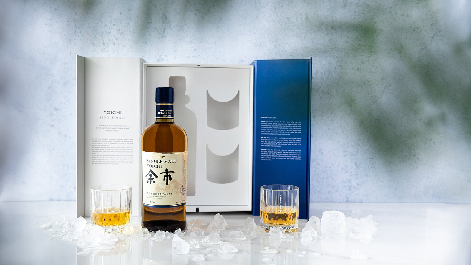
The YOICHI Single Malt box, characterized by a deep blue color, evokes the maritime climate of the first Nikka distillery founded in 1934 on the coast of Hokkaido, Japan.
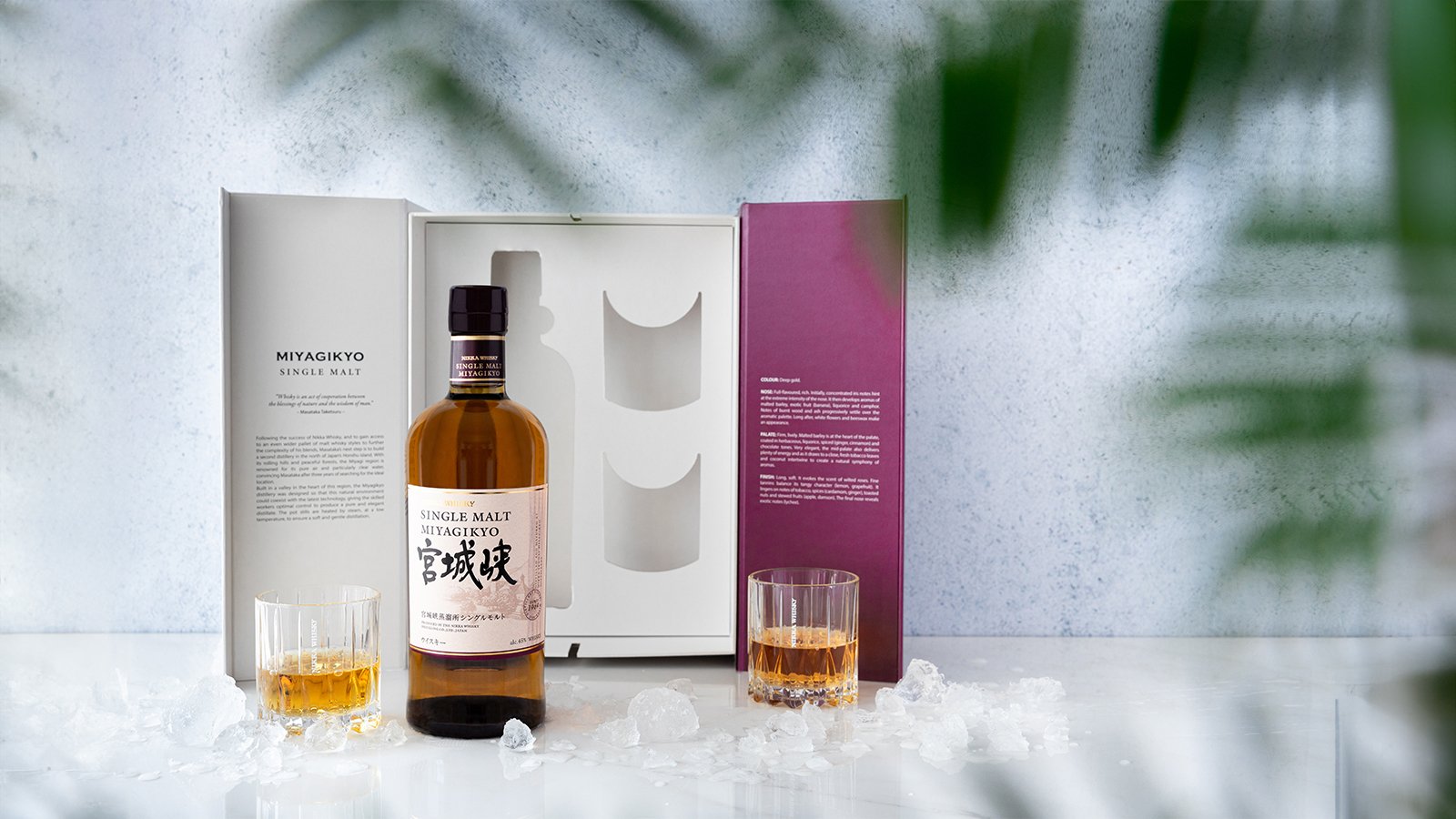
The plum-colored MIYAGIKYO Single Malt box, on the other hand, is inspired by the landscapes of the Miyagi valley, where a distillery founded by Masataka Taketsuru has been located since 1969.
New magnet-free closure system.

MAISON AYALA - CUVÉE ÉPHÉMÈRE ROSÉ N°8


VISUAL IDENTITY & PACKAGING DESIGN
The agency created an identity and packaging that express both the values of this prestigious Champagne House and the intrinsic qualities of this exceptional wine.
We intertwined the container (packaging design) and the content (the wine) to build our creative concept. The "N° 8" was chosen to convey the rarity, excellence, and precision that characterize this special cuvée. The sensual curves of the box, bottle, and label highlight the refinement, elegance, and femininity that are the signatures of the cellar master, Caroline Latrive.
The combination of “glamorous” pink and white recalls that this rosé champagne was intended to appeal not only to a female audience but also to connoisseurs and discoverers.
The lightness, airy, and festive nature of the Art Deco pattern is a nod to the 1920s, a euphoric period when the dance of champagne bubbles matched the dance of bodies, and when Maison AYALA experienced its golden age.
Finally, the chalk color and the choice of textured paper evoke the limestone nature of the precious terroir and its features. The typical pattern of the Roaring Twenties, the freshness of the colors, and the round and voluptuous geometric shapes that were chosen allowed us to create recognizable and adaptable brand codes across all communication media.
Assignments:
Graphic identity of the cuvée
Volume creation of the box
Adaptation of the identity across communication media (ambiance photos, press ads, bags, press kit, flyers, window dressing)
VIRGINIE T. CHAMPAGNE - SIX-YEAR OLD LA GRANDE CUVÉE


VISUAL IDENTITY & PACKAGING DESIGN
For her own brand of exceptional long-aged cuvées, VIRGINIE T., Virginie Taittinger wanted the agency to create a visual identity and packaging in line with the two key values of her House:
- Innovation, present both in the champagne-making process and in its exclusive distribution via the brand's website www.champagnevirginiet.com
- The tradition of ancestral know-how unique to great Champagnes.
Classic Second Empire patterns were given bright colors whose modernity reflects the innovation of the packaging: a box that transforms into a genuine champagne bucket, capable of withstanding icy water for several hours. Thanks to thermochromic ink, the "VIRGINIE T." inscription on the back of the bottle changes from white to red once the ideal tasting temperature is reached, which is 8°C.
Assignments:
Graphic identity
Typography creation
Packaging design
Graphic and packaging guidelines
KAVALAN - TAIWANESE WHISKY


PACKAGING DESIGN
Inspired by the famous Taipei 101 tower in Taiwan, the KAVALAN bottle has an atypical shape that makes it instantly recognizable. This reference to local architecture was the starting point for our packaging research: Taiwan blends technical performance and innovation with the Chinese tradition of curved roofs, bright colors, and interlocking lines.
Keeping this spirit of merging tradition and modernity, we worked with simple shapes reminiscent of the contours of contemporary monuments, to which we added a small touch that would become a true brand signature: the ridge at the top of our boxes was curved, referring to the dynamic of Asian roofs and the cultural symbol of elegance and vitality.
Like the facades of old and modern buildings, particularly that of the Kavalan distillery, a geometric design was chosen for our packs.
Simplicity, play of lines, colors common to natural elements, and rhythmic curves create a sense of range while highlighting the unique identity of each product through various effects and finishes.
Since 2011, our agency has been revisiting the codes of several brands for La Maison du Whisky, an expert in rare bottles and the exclusive distributor of the KAVALAN brand in Europe. www.lmdw.com
Assignments:
Graphics identity
Packaging design
PLANTATION RUM - VINTAGE COLLECTION


VISUAL IDENTITY & PACKAGING DESIGN
Concept based on a graphic composition with an illustrative style typical of the 18th century, which recalls the historical roots of PLANTATION and its pillars, and creates a consistent range while distinguishing the products (terroirs).
Assigments :
Brand platform
Visual identity
Packaging design
Graphic charter
Communication supports
Finalization of bottle materials by Julien Fort
CHATEAU DU SEUIL - GLOBAL DESIGN

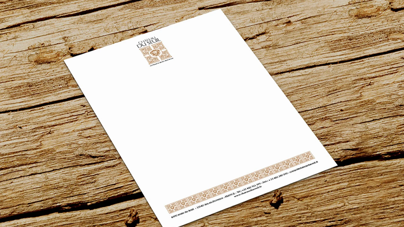
VISUAL IDENTITY & GLOBAL DESIGN
CHÂTEAU DU SEUIL is a 55-hectare vineyard located on the sunny slopes at the center of the Coteaux d'Aix-en-Provence appellation, producing great Provence wines: rosé, white, and red.
The garden, listed in the Supplementary Inventory of Historic Monuments (ISMH) along with the château's facades and built over the centuries, symbolizes the soul of Château du Seuil. Two stone lions from Rognes guard this garden.
The creation of a concept based on an aerial view of the garden, establishing a brand code that sets it apart from its regional competitors.
Application of this new identity across all communication supports, starting with the design of the entire range.
Assignments:
Brand platform
Visual identity
Packaging design
Graphic charter
Communication supports
HEBRARD - WINES OF BORDEAUX


VISUAL IDENTITY & PACKAGING DESIGN
Creation of a crest that represents the brand by expressing the terroir, climate, and historical roots of Maison HEBRARD. The concept breaks the classic color codes of the wine sector to enhance readability in the complex world of Bordeaux appellations.
Assignments:
Graphic identity
Illustration
Graphic & Packaging design
CHARLOPIN - BURGUNDY WINES
VISUAL IDENTITY & PACKAGING DESIGN
The agency created monograms on embossed paper for CHARLOPIN, elegantly recalling the 12 appellations of Côte de Nuits and Côte de Beaune to create range cohesion.
Assignments:
Typographic design
Graphic identity
Graphic charter & Packaging
LA GALOPE - CÔTES DE GASCOGNE
PACKAGING DESIGN
Creation of hybrid characters that combine two emblematic Gascon figures, the duck and the musketeer, to distinguish each LA GALOPE wine reference while maintaining range.
Assignments:
Graphic identity
Illustration
Graphic & Packaging design
TREPO LERIGUIER - CHAMPAGNE
DESIGN PACKAGING
Creation of bottle dressing, label and packaging for Champagne TREPO LERIGUIER, evoking the nighttime harvest carried out on the night of September 27, 2008, to create this vintage titled "Songes d’une Nuit de Vendanges" (‘‘Dream of a Harvest Night”).
Assignments:
Graphic design
Bottle decoration
Box design
PIERRE CROIZET - COGNAC


PACKAGING DESIGN
Designing a decanter label for Maison Pierre CROIZET's "Extra-Extra" cognac, using transparency effects and sandblasting techniques for a luxury design.
Assignments:
Graphic design
Decanter decoration
Technical refinement
À L’ORIGINE - ORGANIC WINES


PACKAGING DESIGN
Creating a graphic identity for the relaunch of this first brand of eco-responsible organic wine destined for mass distribution.
Our aim was to represent the diversity of French viticulture by embodying each harvest with a winemaker's signature and clearly distinguishing the terroir.
Assignments:
Name creation
Graphic & Visual identity
Packaging guidelines: 70 cl wines and bag-in-box
Launch communication