CORTEFINO – PATA NEGRA – IBERIAN HA
/

GLOBAL DESIGN
CORTEFINO was born from a simple insight: fineness changes everything.
In Iberian ham, the thinner the slice, the more the aromas are revealed and the more intense the experience becomes.
From this observation, the brand was created and designed around a clear principle: to reveal the product as a true gastronomic experience.
CORTEFINO is built around both the product and the slicing gesture, at the very heart of tasting.
The name, CORTEFINO (“thinly sliced”), expresses this precision —
a controlled, essential gesture that defines both quality and the intensity of the experience.
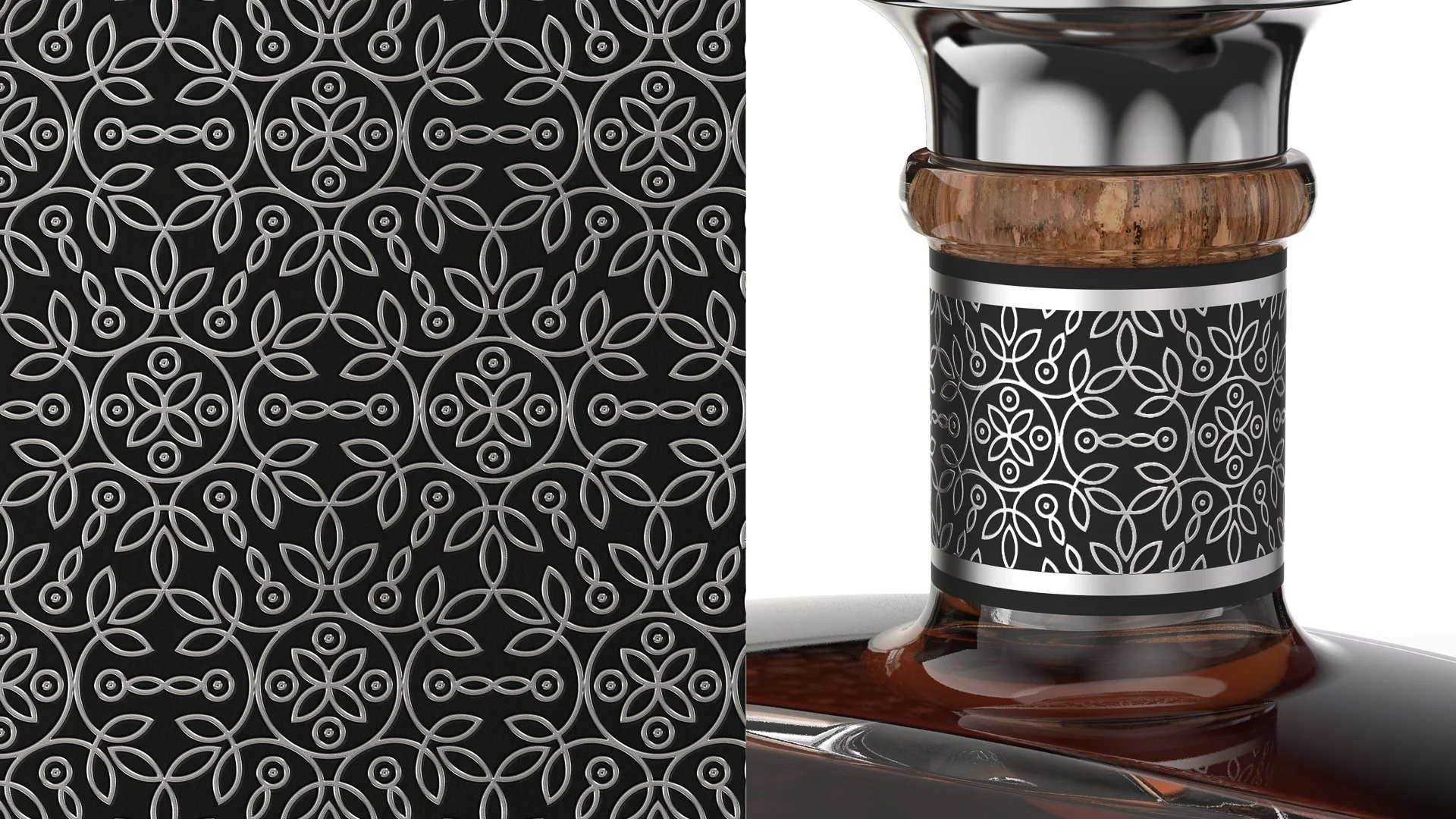
The identity extends this logic, with a logotype marked by a subtle typographic disruption and a pattern inspired by Andalusian codes, reinterpreted through a contemporary lens.
PACKAGING
The packaging embodies the brand’s positioning. It moves away from traditional codes to give full prominence to the product.
It supports the tasting experience, encourages sharing, and extends the moment.
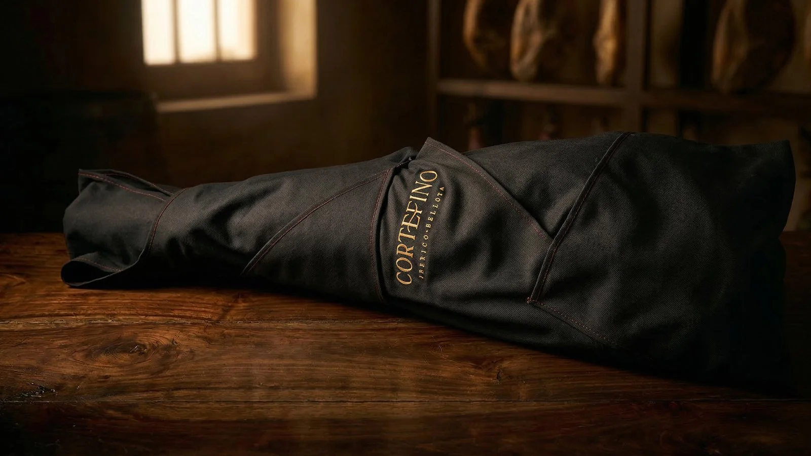
Whole piece
A soft bag designed to reveal the ham and adapt to its shape.
Inside, a fabric wraps the product.
Entirely designed for the brand, it stands apart from traditional solutions while also extending its use by enabling proper preservation.
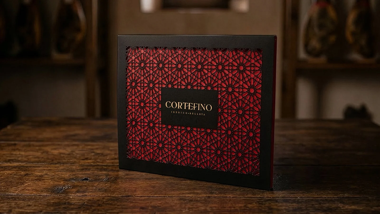
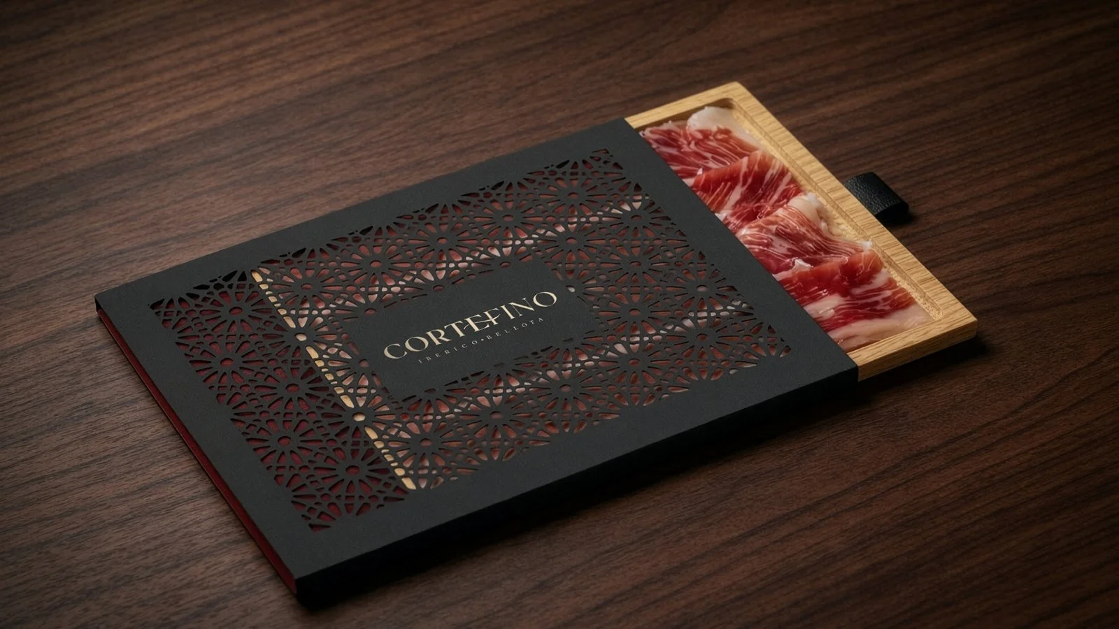
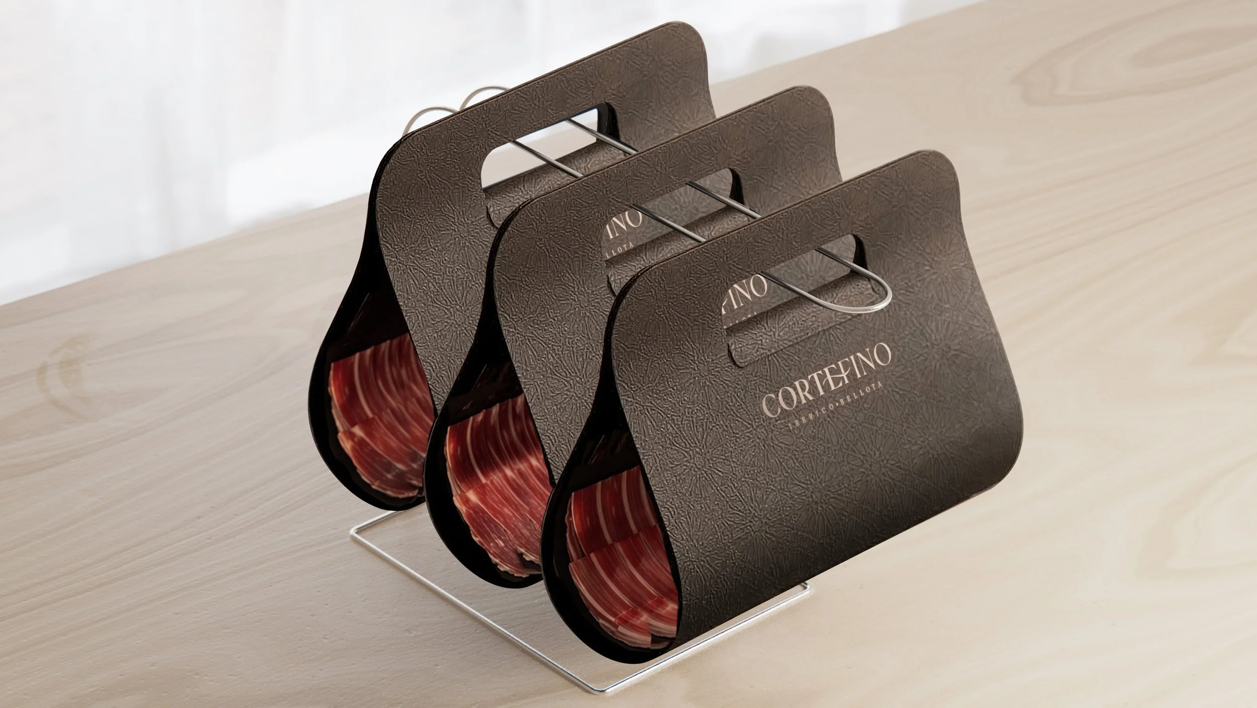
Sliced formats
Two formats designed for different uses.
The first is conceived as a tasting object — packaging that transforms into a serving tray, ready to use.
The sleeve, die-cut from the Andalusian-inspired pattern, reveals the product through transparency — a play of revelation that evokes its origin and signals its quality.
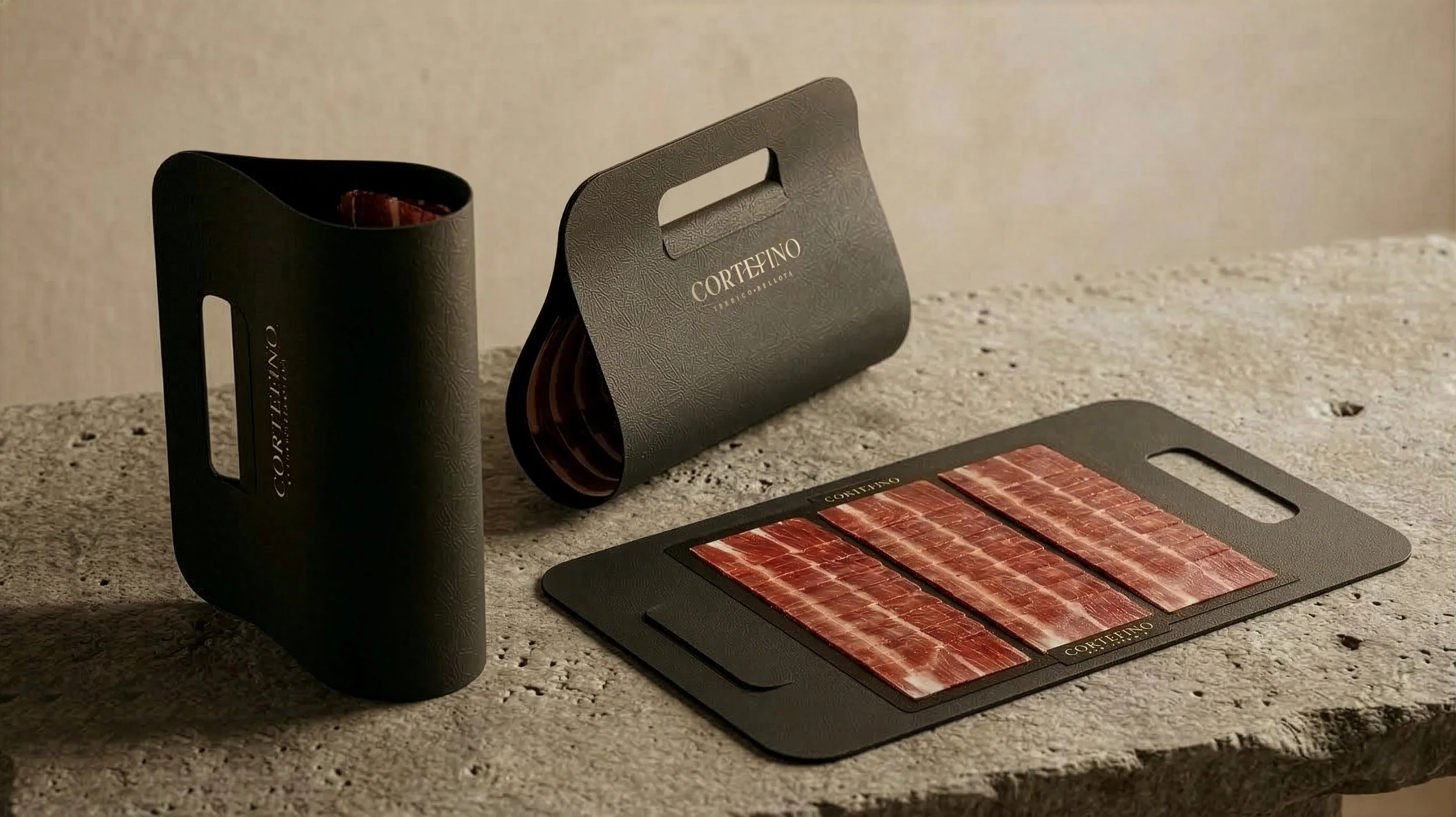
The second is reduced to its essence: a sheet that folds into a bag, designed for immediate handling and vertical display at point of sale.
The packaging becomes an extension of the product — revealing its materiality, supporting the gesture, and expressing fineness at every stage of the experience.
Assignments :
Brand strategy
Naming
Brand identity
Packaging design