RUM NAVI - PACKAGING DESIGN

PACKAGING DESIGN

NAVI rum draws on the art of blending four iconic terroirs: Barbados, Jamaica, Martinique, and Guadeloupe, each contributing its unique aromatic character. A smooth and accessible blended rum, perfect for enhancing the complexity of cocktail flavors.

The design is inspired by the stars that once guided navigators on their journeys. The constellations, essential to sailors crossing the Atlantic, symbolize the maritime heritage and the prosperity of the rum trade.

This packaging pays tribute not only to the historic connection between sky and ocean but also to the spirit of travel and exploration, inviting us to rediscover authentic flavors.

Two blends embody the soul of NAVI:

Cassiopée: A delicate blend of barrel-aged rums, combining finesse and indulgence, composed of three rums from Barbados, Jamaica, and Martinique.

Andromède: A more premium version, based on the same blend but with different proportions, enriched with an aged Guadeloupean rum, offering greater depth and complexity.

The target audience for these new gems: lovers of exotic spirits and mixology.

Assignments:
Brand Identity
Packaging Design

REMI LANDIER - COGNAC

PACKAGING DESIGN

5 GENERATIONS
OVER 250 YEARS OF HERITAGE

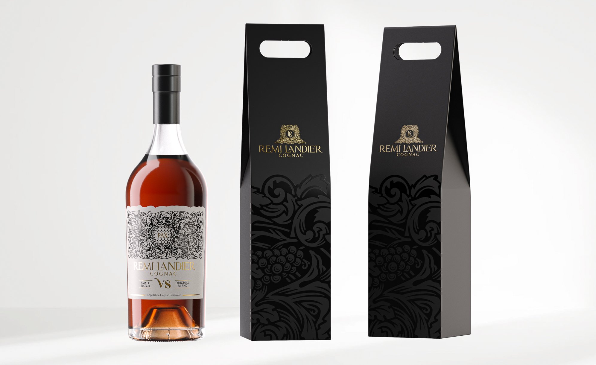
Rooted in the unique terroir of Fins Bois, cherished by the Benedictine monks of the Abbaye Royale de Bassac for over 250 years, Rémi Landier is a family-run cognac house established in 1890 on these exceptional lands in the Cognac region.

Our creation focuses on the symbol of "PAX," a Benedictine emblem meaning "PEACE." This symbol reflects a monastic tradition linked to the Abbaye Royale de Bassac, built around the year 1000. The monks established a farm there at the beginning of the 18th century, producing cognac in the heart of Fins Bois. This farm was acquired by Rémi Landier in the mid-20th century.

By incorporating this emblem on their labels, the Rémi Landier house honors a unique cultural heritage, while emphasizing the harmony and tranquility that characterize their cognacs.

Assignments:
Primary and secondary packaging design
Illustration

THROUGH THE GRAPEVINE

PACKAGING DESIGN

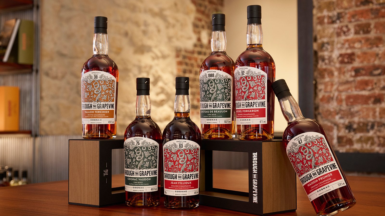
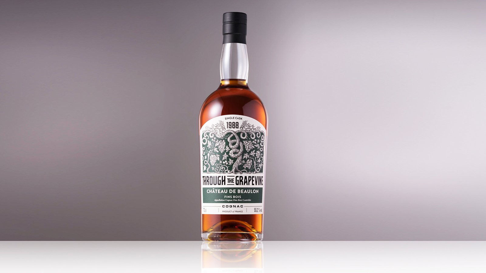
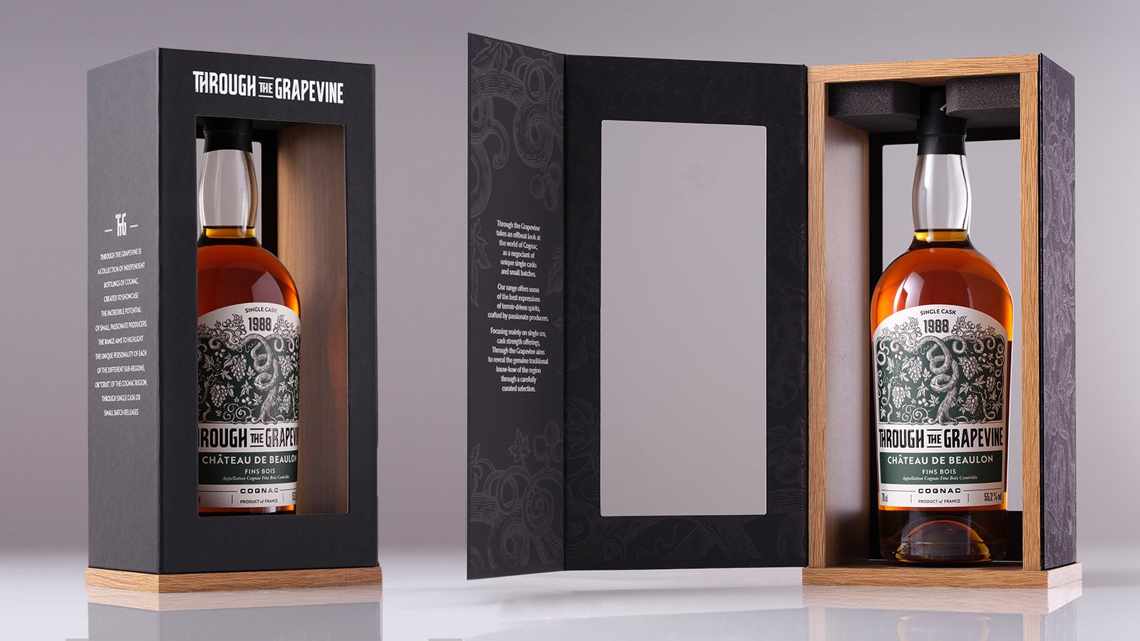
Through the Grapevine (TTG) is a range of independently bottled cognacs, designed to highlight the talent of small producers. Since its launch in 2016, this collection has celebrated the Cognac terroir with unique vintages, sourced from single casks or small batches from exceptional estates. By offering single-cru and primarily cask-strength cognacs, TTG seeks to reveal the authenticity of the region's traditional craftsmanship.

We were tasked with redesigning the identity of the TTG range, with a particular focus on creating a new logo and developing custom illustrations. The use of varied hues depending on the different houses, the meticulous work of fine engraving illustrations, and the attention to print finishing give the range a distinctive authenticity with a touch of modernity.

Assignments:
Graphic identity
Illustration
Primary and secondary packaging design

LA BALEINE À CABOSSE - PACKAGING DESIGN


TASTING BOX

PACKAGING DESIGN

Embark on a gustatory adventure with our latest creation for La Baleine à Cabosse: a "Chocolate World Tour" tasting box, where every detail is carefully crafted to offer you a delicious experience.

To bring a touch of originality to this tasting, we designed an exclusive cardboard tray, providing a dynamic presentation of the chocolate discs. This arrangement instantly arouses the desire to taste. The offset structure of the tray ensures the stability of the discs during transport, thus guaranteeing a preserved tasting experience.

In this aesthetically pleasing and playful box, you will find a collection of 20 discs, representing 10 carefully selected terroirs.

A detailed leaflet guides this exploration, displaying the unique characteristics of each terroir. To refine your palate, a flavor wheel is integrated into the box to identify those taste nuances that often elude you, adding an even more sensory dimension to your tasting experience.

Assignments :
Packaging Design

NIKKA FROM THE BARREL - PACKAGING DESIGN


PRODUCT DESIGN

PACKAGING DESIGN

CELLULOSE BOX

Following the success of the Nikka From the Barrel Silhouette launched last year, we are pleased to present a new version: the silhouette box, which includes two glasses and a pourer. This unique edition follows an eco-responsible approach, featuring a handle made from entirely natural materials (70% sugarcane derivatives and 30% wood pulp). A new version that is 100% recyclable.

Assignments :
Packaging Design

COMTESSE DU BARRY - DESIGN PACKAGING


Comtesse du Barry box

PACKAGING DESIGN

Comtesse du Barry has been growing and evolving for more than a century. The Maison blew out this year its 100 candles. Such beautiful years during which the company imagined, conceived, produced and proposed French premium gastronomic delights.

On the occasion of its 100th anniversary, Comtesse du Barry assigns us many gourmet and festive innovations (from the packaging to the showcase) for its customers‘enjoyment.

Echoing the precious Art Deco motifs which symbolize the festivities of 1908,
the Christmas 2018 collector boxes open onto a world of elegance that fits perfectly with the iconic delicacies of the brand.

Gabrielle box
We created a prestige box to pay tribute to Gabrielle Dubarry, founder of the House : Gabrielle, an exceptional goose foie gras imagined in a limited edition. This signature foie gras is presented in a prestigious setting, the “secret trunk”.

Terrine box
There’s no doubt that the magic of the Christmas period can be found in its collection of terrine, fully redesigned with art deco patterned drawers.

Advent calendar
Over time, a new surprise is revealing each morning... In order to make the wait for Christmas a real pleasure, we imagined a graphic and gourmet calendar that takes the form of a shop as we could have found 110 years ago.

This openable calendar delivers all its delicious secrets and enhances the effect of surprise as each calendar contains a ticket to win.

Assigments: Packaging design
Christmas Showcase Design
Production follow up

EXCELLENCE RHUM - PACKAGING DESIGN


PACKAGING DESIGN

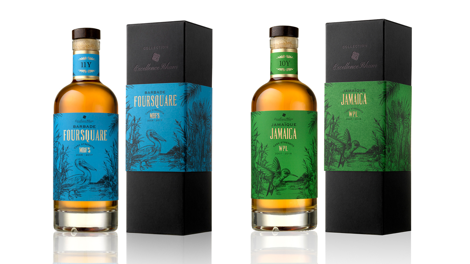
Excellence Rhum, a family company, honors the authenticity of rums from all over the world and the expertise of traditional distilleries.

For the creation of its "COLLECTION" range, we have established a brand identity and a graphic universe for the 4 first aged rum cuvees with strong tasting notes.

Our concept, based on strong elements from the 4 Caribbean islands, illustrates the history and the identity of rum varieties.

The selection of typical elements from each local culture has enabled us to represent each cuvee with an animal as an ambassador and a symbol of each island.

The use of vivid colors in delicate engraving illustrations gives to the range a real authenticity with a touch of modernity. The colors have been selected so as to highlight the different color and origin of each rum.

Assignments :                      Brand identity  
Packaging Design                  Manufacturing follow-up

SHISEIDO - PACKAGING DESIGN


PACKAGING DESIGN

SHISEIDO FUTURE SOLUTION LX.

Development of a prestigious end-of-year box set. For women who want a line of global anti-aging skin care creams using the latest technologies.

Design of the box set on the origami theme in line with the brand's premium positioning. A design faithful to the SHISEIDO identity, combining discovery and folding, strongly embodying contemporary Japan.

The camellia, symbol of the brand, comes close the box. The latter is dressed a textured black paper and a gold interior.

Assignement:
Packaging design

ECRIN DE FLEUR - GLOBAL DESIGN


GLOBAL DESIGN

Global design for a brand of natural soaps, made in France and intended for Chinese consumers. The Ecrin de Fleur soaps are made from natural ingredients and respect the environment, presenting various benefits for the skin.

Creation of the brand name, from its identity and graphic universe to the design of its packaging.
Creation of a strong and spiritual symbol to represent the brand: the flower of life, recognized universally and that can be found in many temples in China. This flower emits a harmonious and beneficial wave: a symbolic rosette of the elements of nature.

Reflecting the natural state of mind of the brand, it is an identity that underlines a link between well-being of the body and the mind and reveals the properties of its soaps: the soaps of the brand regenerate, rebalance, harmonize, energize and protect from external aggressions.

The packaging reinforces the brand’s spirit, and underlines a double meaning:
- A refined aspect, echoing the quality and purity of the ingredients, representative of the spiritual values of Ecrin de Fleur.
- The importance of nature, with a herbalist design illustrating the perfume of each soap. Work on a colour range consistent with the soaps' perfume while creating a beautiful harmony range.

The naming of the brand was chosen to reflect the intrinsic qualities of the products. The flower of life (fleur) as a symbolic and inseparable symbol of the brand's visual identity, and the jewel case (écrin) to emphasize the precious qualities of its products: a ritual of care that contains many benefits for the body and the mind.

Assignments:
Brand Strategy
Brand name
Brand Identity
Packaging design
Graphic charter


ROCHE MAZET - PACKAGING DESIGN


PACKAGING DESIGN

Roche Mazet, brand of the Castel Frères group, is a family-run company which produces wines from the pays d’Oc and shares it passion for the French soil since 1998.

For the summer of 2017, we created an innovative box to magnify its bag-in-box range with a precise meaning and function, while remaining in line with its values: a wine of quality and accessible to the greatest.

We chose to go beyond its practical aspect by bringing an added value to underline its difference and by creating a shared enjoyment with the accessory. We created an innovative box, which will be used for its 7 references: 2 reds, 2 whites and 3 rosés.

After studying everything that could have been done in this sector, we worked on several essential criterias: making it unique as much as practical, aesthetic and playful, matching with a wide audience in various situations.

Aesthetic by the object’s purity and simplicity, which can be placed on any table, from a chic buffet to a summer picnic.
Practical thanks to its carrying handle and its elevation, facilitating the service to the glasses without tilting neither the BIB nor the accessory.

Playful by its pivoting function, which creates an effect of surprise during moments of sharing, while facilitating the insertion of the BIB and the access to the tap: an accessory that remains faithful to the spirit of the brand.

 
Assignments :

Packaging design
Shooting


LA MAISON DU CHOCOLAT - CAVIAR PACKAGING


PACKAGING DESIGN

Caviar and Vodka Box Set Development of an ephemeral box for the Christmas period based on new territories of tastes.
A round and elegant case outlining the graphic codes of an exceptional product: caviar.
Adorned with a black embossed paper, the objective was to awaken curiosity and offer the customers a new tasting gesture.

Assignements:
Packaging design
Graphic design
Production monitoring

ROSÉ NO. 8 - CHAMPAGNE AYALA - UNIQUE VINTAGE


PACKAGING DESIGN

Visual identity and packaging of the Ayala Rosé No. 8 unique vintage.

Our aim was to create a visual identity and packaging that would express both the values of a great champagne house and the intrinsic qualities of an exceptional wine.

That is why we have set up a relationship between the container (packaging design) and the content (the wine) to build our creative concept.

No. 8 was selected to reflect the rarity, excellence and precision that typify this special vintage. The sensuous curves of the packaging, the bottle and the label all emphasise refinement, elegance and femininity, which are the signatures of the cellar master Caroline Latrive.

The light, ethereal and festive characteristics of the Art Deco patterns are a nod to the 1920s, the golden age of Ayala. The fresh colours and voluptuously curved geometric shapes have been selected to create brand codes that are easily recognizable and applicable to all publicity material.

The chalk colour and textured paper are evocative of the limestone of the precious terroir and its features.

Assignments:
Graphic identity of the cuvée
Creation of the box volume
Declination of identity on communication media
(mood photos, press advertisement, bags, press kit, flyers, window dressing)

KAVALAN TAIWANESE WHISKY


PACKAGING DESIGN

Drawing on the famous Taipei 101 tower in Taiwan, the Kavalan bottle has an original shape that stands out immediately. That reference to the local architecture was the starting point of our packaging research. Taiwan combines technical efficiency and innovation with traditional Chinese curved roofs, bright colours and nested lines. Keeping that blend of tradition and modernity in mind, we have decided to work on simple shapes that refer to the contours of contemporary monuments to which we have added subtlety that will become the signature of the brand. The edge at the top of our boxes is curved, in a nod to the dynamic of oriental roofs, associated to the cultural symbol of elegance and vitality.

Like the fronts of both old and modern buildings, particularly that of the Kavalan distillery, our packs have been given a geometrical finish.

Clean lines that work with each other, colours of natural elements and rhythmic curves create a range effect while giving each product its own identity through effects
and finishes.

Since 2011, the agency has been revisiting the codes of many Maison du Whisky brands, experts of rare bottles and exclusive distributors of the brand in Europe. www.lmdw.com

Assignments:
Graphics identity
Packaging design

SIX-YEAR OLD VINTAGE VIRGINIE T. CHAMPAGNE


VISUAL IDENTITY AND PACKAGING DESIGN

For VIRGINIE T., her own brand of exceptional mature vintages, Virginie Taittinger was looking for a visual identity and packaging that would be consistent with the two key values of her House:
- Innovation, which is reflected both in the way the champagne is made and in its exclusive distribution via the website of the brand: www.champagnevirginiet.com
- Traditional ancestral know-how, which is so specific to great champagnes

Classical patterns in a Second Empire style have been livened up by bright colours that reflect the modernity of the packaging innovation: a case that turns into a champagne bucket and can hold chilled water for several hours. Thanks to thermochromic ink, the VIRGINIE T. marking at the back of the bottle changes from white to red when the ideal serving temperature of 8°C is reached. 

Assignments:
Graphics identity
Typography design
Packaging design
Graphics rules and packaging

PLANTATION VINTAGE COLLECTION - VISUAL IDENTITY AND PACKAGING DESIGN


VISUAL IDENTIFICATION AND PACKAGING DESIGN

Concept around a graphics composition with an illustration design typical of the 18th century, to restate the historic roots of the brand and its pillars and to create a range effect by making the products stand apart (terroirs).

Assignments:
Brand platform
Visual identity
Packaging design
Graphics rules
Communication media
Finalisation of bottle materials by Julien Fort

LA MAISON DU CHOCOLAT - WHITE DAY AND SPRING BOX


PACKAGING DESIGN

A delicate, elegant and simple box, on a pearly white background, named after the Japanese festival of 14 March. 

The box features cherry blossom flowers that evoke the season, love and the exclusive recipe of these chocolates (tea and cherry blossom ganache). 

Assignments:
Packaging design
Graphic presentation
Production monitoring
Photo copyright: Caroline Faccioli

NIKKA WHISKY JAPONAIS - 12 YEARS OLD


PACKAGING DESIGN

An “old school” imposing box that matches the design of this 12 years old whisky bottle.