EXCELLENCE RHUM - PACKAGING DESIGN


PACKAGING DESIGN

Excellence Rhum, a family company, honors the authenticity of rums from all over the world and the expertise of traditional distilleries.

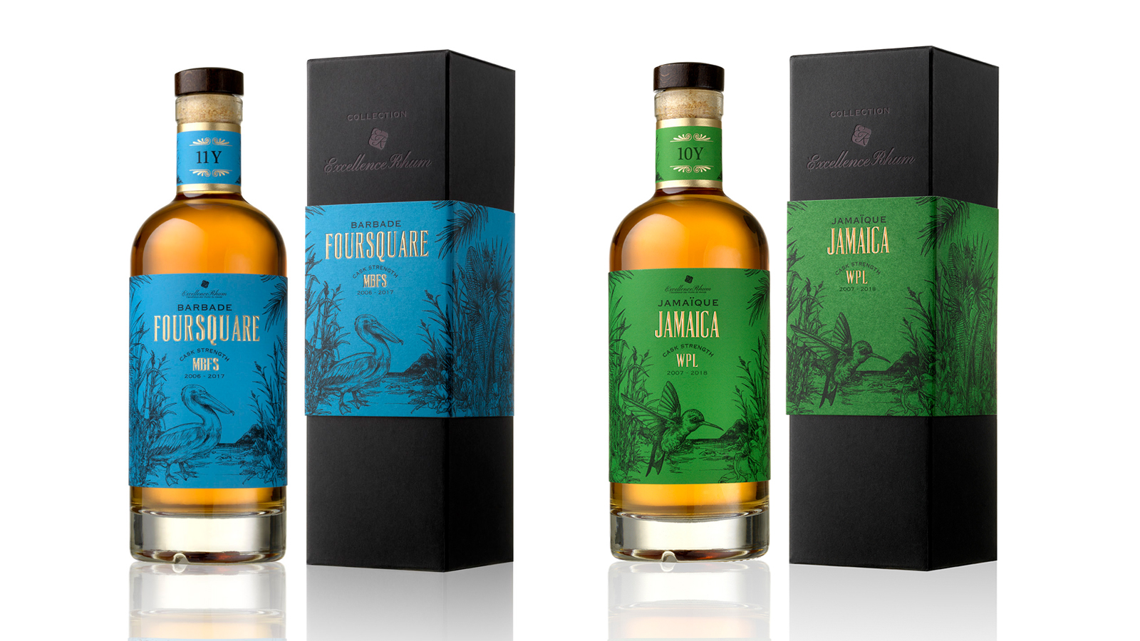
For the creation of its "COLLECTION" range, we have established a brand identity and a graphic universe for the 4 first aged rum cuvees with strong tasting notes.

Our concept, based on strong elements from the 4 Caribbean islands, illustrates the history and the identity of rum varieties.

The selection of typical elements from each local culture has enabled us to represent each cuvee with an animal as an ambassador and a symbol of each island.

The use of vivid colors in delicate engraving illustrations gives to the range a real authenticity with a touch of modernity. The colors have been selected so as to highlight the different color and origin of each rum.

Assignments :                      Brand identity  
Packaging Design                  Manufacturing follow-up

SIX-YEAR OLD VINTAGE VIRGINIE T. CHAMPAGNE


VISUAL IDENTITY AND PACKAGING DESIGN

For VIRGINIE T., her own brand of exceptional mature vintages, Virginie Taittinger was looking for a visual identity and packaging that would be consistent with the two key values of her House:
- Innovation, which is reflected both in the way the champagne is made and in its exclusive distribution via the website of the brand: www.champagnevirginiet.com
- Traditional ancestral know-how, which is so specific to great champagnes

Classical patterns in a Second Empire style have been livened up by bright colours that reflect the modernity of the packaging innovation: a case that turns into a champagne bucket and can hold chilled water for several hours. Thanks to thermochromic ink, the VIRGINIE T. marking at the back of the bottle changes from white to red when the ideal serving temperature of 8°C is reached. 

Assignments:
Graphics identity
Typography design
Packaging design
Graphics rules and packaging

PLANTATION VINTAGE COLLECTION - VISUAL IDENTITY AND PACKAGING DESIGN


VISUAL IDENTIFICATION AND PACKAGING DESIGN

Concept around a graphics composition with an illustration design typical of the 18th century, to restate the historic roots of the brand and its pillars and to create a range effect by making the products stand apart (terroirs).

Assignments:
Brand platform
Visual identity
Packaging design
Graphics rules
Communication media
Finalisation of bottle materials by Julien Fort