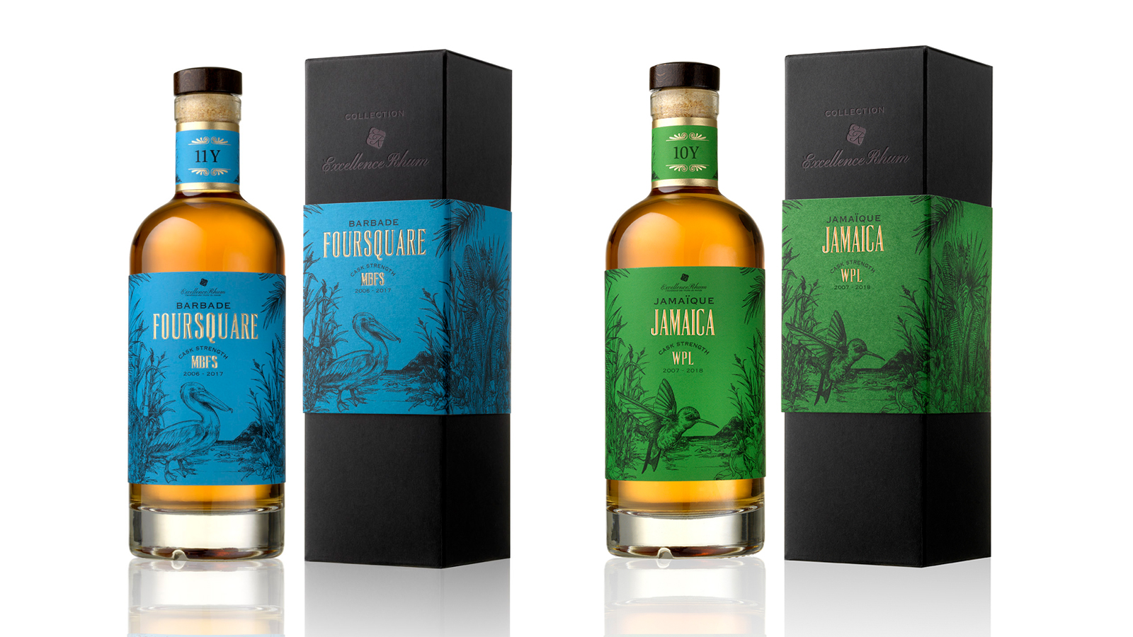
LONGUETEAU - EXCELLENCE RHUM CUVEE
/
PACKAGING DESIGN
We had the honour of designing the packaging for this unique white rum cuvée, born from a collaboration between Maison Excellence Rhum and the Longueteau distillery.
A true product of exceptional craftsmanship, this white rum originates from Plot No. 9, made from a meticulous selection of red sugarcane (R-579), harvested and distilled in March 2022.
For this cuvée's design, we created an illustration that merges two worlds:
On one side, the iconic monuments of Paris, symbols of elegance and heritage that reflect the identity of Excellence Rhum, a flagship boutique in Paris’ 6th arrondissement.
On the other, the Creole architecture of traditional Guadeloupean homes, paying tribute to the roots of the Longueteau distillery.
These two worlds are woven together into a refined and sophisticated line art fresco, where each architectural element blends seamlessly with the others.
The result is a unique and coherent visual landscape — halfway between Paris and Guadeloupe — that elevates the identity of this cuvée and offers a visual experience honouring the richness of both cultures.
When the packaging is placed side by side, the illustration extends into a complete fresco, visually uniting the timeless elegance of Paris with the authentic spirit of Guadeloupe. Two identities merging into one singular vision.
Assignments :
Packaging design
Iconography