
AIKAN WHISKY - GLOBAL DESIGN AND COMMUNICATION
/


GLOBAL DESIGN AND COMMUNICATION
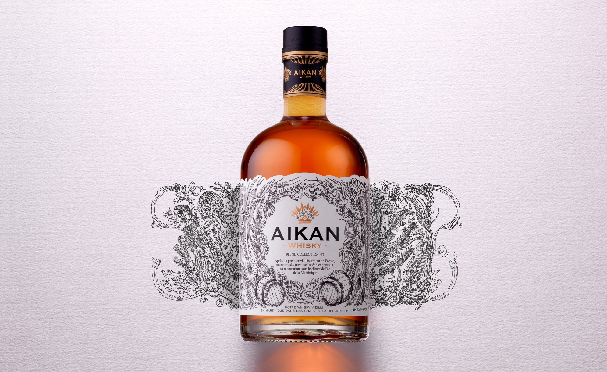
Aikan is a whisky distilled and matured in France and in Scotland, which then crosses the ocean to arrive up to the Caribbean sea.
It is on the Martinique island that the distillation is pursued, nearby a water source flowing from the Pelée mountain.
There, the whisky ages in oak barrels in JM’s rum distillery wineries.
Aikan means « wedding » in Arawak, which was the language of the first Amerindian in Martinique.
We chose that mixing would be the key element to create the visual identity of the brand, which will be applied to all of its communication mediums.
Aikan’s identity is the result of two climates and also two different times, finding its inspiration in the Amerindian era, the first ones to arrive in Martinique.
We put forward the union between these different universes, which intertwine through an illustration simultaneously ancient, contemporary and representative of the cultural union between Europe and Martinique.
The logo, which represents an Amerindian hairstyle with feathers, also incorporates a lily flower, an explicit reference to the union of these cultures.
We also added a reinforced and hidden message at the back of the facing: the representation of the union between a European woman of that time and an Amerindian man.
This is the symbol of the authentic union of two cultures (printing of a double-sided adhesive label).
Assignments:
Brand strategy
Brand identity
Packaging design
Communication mediums
Iconography
Motion design


