LA BALEINE A CABOSSE - GLOBAL DESIGN


GLOBAL DESIGN

Claire and Aurélien did not know anything about cocoa until the day they decided to travel to Colombia. They discovered the richness and the variety of cocoa beans. Far from industrial chocolate, they threw themselves into the “bean-to-bar” concept (which means “from the cocoa bean to the chocolate bar”). They roast, crush, winnow and grind the cocoa beans within their store in Marseilles (France) to produce their own range of chocolates. The couple, passionate about their new profession, emphasize on homemade chocolate. In one chocolate bar, there is an explosion of flavors.

It is directly from Colombia that Claire and Aurélien contacted the 2S Global Design agency to help them for their project. Our mission was to develop the global design of the brand.

Why is the brand named La Baleine à Cabosse? (which means “The Whale with the hump” in French. “Bosse” means hump and “Cabosse” means cocoa bean.) In Tumaco, when coming back from a tour of cocoa plantations, the couple saw humpback whales. Their shape immediately reminded them of cocoa beans. That is how La Baleine à Cabosse was created, a legendary creature that traverses the Pacific waters looking for boats filled with cocoa. Apparently, if you see one of these whales from the shore, you are guaranteed to have a spectacular crop the following year.

By creating the identity of the brand, we brought life to the whale “à cabosse” who carries on her back trips from different regions of Colombia, the rising star of exceptional cocoa. The warm colors and raw materials make La Baleine simultaneously traditional and modern. The concept of the brand’s identity had to break with the traditional codes of chocolate factories and sweet stores.

The design of the chocolate bar was made so as to reinforce the story of the brand. We created a thin and wavy shape, making the squares of chocolate easy to cut and enjoyable to eat.

The packaging was conceived without any glue. It is a simple folding decorated by the atmosphere and the decor of the couple’s fabulous trip to Cordoba, Arauca and Tumaco, different regions of Colombia. 3 terroirs, resulting in 3 different flavors.

The universe of the store is shimmering and colorful, combining raw materials and different flat tints in harmony with the identity codes of the brand.

Assignments:
Brand strategy
Brand identity
Packaging design
Culinary design
Communication mediums

AIKAN WHISKY - GLOBAL DESIGN AND COMMUNICATION


GLOBAL DESIGN AND COMMUNICATION

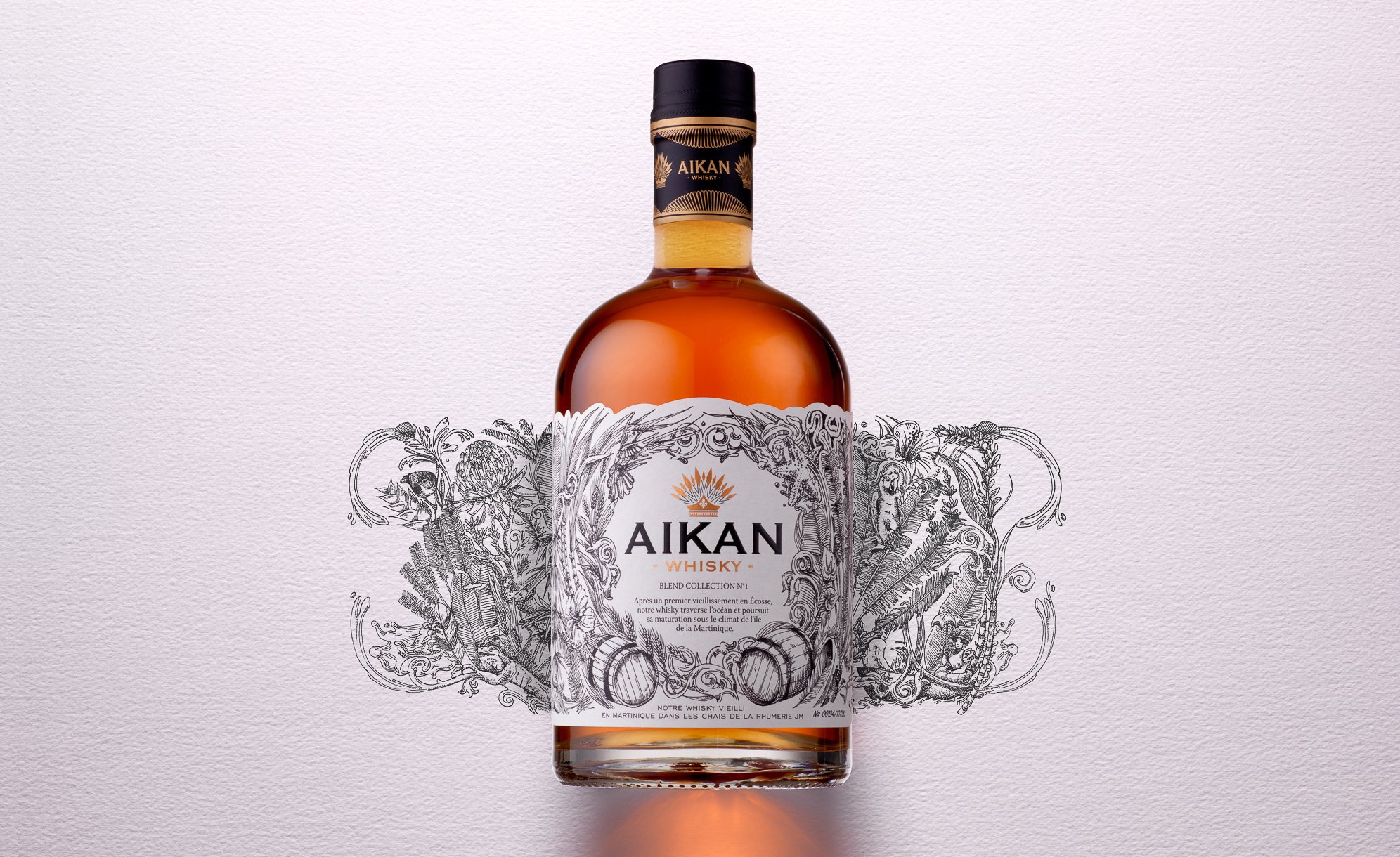
Aikan is a whisky distilled and matured in France and in Scotland, which then crosses the ocean to arrive up to the Caribbean sea.
It is on the Martinique island that the distillation is pursued, nearby a water source flowing from the Pelée mountain.
There, the whisky ages in oak barrels in JM’s rum distillery wineries.

Aikan means « wedding » in Arawak, which was the language of the first Amerindian in Martinique.
We chose that mixing would be the key element to create the visual identity of the brand, which will be applied to all of its communication mediums.

Aikan’s identity is the result of two climates and also two different times, finding its inspiration in the Amerindian era, the first ones to arrive in Martinique.

We put forward the union between these different universes, which intertwine through an illustration simultaneously ancient, contemporary and representative of the cultural union between Europe and Martinique.

The logo, which represents an Amerindian hairstyle with feathers, also incorporates a lily flower, an explicit reference to the union of these cultures.

We also added a reinforced and hidden message at the back of the facing: the representation of the union between a European woman of that time and an Amerindian man.
This is the symbol of the authentic union of two cultures (printing of a double-sided adhesive label).

Assignments:
Brand strategy
Brand identity
Packaging design
Communication mediums
Iconography
Motion design


PARIS CROISSANT - GLOBAL DESIGN


GLOBAL DESIGN AND COMMUNICATION

The SPC Korean group is an entity which mainly operates in the food industry, notably in the bakery and confectionary sectors, and holds the Paris Baguette, Paris Croissant and Shany brands.
It entrusted us with the global design of their most premium brand, which counts more than 20 shops in Asia and worldwide: Paris Croissant.
Our mission relied on bringing our premium French touch in all communication mediums.

Creation of a new identity for the Paris Croissant brand:
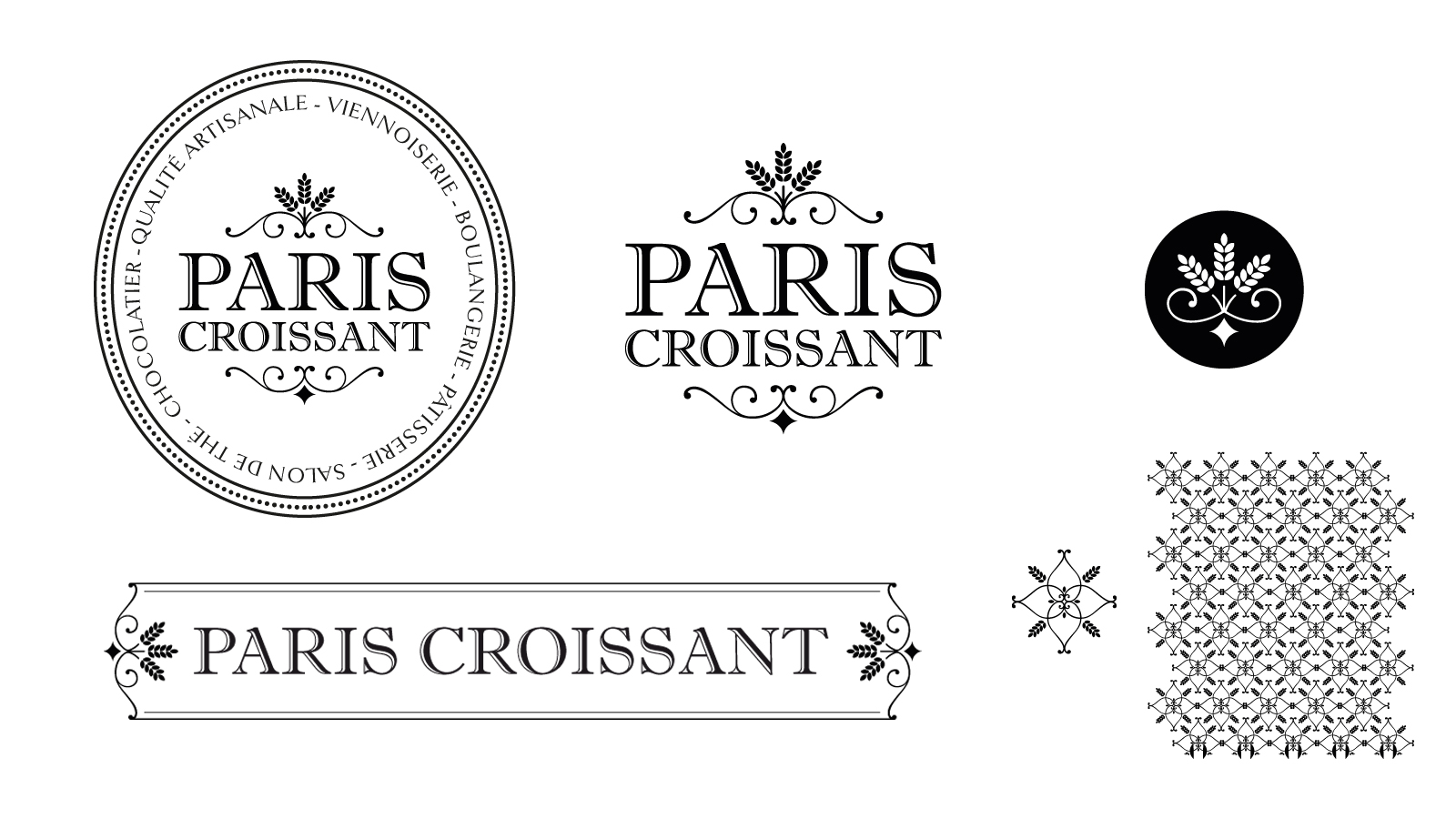
Paris being the French capital of bakery and pastry, we drew our inspiration from the ancient Parisian bakeries’ style, to conceive the new Paris Croissant identity.
The typography has been refined through two approaches: tradition and modernity.
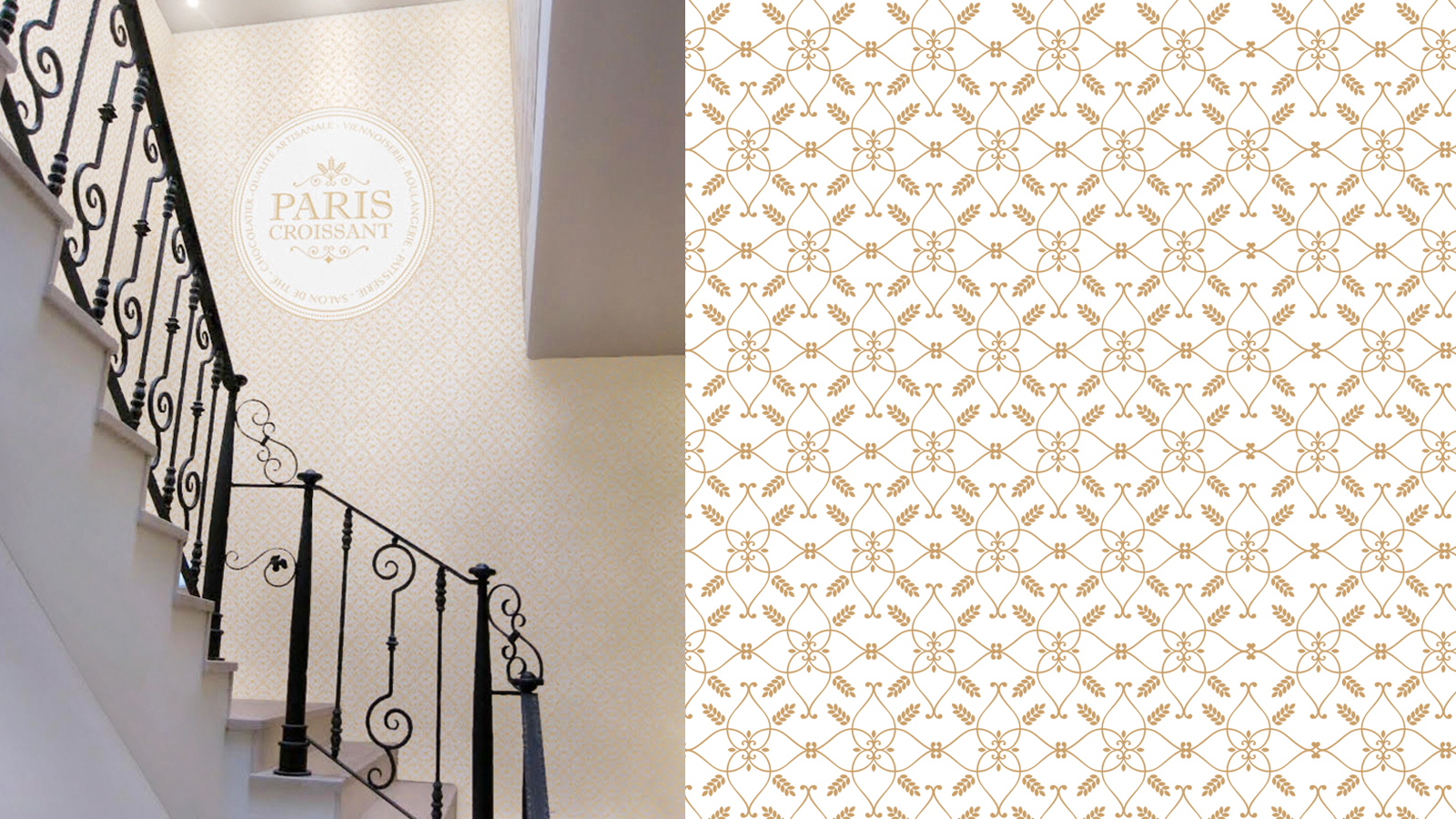
The wheat symbol is included to reinforce the brand’s universe. It has been graphically designed in several ways, including a pattern, which can be used either in print communication or in space design. The different versions of the logotype have been conceived for each communication medium to create a strong and coherent visual identity.

Creation of a new packaging identity:
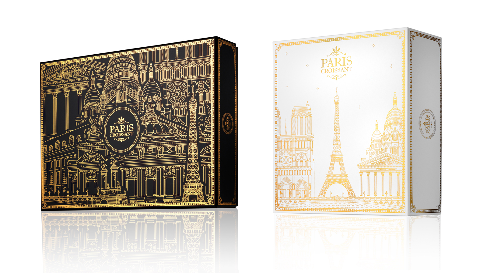
Our concept: the French art de vivre. French people share a way of life inherited from their culture. They appreciate wandering, looking at historical monuments, having coffee, going shopping…
Going to Paris Croissant means stepping into French culture. It is about taking the time to taste a good pastry in a decor that is built to immerse you in the heart of the French capital. It implies engaging oneself in tourism and discovering the city through the packaging specifically conceived to match with the brand’s universe.
We declined this new packaging and merchandising concept for the Christmas and Valentine’s Day festivities, selecting the most accurate monuments for each theme.
To establish coherence between the new brand image and the boutiques, SPC also entitled us with the decor of a flagship boutique in the French neighbourhood of Seoul: Seorae.

Assignments:
Branding strategy
Brand identity
Packaging design
Merchandising
Communication supports
Boutique design

CHATEAU DU SEUIL - GLOBAL DESIGN


VISUAL IDENTITY AND GLOBAL DESIGN

Château du Seuil en Provence is a 55 hectares vineyard located on the sunny slopes in the center of the appellation Coteau d'air in Provence.
Great wines from Provence rosés but also white and red ones.

 
A concept around a view of the garden from the sky to create a brand code distinguishing itself from its main competitors in the region.
Declination of this new identity on each communication medium, beginning with the design of the whole wine range. Manufacturing recommendation.
Choice of an identity bottle standard. Work on the label shape. Textured and gilded paper with brand code.


Assignments:
Brand platform
Visual identity Packaging design
Graphic charter
Communication media

L'ATELIER JÉRÔME VERZEGNASSI - GLOBAL DESIGN


GLOBAL DESIGN

To accompany the company's move upmarket, we created a communication territory, a visual identity, a name and all supporting communication media, presenting their full capacity to manage all types of project. 

Assignments
Name creation
Graphic identity (logo and graphic environment)
Sales brochure
Copywriting
Press releases
Printed materials

SCHROEDER JOAILLIERS - PAS DE DEUX - ARABESQUE COLLECTION


SCHROEDER JOAILLIERS - PARFUM - PAS DE DEUX

GLOBAL DESIGN

An overarching concept surrounding the identity pattern of the Pas de Deux brand (the trapeze) on its 25th anniversary and the launch of the Arabesque collection.

Assignments:
Visual identity
Perfume set
Content design
Press kit and catalogue
Hosting of an event for 900 people
Merchandising
Brand imagery