MAISON BLIN ARTISAN PASTA
/GLOBAL DESIGN
Sébastien Blin asked the agency to develop a packaging concept that stands out from current trends by highlighting the traditional and innovative aspects of his products. He has just created his brand of flavoured pasta made in Beauce, France. His ambition is to sell his products through all the premium grocery stores in Paris, in a spirit of short local marketing circuits, since his farm is located a mere 50 km from the capital.
Brand name creation. We have opted for an authentic name, both traditional and modern, which uses the client’s last name. The addition of the word “Maison” reflects know-how and reliability, and does not limit the range to pasta.
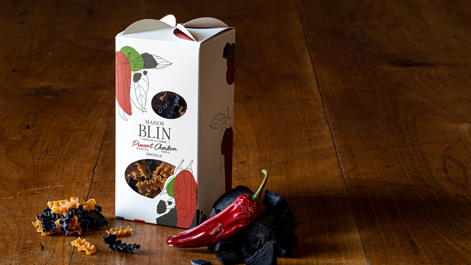
While creating the packaging, we were looking for something simple, elegant and easy to identify, which stands well apart from the competition with a signed folded part on the top of the package that evokes windmill sails, since the wheat is milled in a nearby mill. The product can be seen through windows that are shaped to convey identity and blend in with the graphics.
For the graphics that identify Maison Blin, we continued with the combination of modernity and tradition, drawing inspiration from the simple recipes of the products. The drawing of one of the ingredients in an engraving style and graphic spots of colour to symbolise the other ingredient come together to express the concept of the brand: dual taste.
The result is a clean design and a product that can be understood at first glance.
This graphics style will be used on all the advertising material of the brand.
All the images were taken directly in the Maison Blin farm, in natural light to stress the genuine and natural side of the brand.
Which ones would you choose?
www.maisonblin.fr
Assignments:
Brand strategy
Naming
Brand identity
Packaging design
Iconography
Web design


