SAINT JAMES - PACKAGING DESIGN


PACKAGING DESIGN

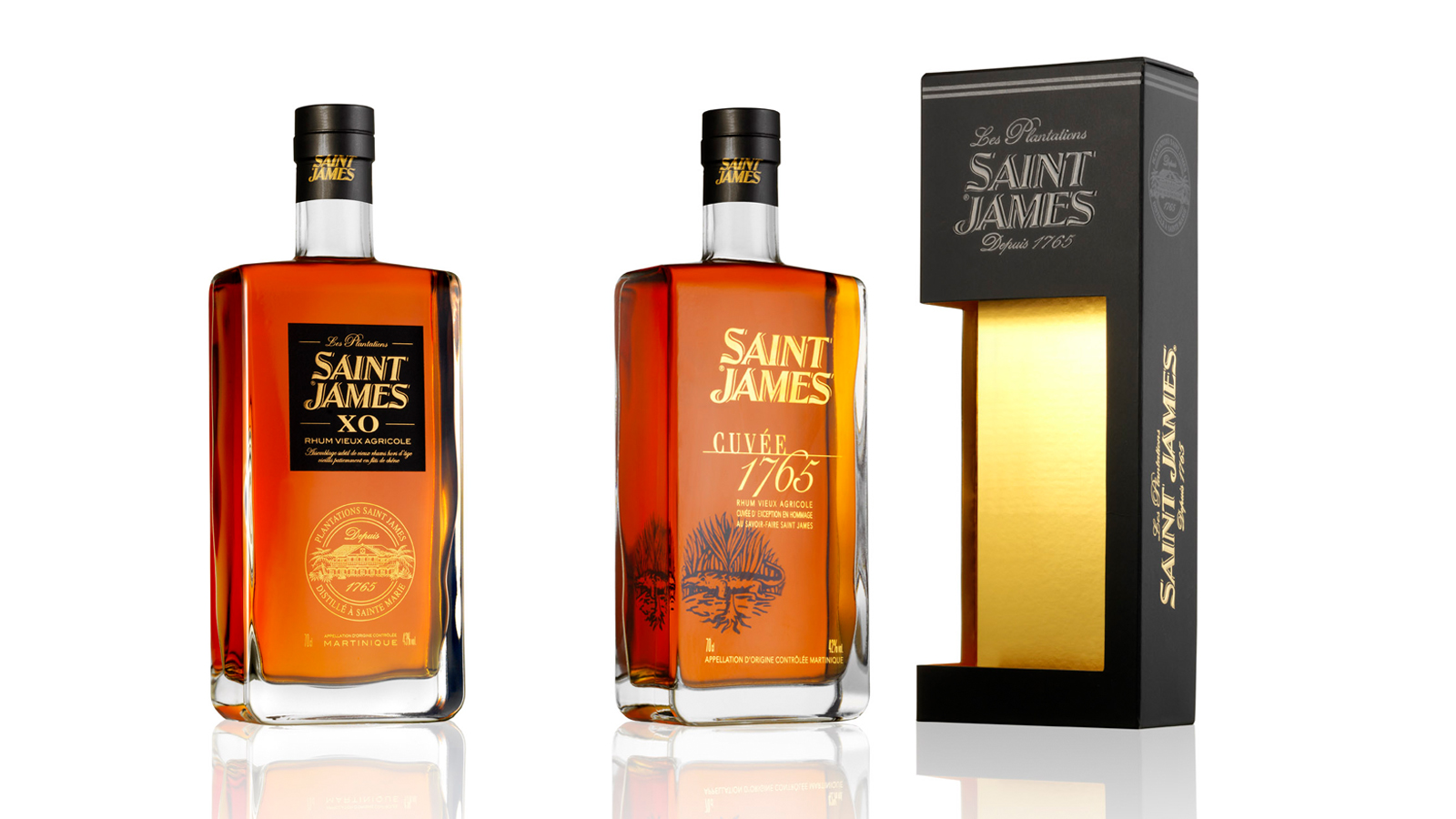
SAINT JAMES agricole rums, famous all over the world for their exceptional quality, are the fruit of a long history of passion, know-how and expertise which started in 1765. 

Elaborated from fresh pure sugarcane juice, SAINT JAMES rums have been accredited the Martinique A.O.C. ( Appellation d’Origine Contrôlée/Controlled Designation of Origin) which ensures their quality and their intimate link with the planting terroir.

Our mission was to create a packaging common to the three different SAINT JAMES references. The packaging size was adapted to the Long Island 70 cl.  This packaging had to value the SAINT JAMES brand and to drive purchase intent across the various distribution networks: GMS, Wine merchants, Export (Duty-free).

We created a sober packaging following the codes of the luxury sector,  with a window in the box which lets the front label of the brand readable. The graphics are consistent with the packaging of the 3 decanters so as to create a range effect. The window was designed shifted and overflowing on the side of the packaging to give an identity to the packaging and emphasize the shape of the bottle.

A "Neutral" marking in a way that it is adaptable on the 3 references. - printing on matt black paper: embossing, hot gilt, selective varnish. The inner packaging was lined with gold to sublimate the color of rum drinks.

Assignments :                      Graphic & packaging design   Manufacturing follow-up

LA BALEINE A CABOSSE - GLOBAL DESIGN


GLOBAL DESIGN

Claire and Aurélien did not know anything about cocoa until the day they decided to travel to Colombia. They discovered the richness and the variety of cocoa beans. Far from industrial chocolate, they threw themselves into the “bean-to-bar” concept (which means “from the cocoa bean to the chocolate bar”). They roast, crush, winnow and grind the cocoa beans within their store in Marseilles (France) to produce their own range of chocolates. The couple, passionate about their new profession, emphasize on homemade chocolate. In one chocolate bar, there is an explosion of flavors.

It is directly from Colombia that Claire and Aurélien contacted the 2S Global Design agency to help them for their project. Our mission was to develop the global design of the brand.

Why is the brand named La Baleine à Cabosse? (which means “The Whale with the hump” in French. “Bosse” means hump and “Cabosse” means cocoa bean.) In Tumaco, when coming back from a tour of cocoa plantations, the couple saw humpback whales. Their shape immediately reminded them of cocoa beans. That is how La Baleine à Cabosse was created, a legendary creature that traverses the Pacific waters looking for boats filled with cocoa. Apparently, if you see one of these whales from the shore, you are guaranteed to have a spectacular crop the following year.

By creating the identity of the brand, we brought life to the whale “à cabosse” who carries on her back trips from different regions of Colombia, the rising star of exceptional cocoa. The warm colors and raw materials make La Baleine simultaneously traditional and modern. The concept of the brand’s identity had to break with the traditional codes of chocolate factories and sweet stores.

The design of the chocolate bar was made so as to reinforce the story of the brand. We created a thin and wavy shape, making the squares of chocolate easy to cut and enjoyable to eat.

The packaging was conceived without any glue. It is a simple folding decorated by the atmosphere and the decor of the couple’s fabulous trip to Cordoba, Arauca and Tumaco, different regions of Colombia. 3 terroirs, resulting in 3 different flavors.

The universe of the store is shimmering and colorful, combining raw materials and different flat tints in harmony with the identity codes of the brand.

Assignments:
Brand strategy
Brand identity
Packaging design
Culinary design
Communication mediums

AIKAN WHISKY - GLOBAL DESIGN AND COMMUNICATION


GLOBAL DESIGN AND COMMUNICATION

Aikan is a whisky distilled and matured in France and in Scotland, which then crosses the ocean to arrive up to the Caribbean sea.
It is on the Martinique island that the distillation is pursued, nearby a water source flowing from the Pelée mountain.
There, the whisky ages in oak barrels in JM’s rum distillery wineries.

Aikan means « wedding » in Arawak, which was the language of the first Amerindian in Martinique.
We chose that mixing would be the key element to create the visual identity of the brand, which will be applied to all of its communication mediums.

Aikan’s identity is the result of two climates and also two different times, finding its inspiration in the Amerindian era, the first ones to arrive in Martinique.

We put forward the union between these different universes, which intertwine through an illustration simultaneously ancient, contemporary and representative of the cultural union between Europe and Martinique.

The logo, which represents an Amerindian hairstyle with feathers, also incorporates a lily flower, an explicit reference to the union of these cultures.

We also added a reinforced and hidden message at the back of the facing: the representation of the union between a European woman of that time and an Amerindian man.
This is the symbol of the authentic union of two cultures (printing of a double-sided adhesive label).

Assignments:
Brand strategy
Brand identity
Packaging design
Communication mediums
Iconography
Motion design


COMTESSE DU BARRY - CHRISTMAS BOX AND ADVENT CALENDAR 2017 - PACKAGING DESIGN


PACKAGING DESIGN

CHRISTMAS BOX AND ADVENT CALENDAR 2017

Being a gastronomy expert, Comtesse du Barry is renowned for its large choice of local products and foie gras specialties.

Christmas is that special time of the year in which we give cards, letters and presents that we wrap.
Through the art of presenting gifts, we tell our loved ones how much they mean to us. Comtesse du Barry wished to develop a range of unforgettable Christmas boxes that would be up to this moment.

In 2017, Comtesse du Barry immersed in the wonderful world of origami. This theme corresponds to its traditional inheritance and its two fundamental values: gastronomy and aristocracy.

Originally, origamis were made with quality materials by aristocrats who wished to present gifts that would show their benevolence to their addressee.  

We conceived the range of Christmas boxes by developing a refined, chic and gourmet origami, like a gift that one would unwrap.
In perfect harmony with the institutional boxes of the brand, we created a combination of colors and luminous effects with a Christmas spirit.

This concept is developed on envelopes, ribbons, the press box and in particular the Comtesse du Barry Advent Calendar. The latter being an innovation for the brand, we chose to develop a noteworthy shape, linked to the main theme.

The calendar unfolds to reveal all of its graphics and its surprises in the style of a chic and gourmet origami.
Behind each square, a candy sagely awaits to be savored each day.

Assignments:
Packaging design

SHISEIDO - PACKAGING DESIGN


PACKAGING DESIGN

SHISEIDO FUTURE SOLUTION LX.

Development of a prestigious end-of-year box set. For women who want a line of global anti-aging skin care creams using the latest technologies.

Design of the box set on the origami theme in line with the brand's premium positioning. A design faithful to the SHISEIDO identity, combining discovery and folding, strongly embodying contemporary Japan.

The camellia, symbol of the brand, comes close the box. The latter is dressed a textured black paper and a gold interior.

Assignement:
Packaging design

ECRIN DE FLEUR - GLOBAL DESIGN


GLOBAL DESIGN

Global design for a brand of natural soaps, made in France and intended for Chinese consumers. The Ecrin de Fleur soaps are made from natural ingredients and respect the environment, presenting various benefits for the skin.

Creation of the brand name, from its identity and graphic universe to the design of its packaging.
Creation of a strong and spiritual symbol to represent the brand: the flower of life, recognized universally and that can be found in many temples in China. This flower emits a harmonious and beneficial wave: a symbolic rosette of the elements of nature.

Reflecting the natural state of mind of the brand, it is an identity that underlines a link between well-being of the body and the mind and reveals the properties of its soaps: the soaps of the brand regenerate, rebalance, harmonize, energize and protect from external aggressions.

The packaging reinforces the brand’s spirit, and underlines a double meaning:
- A refined aspect, echoing the quality and purity of the ingredients, representative of the spiritual values of Ecrin de Fleur.
- The importance of nature, with a herbalist design illustrating the perfume of each soap. Work on a colour range consistent with the soaps' perfume while creating a beautiful harmony range.

The naming of the brand was chosen to reflect the intrinsic qualities of the products. The flower of life (fleur) as a symbolic and inseparable symbol of the brand's visual identity, and the jewel case (écrin) to emphasize the precious qualities of its products: a ritual of care that contains many benefits for the body and the mind.

Assignments:
Brand Strategy
Brand name
Brand Identity
Packaging design
Graphic charter


ROCHE MAZET - PACKAGING DESIGN


PACKAGING DESIGN

Roche Mazet, brand of the Castel Frères group, is a family-run company which produces wines from the pays d’Oc and shares it passion for the French soil since 1998.

For the summer of 2017, we created an innovative box to magnify its bag-in-box range with a precise meaning and function, while remaining in line with its values: a wine of quality and accessible to the greatest.

We chose to go beyond its practical aspect by bringing an added value to underline its difference and by creating a shared enjoyment with the accessory. We created an innovative box, which will be used for its 7 references: 2 reds, 2 whites and 3 rosés.

After studying everything that could have been done in this sector, we worked on several essential criterias: making it unique as much as practical, aesthetic and playful, matching with a wide audience in various situations.

Aesthetic by the object’s purity and simplicity, which can be placed on any table, from a chic buffet to a summer picnic.
Practical thanks to its carrying handle and its elevation, facilitating the service to the glasses without tilting neither the BIB nor the accessory.

Playful by its pivoting function, which creates an effect of surprise during moments of sharing, while facilitating the insertion of the BIB and the access to the tap: an accessory that remains faithful to the spirit of the brand.

 
Assignments :

Packaging design
Shooting


PARIS CROISSANT - GLOBAL DESIGN


GLOBAL DESIGN AND COMMUNICATION

The SPC Korean group is an entity which mainly operates in the food industry, notably in the bakery and confectionary sectors, and holds the Paris Baguette, Paris Croissant and Shany brands.
It entrusted us with the global design of their most premium brand, which counts more than 20 shops in Asia and worldwide: Paris Croissant.
Our mission relied on bringing our premium French touch in all communication mediums.

Creation of a new identity for the Paris Croissant brand:
Paris being the French capital of bakery and pastry, we drew our inspiration from the ancient Parisian bakeries’ style, to conceive the new Paris Croissant identity.
The typography has been refined through two approaches: tradition and modernity.
The wheat symbol is included to reinforce the brand’s universe. It has been graphically designed in several ways, including a pattern, which can be used either in print communication or in space design. The different versions of the logotype have been conceived for each communication medium to create a strong and coherent visual identity.

Creation of a new packaging identity:
Our concept: the French art de vivre. French people share a way of life inherited from their culture. They appreciate wandering, looking at historical monuments, having coffee, going shopping…
Going to Paris Croissant means stepping into French culture. It is about taking the time to taste a good pastry in a decor that is built to immerse you in the heart of the French capital. It implies engaging oneself in tourism and discovering the city through the packaging specifically conceived to match with the brand’s universe.
We declined this new packaging and merchandising concept for the Christmas and Valentine’s Day festivities, selecting the most accurate monuments for each theme.
To establish coherence between the new brand image and the boutiques, SPC also entitled us with the decor of a flagship boutique in the French neighbourhood of Seoul: Seorae.

Assignments:
Branding strategy
Brand identity
Packaging design
Merchandising
Communication supports
Boutique design

CHATEAU DU SEUIL - GLOBAL DESIGN


VISUAL IDENTITY AND GLOBAL DESIGN

Château du Seuil en Provence is a 55 hectares vineyard located on the sunny slopes in the center of the appellation Coteau d'air in Provence.
Great wines from Provence rosés but also white and red ones.

 
A concept around a view of the garden from the sky to create a brand code distinguishing itself from its main competitors in the region.
Declination of this new identity on each communication medium, beginning with the design of the whole wine range. Manufacturing recommendation.
Choice of an identity bottle standard. Work on the label shape. Textured and gilded paper with brand code.


Assignments:
Brand platform
Visual identity Packaging design
Graphic charter
Communication media

LA MAISON DU CHOCOLAT - CAVIAR PACKAGING


PACKAGING DESIGN

Caviar and Vodka Box Set Development of an ephemeral box for the Christmas period based on new territories of tastes.
A round and elegant case outlining the graphic codes of an exceptional product: caviar.
Adorned with a black embossed paper, the objective was to awaken curiosity and offer the customers a new tasting gesture.

Assignements:
Packaging design
Graphic design
Production monitoring

ROSÉ NO. 8 - CHAMPAGNE AYALA - UNIQUE VINTAGE


PACKAGING DESIGN

Visual identity and packaging of the Ayala Rosé No. 8 unique vintage.

Our aim was to create a visual identity and packaging that would express both the values of a great champagne house and the intrinsic qualities of an exceptional wine.

That is why we have set up a relationship between the container (packaging design) and the content (the wine) to build our creative concept.

No. 8 was selected to reflect the rarity, excellence and precision that typify this special vintage. The sensuous curves of the packaging, the bottle and the label all emphasise refinement, elegance and femininity, which are the signatures of the cellar master Caroline Latrive.

The light, ethereal and festive characteristics of the Art Deco patterns are a nod to the 1920s, the golden age of Ayala. The fresh colours and voluptuously curved geometric shapes have been selected to create brand codes that are easily recognizable and applicable to all publicity material.

The chalk colour and textured paper are evocative of the limestone of the precious terroir and its features.

Assignments:
Graphic identity of the cuvée
Creation of the box volume
Declination of identity on communication media
(mood photos, press advertisement, bags, press kit, flyers, window dressing)

KAVALAN TAIWANESE WHISKY


PACKAGING DESIGN

Drawing on the famous Taipei 101 tower in Taiwan, the Kavalan bottle has an original shape that stands out immediately. That reference to the local architecture was the starting point of our packaging research. Taiwan combines technical efficiency and innovation with traditional Chinese curved roofs, bright colours and nested lines. Keeping that blend of tradition and modernity in mind, we have decided to work on simple shapes that refer to the contours of contemporary monuments to which we have added subtlety that will become the signature of the brand. The edge at the top of our boxes is curved, in a nod to the dynamic of oriental roofs, associated to the cultural symbol of elegance and vitality.

Like the fronts of both old and modern buildings, particularly that of the Kavalan distillery, our packs have been given a geometrical finish.

Clean lines that work with each other, colours of natural elements and rhythmic curves create a range effect while giving each product its own identity through effects
and finishes.

Since 2011, the agency has been revisiting the codes of many Maison du Whisky brands, experts of rare bottles and exclusive distributors of the brand in Europe. www.lmdw.com

Assignments:
Graphics identity
Packaging design

SIX-YEAR OLD VINTAGE VIRGINIE T. CHAMPAGNE


VISUAL IDENTITY AND PACKAGING DESIGN

For VIRGINIE T., her own brand of exceptional mature vintages, Virginie Taittinger was looking for a visual identity and packaging that would be consistent with the two key values of her House:
- Innovation, which is reflected both in the way the champagne is made and in its exclusive distribution via the website of the brand: www.champagnevirginiet.com
- Traditional ancestral know-how, which is so specific to great champagnes

Classical patterns in a Second Empire style have been livened up by bright colours that reflect the modernity of the packaging innovation: a case that turns into a champagne bucket and can hold chilled water for several hours. Thanks to thermochromic ink, the VIRGINIE T. marking at the back of the bottle changes from white to red when the ideal serving temperature of 8°C is reached. 

Assignments:
Graphics identity
Typography design
Packaging design
Graphics rules and packaging

PLANTATION VINTAGE COLLECTION - VISUAL IDENTITY AND PACKAGING DESIGN


VISUAL IDENTIFICATION AND PACKAGING DESIGN

Concept around a graphics composition with an illustration design typical of the 18th century, to restate the historic roots of the brand and its pillars and to create a range effect by making the products stand apart (terroirs).

Assignments:
Brand platform
Visual identity
Packaging design
Graphics rules
Communication media
Finalisation of bottle materials by Julien Fort

LA MAISON DU CHOCOLAT - WHITE DAY AND SPRING BOX


PACKAGING DESIGN

A delicate, elegant and simple box, on a pearly white background, named after the Japanese festival of 14 March. 

The box features cherry blossom flowers that evoke the season, love and the exclusive recipe of these chocolates (tea and cherry blossom ganache). 

Assignments:
Packaging design
Graphic presentation
Production monitoring
Photo copyright: Caroline Faccioli

NIKKA WHISKY JAPONAIS - COFFRET PURE MALT


PACKAGING DESIGN

The challenge was to find a way to differentiate the three products with a surprising effect for each new edition.

The Japanese pattern
While the packaging remains the same, each whisky has a specific Japanese pattern that customises its appearance.

The tasting box
The box features a different cover for each product, to create differentiation. The pattern can be seen via the window on the facing.

The tasting set
Design of a wooden serving board that fits seamlessly into the box door, with a rounded end to make it easier to hold. 

NIKKA WHISKY JAPONAIS - 12 YEARS OLD


PACKAGING DESIGN

An “old school” imposing box that matches the design of this 12 years old whisky bottle. 

L'ATELIER JÉRÔME VERZEGNASSI - GLOBAL DESIGN


GLOBAL DESIGN

To accompany the company's move upmarket, we created a communication territory, a visual identity, a name and all supporting communication media, presenting their full capacity to manage all types of project. 

Assignments
Name creation
Graphic identity (logo and graphic environment)
Sales brochure
Copywriting
Press releases
Printed materials

SCHROEDER JOAILLIERS - PAS DE DEUX - ARABESQUE COLLECTION


SCHROEDER JOAILLIERS - PARFUM - PAS DE DEUX

GLOBAL DESIGN

An overarching concept surrounding the identity pattern of the Pas de Deux brand (the trapeze) on its 25th anniversary and the launch of the Arabesque collection.

Assignments:
Visual identity
Perfume set
Content design
Press kit and catalogue
Hosting of an event for 900 people
Merchandising
Brand imagery

BAUME & MERCIER - CHRISTMAS THEME


DESIGN MERCHANDISING

A Christmas concept surrounding the brand (the Phi), chosen for its elegance and its infinite versatility, for all occasions and seasons.

Assignments:
Merchandising concept
Graphic design
Manufacturing follow-up