LENÔTRE - DESIGN PACKAGING


PACKAGING DESIGN

“Patisserie, you know, isn’t made to feed people, but to give them something sweet to share.” Gaston Lenôtre

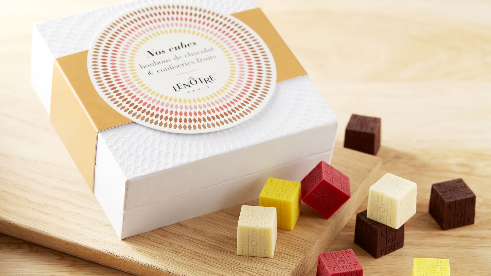
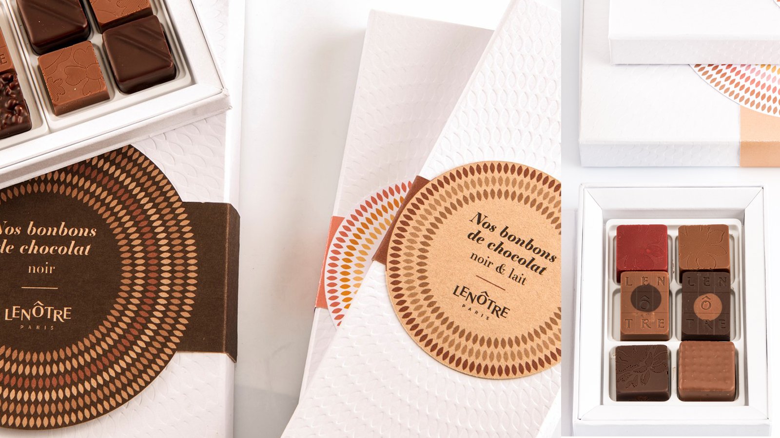
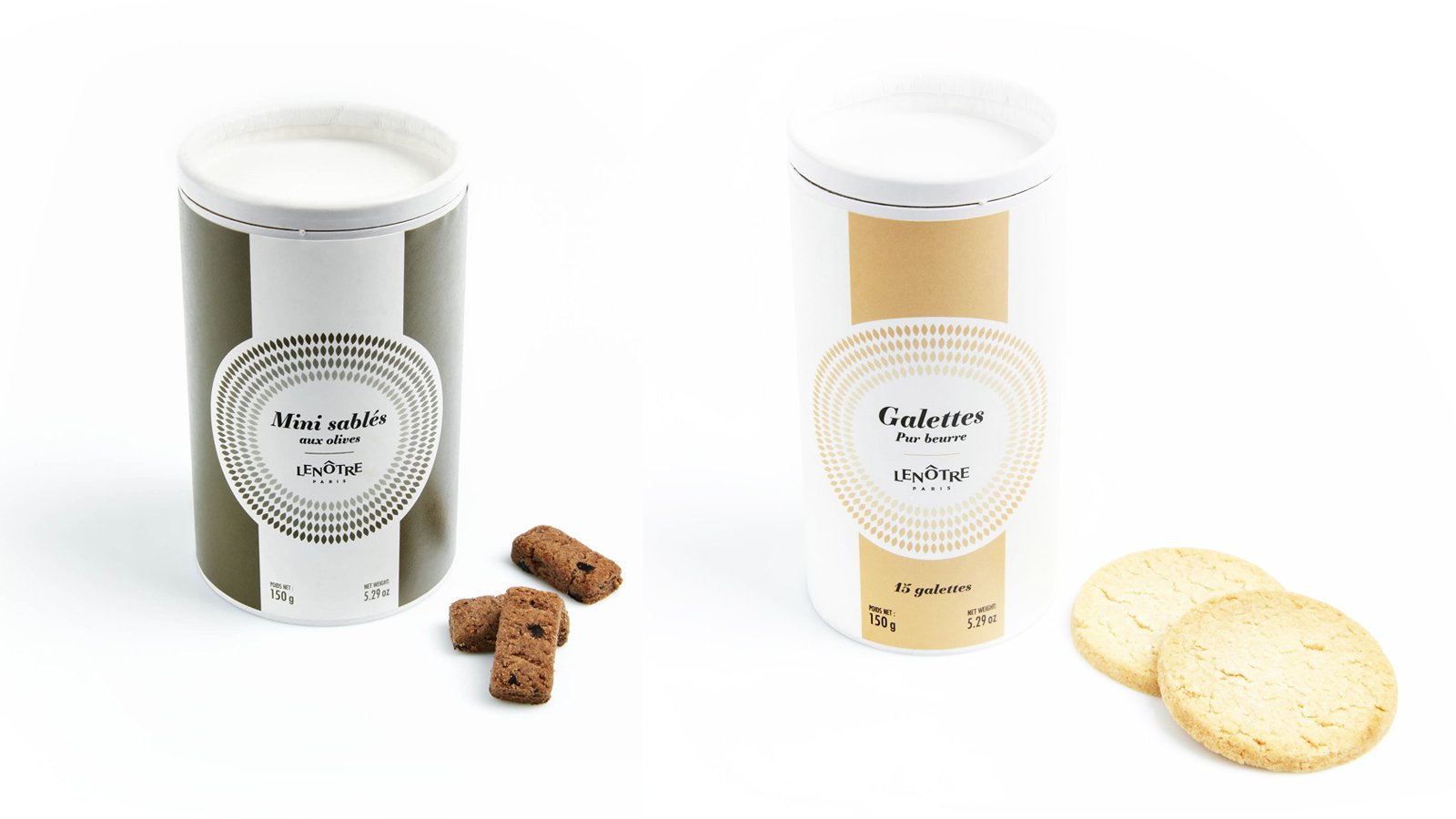
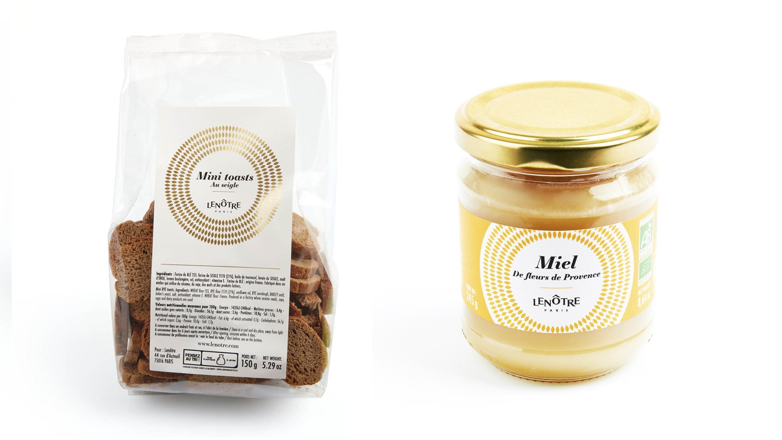
In 2019, Maison Lenôtre redesigned its brand platform and identity to establish its new signature “Maison Parisienne de la Gourmandise” and to bring a breath of fresh air to this firmly established player in the world of French gastronomy.

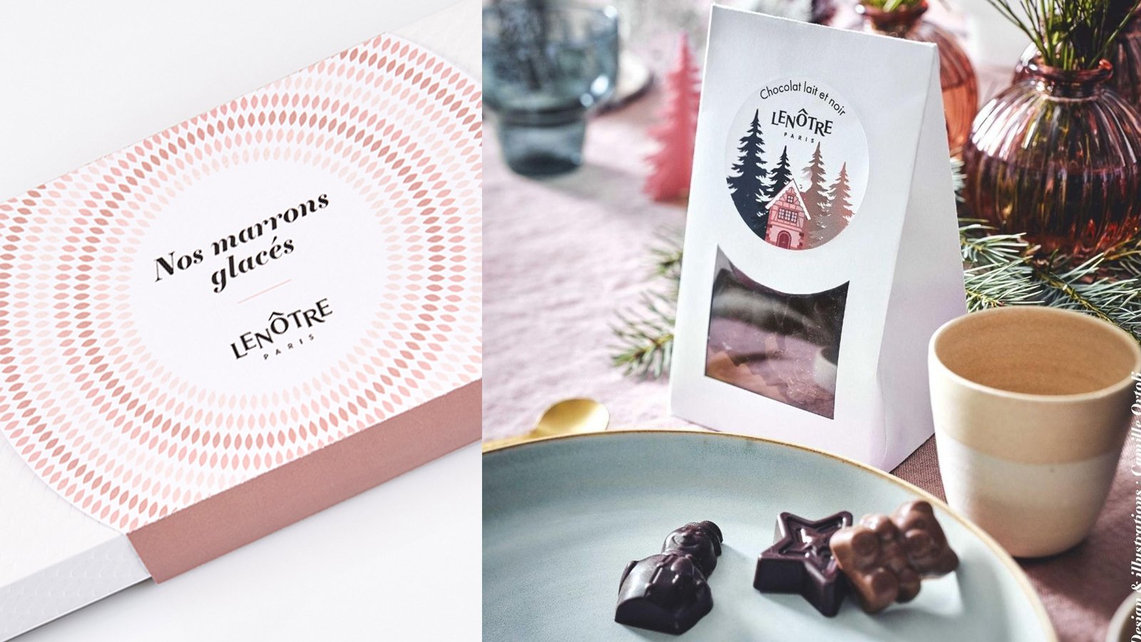
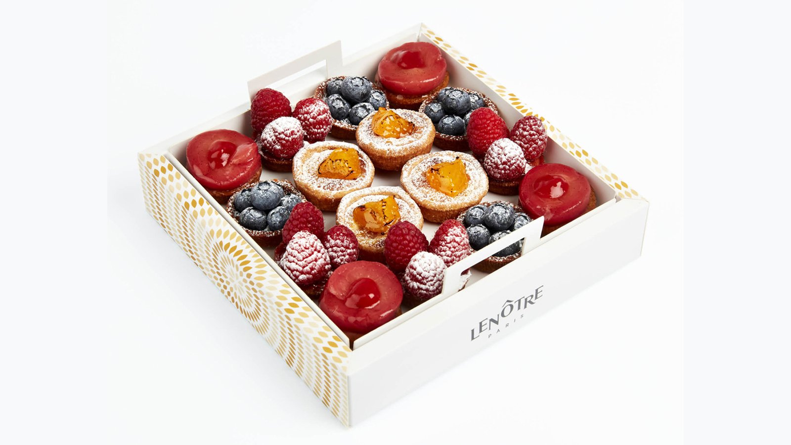
Maison Lenôtre asked us to completely redesign its packaging range, with the aim of restating Lenôtre’s traditional expertise and embodying the new brand platform. To creatively use the different resources and design potential to meet the specific objectives of each product line (accessibility/celebration). 

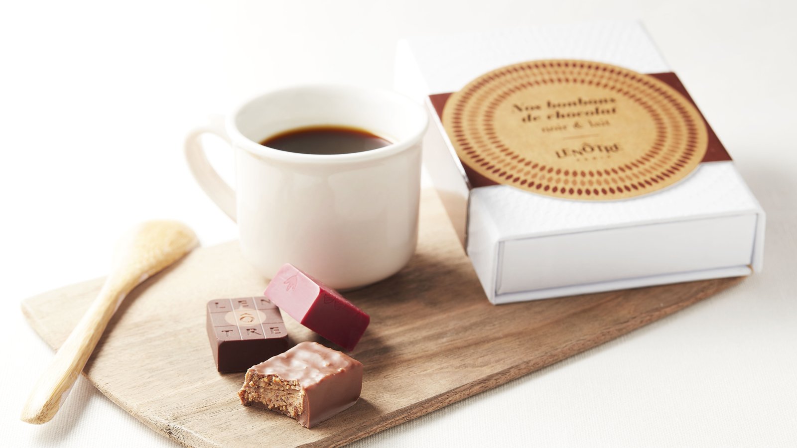
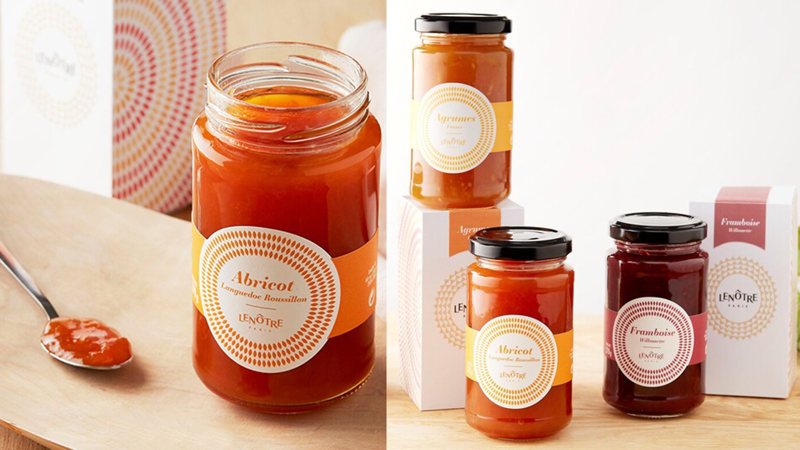
The agency suggested translating this new identity across the range to give the new packaging a real personality and a unique character while staying on-brand. The packaging was designed with an eye for detail in terms of the choice of materials and subtle finishing touches. The packaging design reinforces and enhances the brand’s new visual identity in keeping with its gourmet creations.

Developed packaging

Confectionery bags : a simple folding technique that reflects the artisanal side of the brand while also being modern. The ears of wheat on the side of the packaging are part of the design while at the same time being part of the folding. This clever bag has two possible sizes due to the way it is folded.

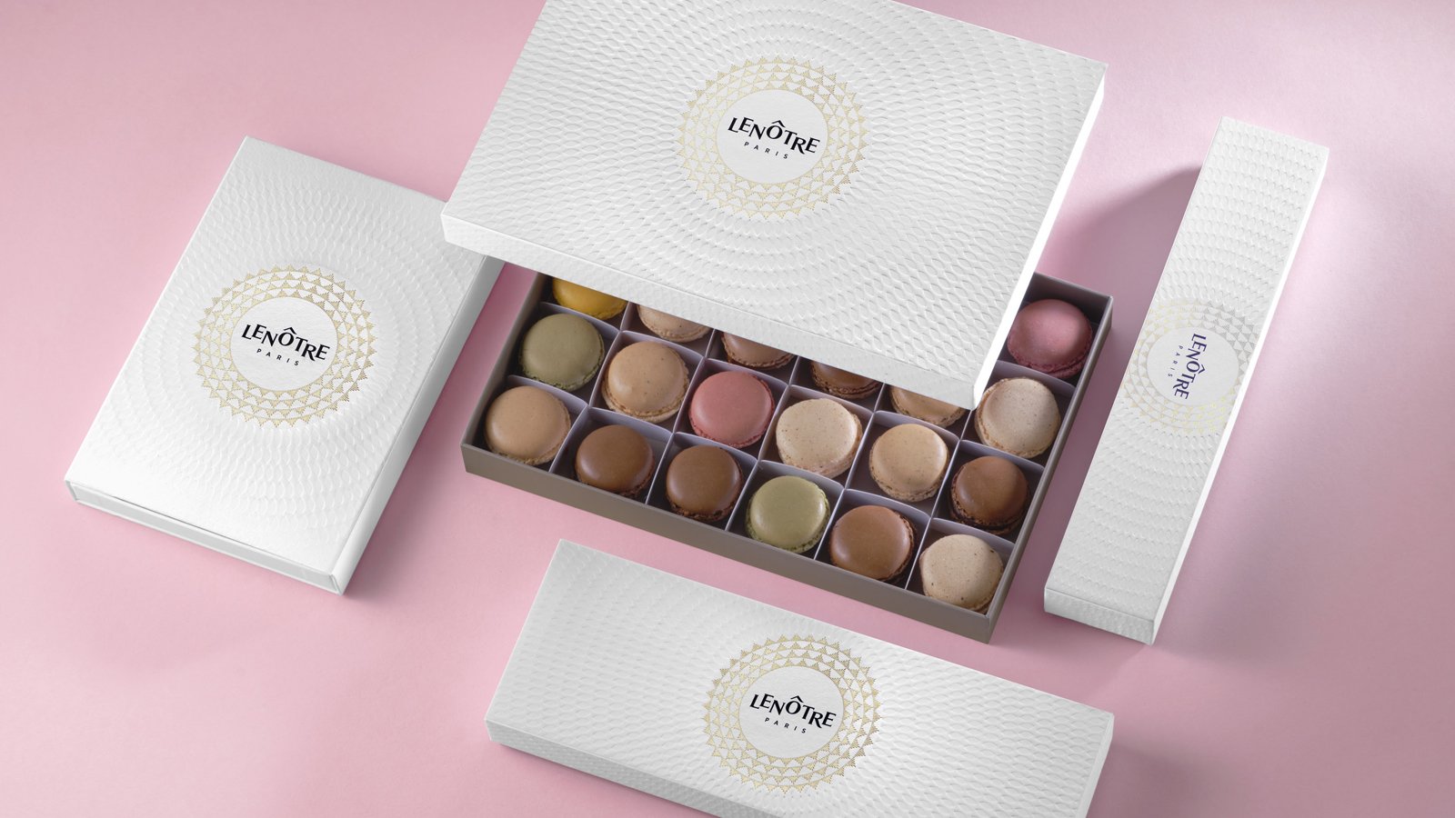
Macarons range : the macaron is the icon of Maison Lenôtre, its trademark and its source of pride. Redesign of all formats to showcase the product and its many flavours.

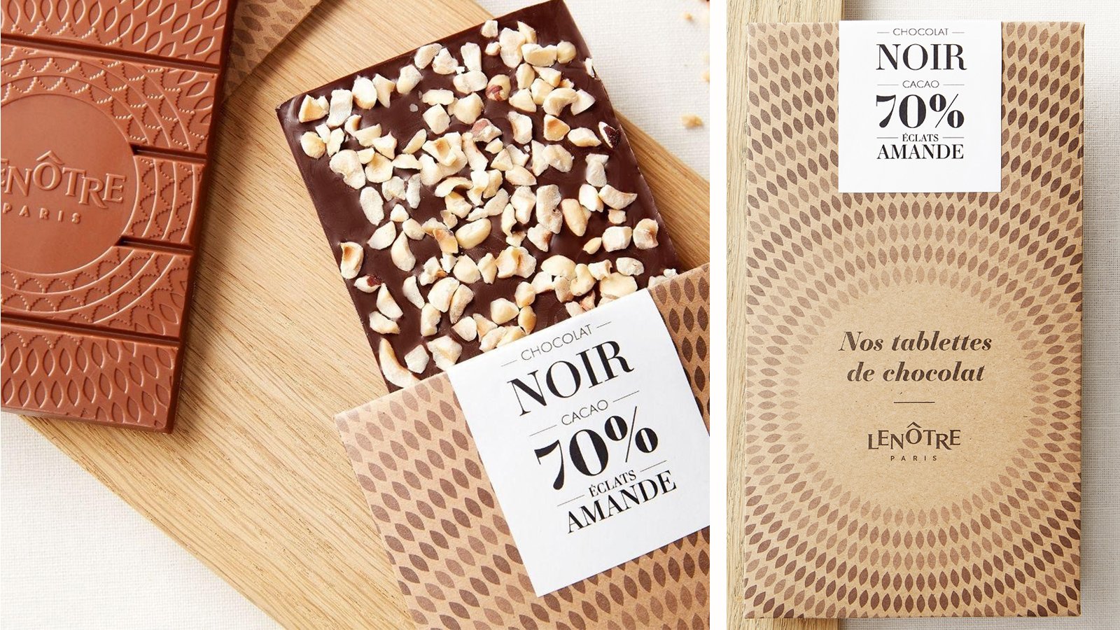
Chocolate bar packaging
Bags, patisserie packets 
Biscuit gift box
Jam rang   
Product personalisation rings

Assignments :
Packaging Design

AIKAN WHISKY INTENSE


PACKAGING DESIGN

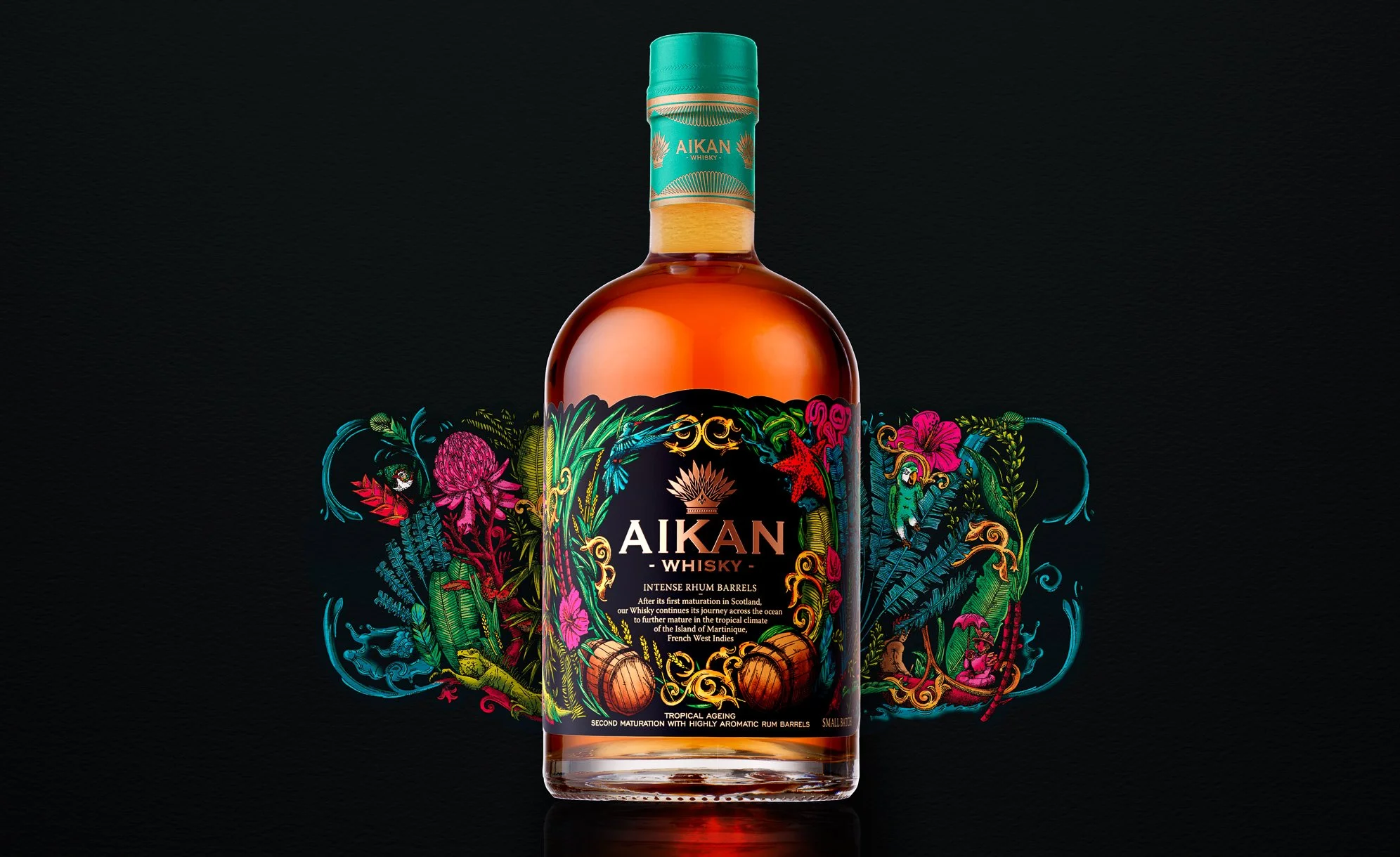
Aikan, a favourite among lovers of rum as well as whisky for their whiskies distilled in Scotland then aged in Martinique.

We are delighted to unveil the fourth product in the range: Intense Rhum Barrels, a distinctive whisky with especially prominent notes of tropical fruits and French pastries.

Assignements :
Brand identity
Packaging design
Illustration colouring

COMTESSE DU BARRY – CHRISTMAS 2021


PACKAGING DESIGN

A culinary journey inspired by a Christmas classic!

As every year, the
Comtesse du Barry brand entrusted us with the full design of its Christmas range.

For 2021, we opted for a collection inspired by the famous classical ballet,
The Nutcracker. 

The story of “The Nutcracker and the Mouse King” and Tchaikovsky’s ballet melts away
the barriers between childhood, dreams and reality. The success of the story has made. The Nutcracker a Christmas icon.

The boxes with their decoration inspired by the imagination and the magic of Christmas hold a selection of refined and exquisite products that the brand has earned its reputation for.

A brightly coloured collection in which each box is different and helps to recreate the story of The Nutcracker, with characters from the ballet or individual details of their beautiful costumes.

Get into The Nutcracker spirit with our 2021 boxes.

Assignements :
Packaging design
Graphic design

LA VILLA ANGELI – CORSICAN LIQUEUR


PACKAGING DESIGN

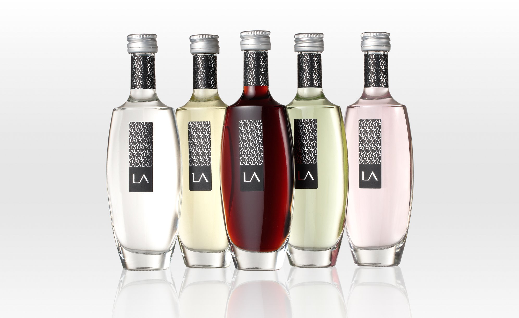
This estate established on Antiparti soil was founded by Albert Mizael in the 1960s. His children including Guy Mizael took the reins in 2000. Together they have completely restructured the vineyard and brought fresh momentum and ambition to this family-run estate.

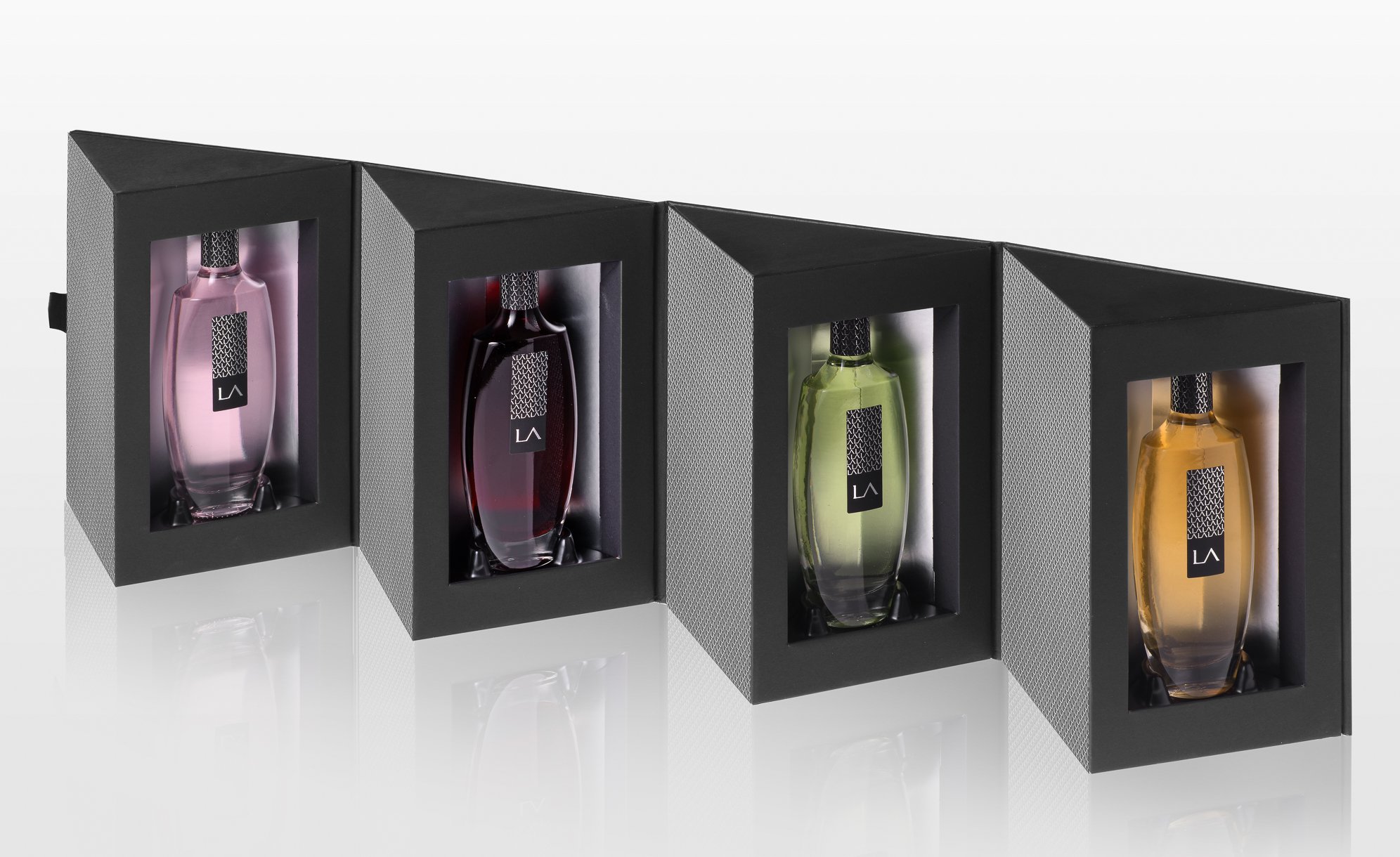
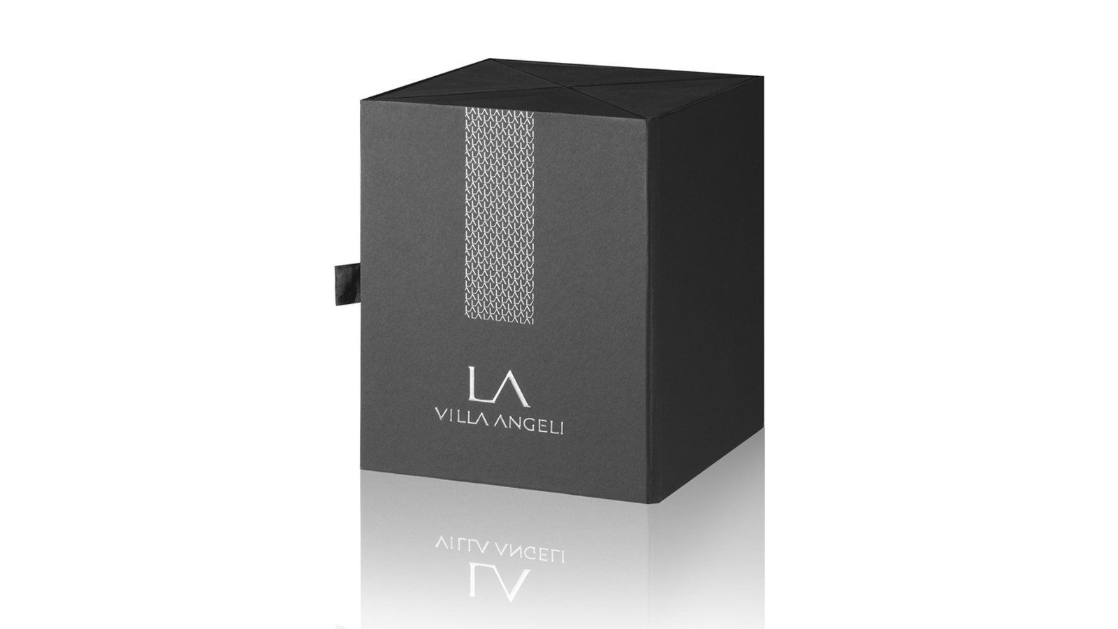
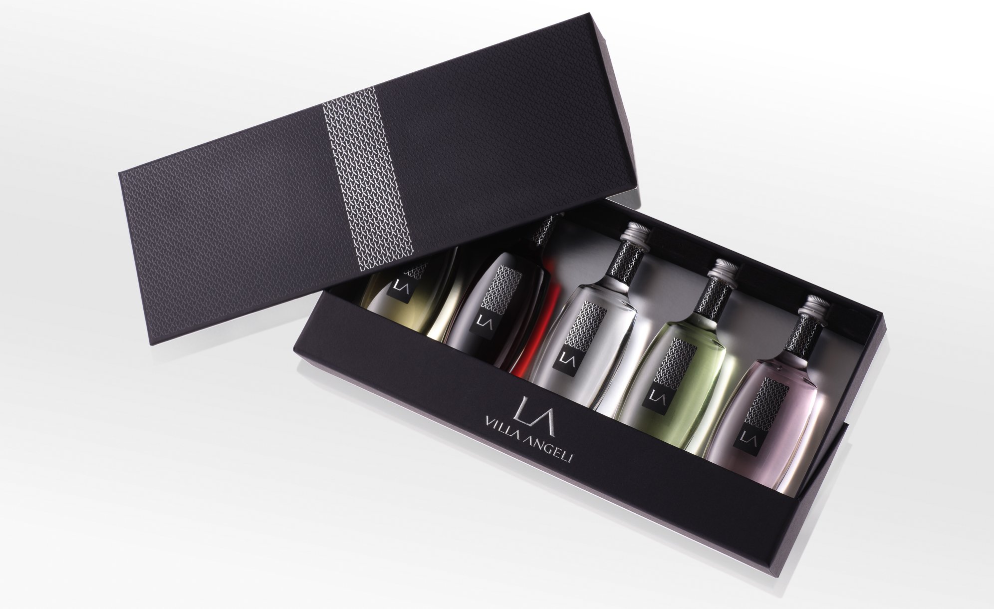
The agency was hired to design the visual identity of La Villa Angeli wines used in 5 liqueurs in miniature format as well as 3 boxes offering a range of presentation techniques to showcase the style of these iconic liqueurs with packaging to match.

A way to promote Corsican liqueurs in an original and premium way, far removed from the old clichés.

Three-liqueur gift box (Clementine, Myrtle, Lemon). A fun and practical gift box that tourists can easily take back home with them for a souvenir of the “isle of beauty”.

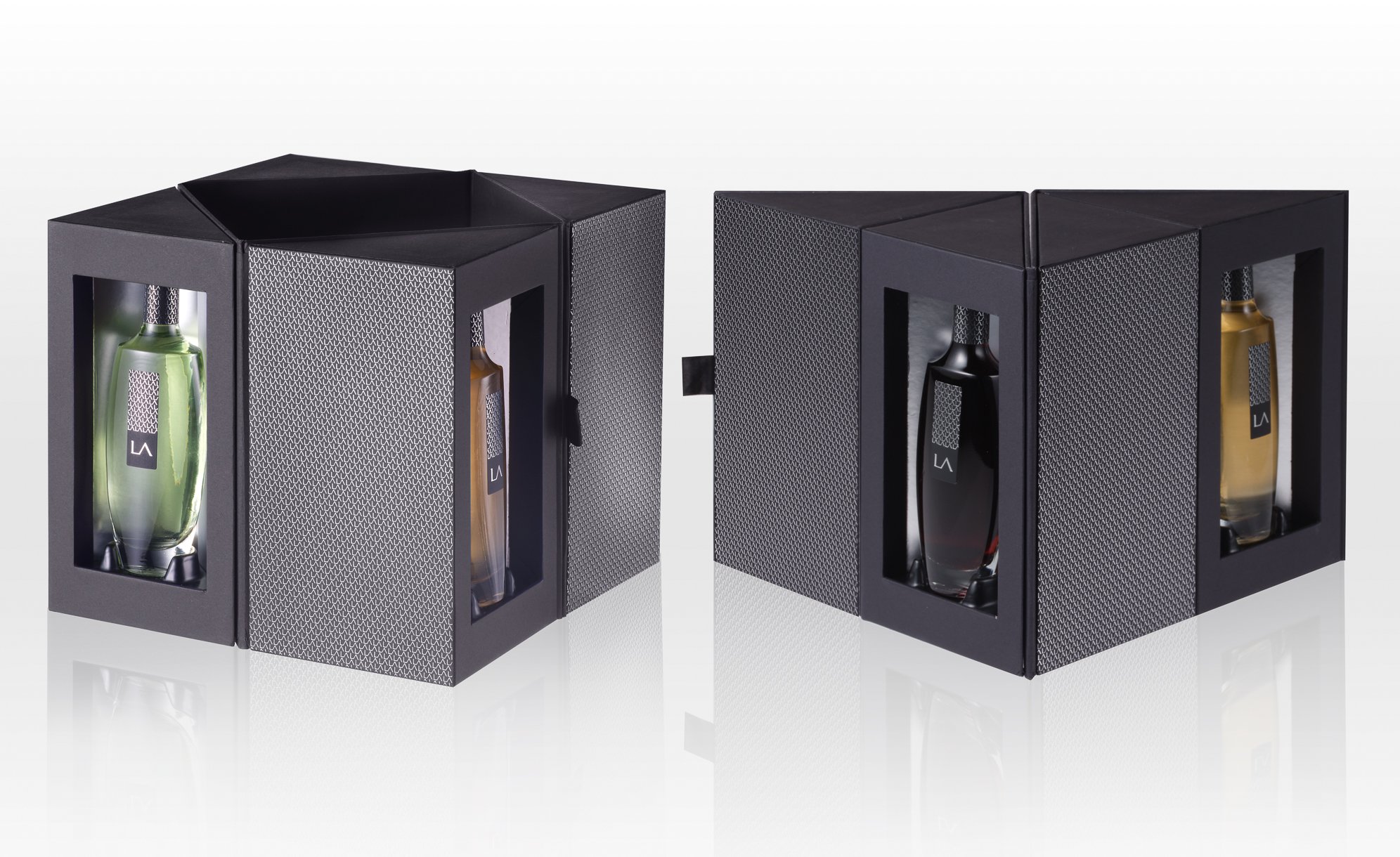
Four-liqueur gift box (Clementine, Myrtle, Lemon and Citron)  Designed with merchants in mind, this premium gift box can be presented in a number of ways depending on how it is folded. Unfolded to its fullest extent, all four liqueurs are on proud display. In its multiple configurations, the box can also be presented in rectangular, triangular or rhombus form.

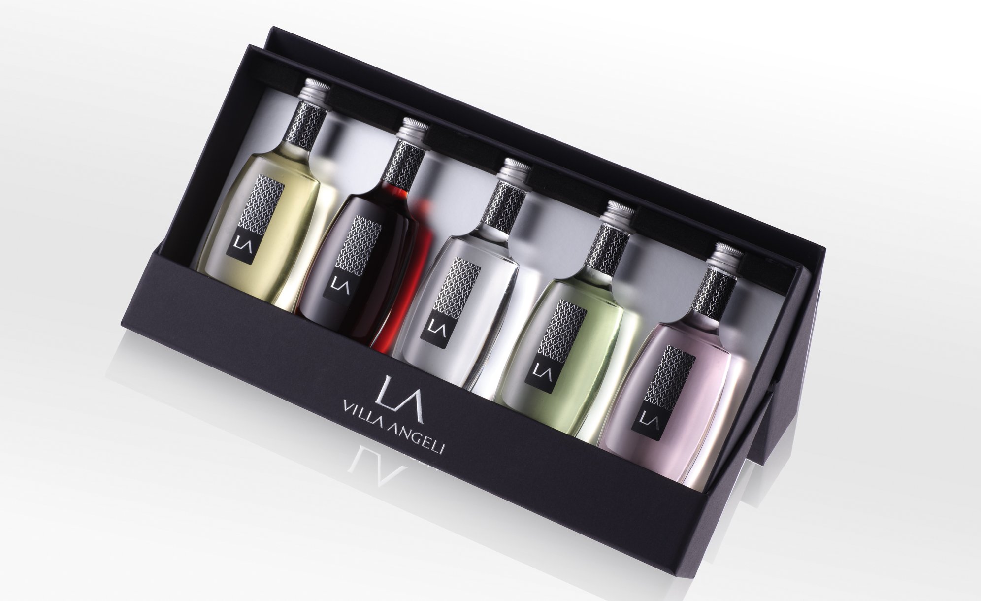
Five-liqueur gift box (Clementine, Myrtle, Lemon, Citron and Eau de vie) With B2B in mind, the agency gave this box a dual purpose. Thanks to the lid design, the box can be turned into a display to perfectly showcase all five bottles.

Assignements :
Adapt the existing brand identity to the miniature format
Packaging design

CONQUÉRANT SPIRITS


GLOBAL DESIGN

Amidst the lands formerly occupied by the famous William the Conqueror, Duke of Normandy, King of England, two childhood friends have decided to launch their spirits brand. They came to the agency to help them create a complete brand image. 

 In the Swiss Normande and in Calvados, the two friends produce unique Organic gins. In their respective priory and Abbey gardens, they grow the ingredients they need for their production.

Passionate about the history, environment and beauty of the different landscapes in this region, the two partners wanted to find the expression of these noble places and their unique flavours. 

It’s called Conquérant Spirits and bears the brand image and its graphic design with flair. A design reflecting the strength and character of the glorious historical figure that it celebrates. 

Assignements :
Brand strategy
Naming
Brand identity
Packaging design

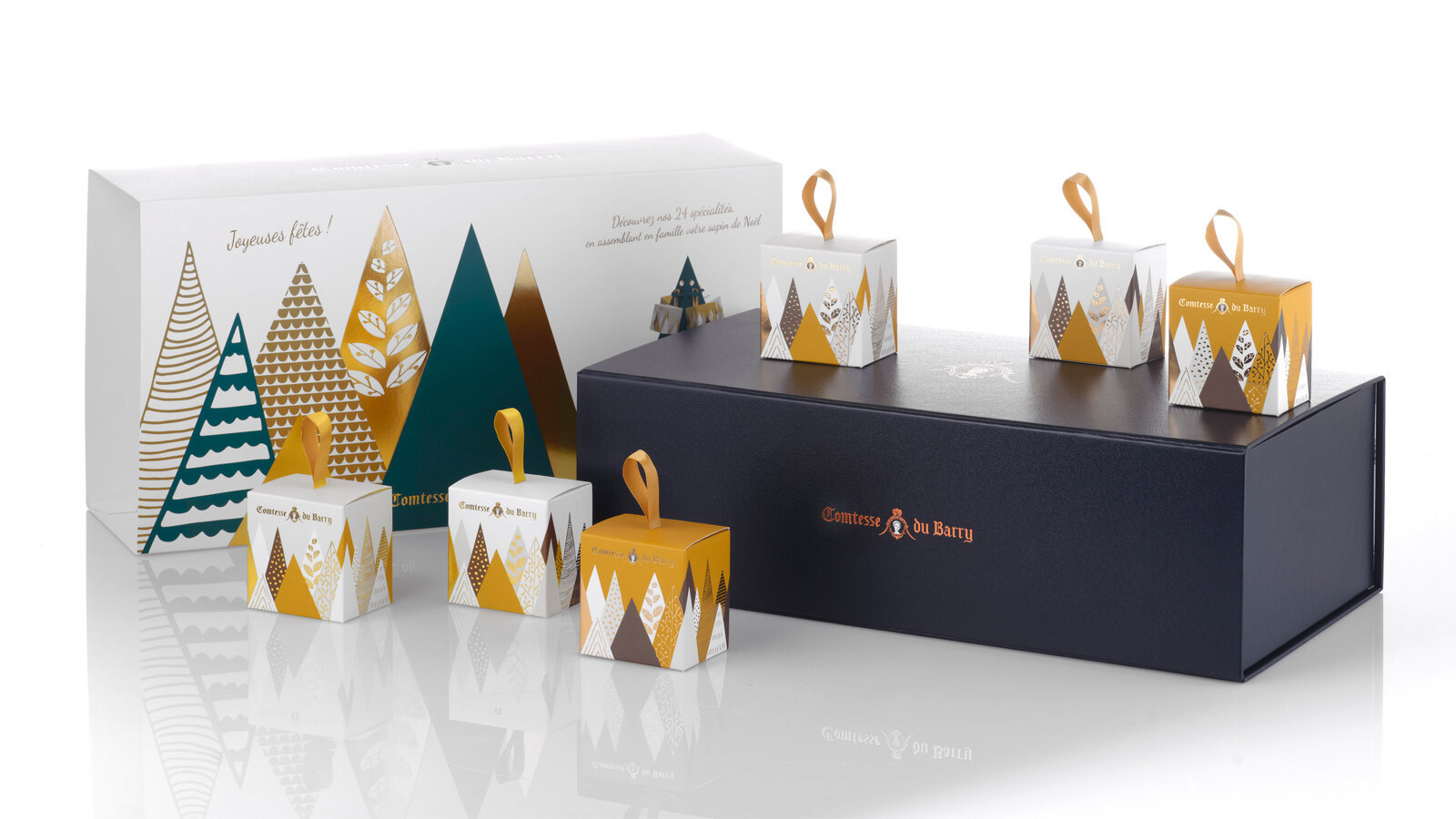
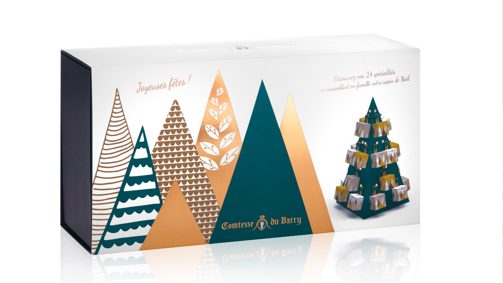
COMTESSE DU BARRY - CHRISTMAS 2020


DESIGN PACKAGING

A gourmet tour in an enchanted forest.

As every year, we have been charged with the entire creation of the Christmas range of La Comtesse Du Barry.

Pour 2020, we designed a magical world in which good food and creativity combine to express the best of French produce in its compositions.

An enchanting range of forest-themed gifts that carry the eater off on a festive journey. It is an invitation to escape to the enchanted forest. 

Unusual advent calendars, enchanting receptacles, refined specialties from the land and the sea... each product undergoes stringent selection and is painstakingly worked in an ode to Epicureanism that varies pleasures and delights the palate. 

Sweet calendar: every tree hides a gourmet chocolate to make the wait up to Christmas as delicious as possible. The calendar stands as a decoration, and a new tree emerges every day to create an enchanted forest. 

Savory calendar: Advent calendars are traditionally thought of as something you open every morning. But why not, in a slight twist, leave the surprise for the evening hour?

This Advent calendar takes the form of a 48 cm high cardboard Christmas tree to assemble. It will blend perfectly with your Christmas decorations. 24days of waiting, with 24 little packages to open and discover the best specialties from France.

Foie gras, porcini mushrooms and truffles gift box: a numbered limited edition containing the sweetness of foie gras, the delicate aroma of porcini mushrooms and the power of truffles in a pyramid-shaped box with a contemporary iridescent forest decoration. 

Assignments:
Packaging design

MAISON BLIN ARTISAN PASTA


GLOBAL DESIGN

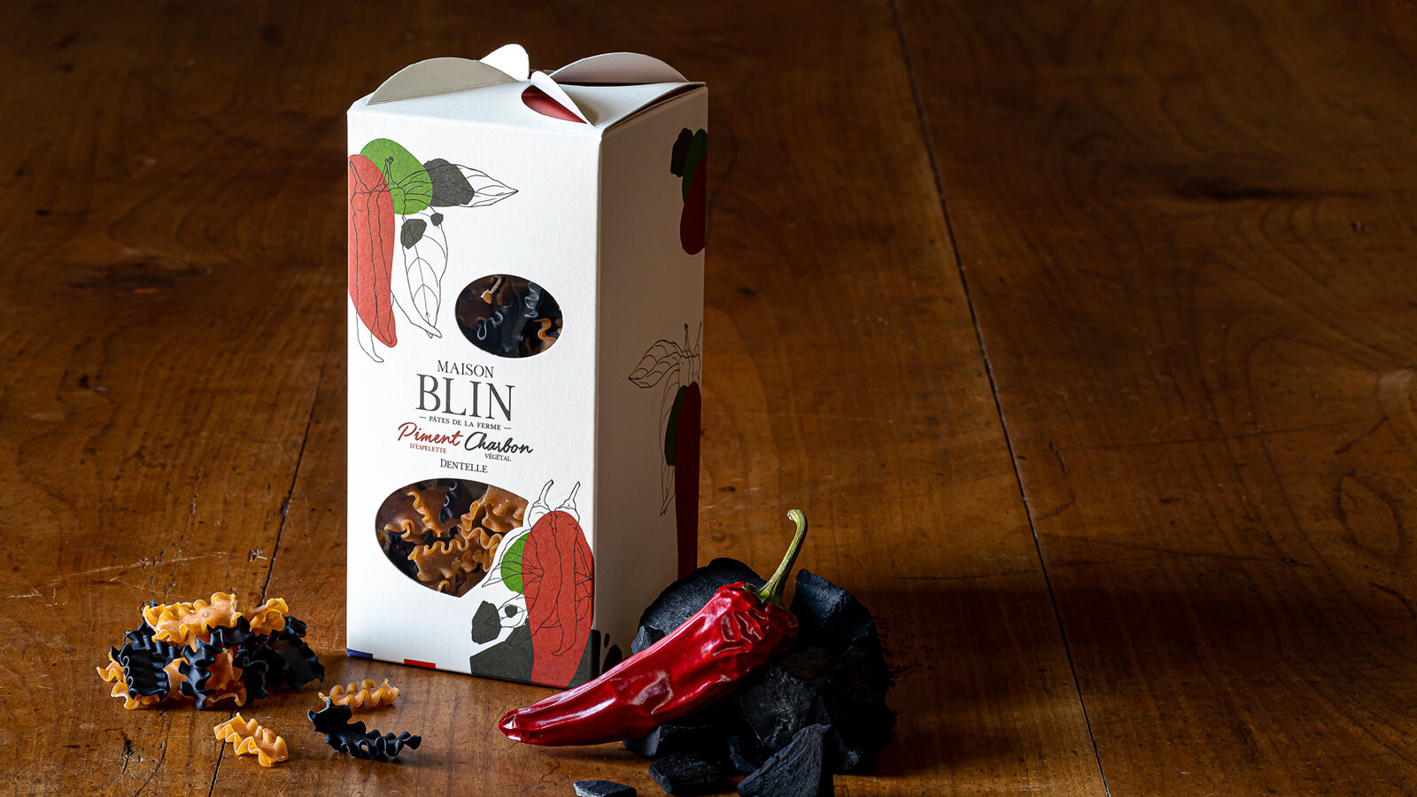
Sébastien Blin asked the agency to develop a packaging concept that stands out from current trends by highlighting the traditional and innovative aspects of his products. He has just created his brand of flavoured pasta made in Beauce, France. His ambition is to sell his products through all the premium grocery stores in Paris, in a spirit of short local marketing circuits, since his farm is located a mere 50 km from the capital.

Brand name creation. We have opted for an authentic name, both traditional and modern, which uses the client’s last name. The addition of the word “Maison” reflects know-how and reliability, and does not limit the range to pasta.

While creating the packaging, we were looking for something simple, elegant and easy to identify, which stands well apart from the competition with a signed folded part on the top of the package that evokes windmill sails, since the wheat is milled in a nearby mill. The product can be seen through windows that are shaped to convey identity and blend in with the graphics.

For the graphics that identify Maison Blin, we continued with the combination of modernity and tradition, drawing inspiration from the simple recipes of the products. The drawing of one of the ingredients in an engraving style and graphic spots of colour to symbolise the other ingredient come together to express the concept of the brand: dual taste. 

The result is a clean design and a product that can be understood at first glance.

This graphics style will be used on all the advertising material of the brand.

All the images were taken directly in the Maison Blin farm, in natural light to stress the genuine and natural side of the brand.

Which ones would you choose?
www.maisonblin.fr

Assignments:
Brand strategy
Naming
Brand identity
Packaging design
Iconography
Web design

APERITIF KITS FROM LA MAISON KYRËGAL


GLOBAL DESIGN

APERITIF KITS combining spreads and crackers with a tasting ritual for food lovers.

The aim was to develop packaging with a strong identity that would reflect an original and innovative concept of ready-to-eat foods served with an aperitif.

A shape and packaging that clearly sets apart the product by making the kit unique as well as practical, attractive and almost playful. Aimed at a wide audience and to be taken away wherever you want, at home, with family or friends or on an adventure like a picnic in the wild, etc. Gift packaging to make the product a real treat-yourself buy which encourages you to share it and get together with others.

Each APERITIF KIT includes complementary flavours based on cookies, a spread and a condiment. Products preserved in three glass containers accompanied by two wooden spatulas. Cardboard case covered with custom illustrations playing with three foodie openings, embellished with a practical handle to transport the product in perfect harmony with the transportable side of the box.

Our agency has also designed a tasting tray that elegantly carries the three festive foods that will go with the aperitif drinks. Creates a real moment of relaxation and simple culinary pleasures.

These boxes, distributed in wine shops and delicatessens, come in three traditional designs (fish, meat and vegetables) symbolising the local region. Three motifs, three indulgent illustrations and “good mood” colour coding to clearly present each design and each complementary flavour.

Separate kits with overall coherence, making you want to discover all the “symphonies of flavours”.

Assignments:
Brand identity
Packaging design
Product design

COMTESSE DU BARRY - CHRISTMAS 2019


GLOBAL DESIGN

As every year, for the festivities, the Maison Comtesse du Barry has entrusted the 2S agency with the creation of its Christmas range, from the box set to the creation of the product catalogue, up to merchandising. A delicious collection that invites you to enter its exquisite world...

Creation of a box set shape, dressed with a custom-made illustration on the Christmas theme. Search for a colourful, festive and refined universe throughout the range.

Creation of a graphic and gourmet Advent calendar, representing a cityscape with 24 small bright windows to open, each containing a selection of chocolates.

Creation of the business gift catalogue, in accordance with the theme developed on the box sets.

Design of the store window, the graphic design worked in volume becomes a glorifyer display in gold metal and with touches of red.

Assignments:
Packaging design Edition - Creation of the product catalogue Store window design

SHISEIDO BOX SET- FUTURE SOLUTION LX LIMITED EDITION - PACKAGING DESIGN


PACKAGING DESIGN

Creation of a reusable premium box set to celebrate the 10th anniversary of the Future Solution range.

The box set contains 3 creations inspired by the culture and botanical myths of Japan, designed to restore the complexion to its original radiance overnight.

The packaging had to convey the premium positioning of the range and its strong link to its Japanese origins. We have chosen to dress it with a full moon in negative on the sheath and in positive on the case by adding a touch of gold glitter in hot stamping. The deep matte black contrast and the glitter effect visually and to the touch, complete the sensory experience of the skin care ritual from the first contact.

This box has been designed according to the delicate art of Japanese packaging, the Tsutsumu, with noble materials and a luxurious festive touch evoking the 10th anniversary of the range.

Assignment :
Packaging design

BONJOUR BRAND IN COLLABORATION WITH T-MALL - MOONCAKE BOX SET - PACKAGING DESIGN


PACKAGING DESIGN

The idea of this box set was to reach the new middle class of 200 million young Chinese consumers and provide them with surprise and innovation with our French touch.

A targeted communication strategy with the support of the Alibaba group to optimize traffic and attract the young Chinese generation. T-Mall and Bonjour Brand, commissioned the agency to create box sets for the moon festival. The agency has gone against new borders by collaborating on new products co-created by France and China.

Celebrated in mid-autumn, the Moon Festival is one of China's most important celebrations. Symbol of unity and gathering, it is also on this occasion that the moon cakes are offered. It was important in the design of the box set that it could be worn both during a parade organized by T-mall and by the consumer once the cakes had been tasted. This is why we have decided to give a new dimension to this traditional celebration by creating a box set that is modern, chic and luxurious.

To highlight this festive day, we have made the moon our muse to carry our box set. It is wire-shaped, lightweight and rigid at the same time, its golden metal design reveals the strong identity of this creation before revealing its content in an unexpected way. Inspired by the greatest Parisian Haute Couture fashion shows, this box set can be worn at arm's length to give its owner a determined and modern look. The leather finish contrasts with the modern graphics of the box set and offers it the attributes of a "luxury" accessory, targeting a young audience.

Assignments:
Packaging design

CHAMPAGNE AYALA - LE BLANC DE BLANCS 2012 - PACKAGING DESIGN


PACKAGING DESIGN

The quintessence of Chardonnay, the emblematic grape variety of the Maison D'AYALA

Great aromatic freshness, silky texture and pure line: the codes of the AYALA Champagne style are perfectly embodied by the new identity of the House's emblematic cuvée, LE BLANC DE BLANCS 2012, both in terms of its organoleptic characteristics and its packaging.

LE BLANC DE BLANCS 2012, a cuvée that is part of the AYALA Champagnes range, stands out for its new appearance:

A transparent bottle with a shape exclusive to the House, a round label design improving the readability and visibility of the bottles, as well as a new case with an innovative design. A new branded block exclusive to this cuvée has been specially created to strengthen the identity of this emblematic reference in the range.

Declination of this identity on other communication media

Assignements :
Graphic identity of the cuvée
Creation of the packaging
Declination of the identity on a communication support (mood photos, press announcement, press kit, product sheets)

MUMM CHAMPAGNE - PACKAGING DESIGN


PACKAGING DESIGN

Faithful to its pioneering spirit, Mumm reinvents its iconic bottle through an avant-garde design. The Mumm Grand Cordon bottle thus enhances the Pinot Noir, the House's emblematic grape variety.

The objective of this box set intended for the press and companies was to sublimate and make the bottle design easily identifiable by respecting the brand's DNA.

Creation of a sober packaging in the codes of luxury, the red ribbon embedded in the bottle of the Grand Cordon vintage can be seen through a window dug on the front of the closed box. It opens like a drawer to reveal, on a red background, the emblematic champagne of the Mumm House, which remains attached to the motto of its founder George Hermann Mumm: "Only the best".

Printing on soft touch matt black paper, embossing, hot foil stamping.

Inside the red packaging on gold polyester paper to give depth to the red.

Assignments :
Packaging design
Graphic design
Production monitoring

COMTESSE DU BARRY - DESIGN PACKAGING


Comtesse du Barry box

PACKAGING DESIGN

Comtesse du Barry has been growing and evolving for more than a century. The Maison blew out this year its 100 candles. Such beautiful years during which the company imagined, conceived, produced and proposed French premium gastronomic delights.

On the occasion of its 100th anniversary, Comtesse du Barry assigns us many gourmet and festive innovations (from the packaging to the showcase) for its customers‘enjoyment.

Echoing the precious Art Deco motifs which symbolize the festivities of 1908,
the Christmas 2018 collector boxes open onto a world of elegance that fits perfectly with the iconic delicacies of the brand.

Gabrielle box
We created a prestige box to pay tribute to Gabrielle Dubarry, founder of the House : Gabrielle, an exceptional goose foie gras imagined in a limited edition. This signature foie gras is presented in a prestigious setting, the “secret trunk”.

Terrine box
There’s no doubt that the magic of the Christmas period can be found in its collection of terrine, fully redesigned with art deco patterned drawers.

Advent calendar
Over time, a new surprise is revealing each morning... In order to make the wait for Christmas a real pleasure, we imagined a graphic and gourmet calendar that takes the form of a shop as we could have found 110 years ago.

This openable calendar delivers all its delicious secrets and enhances the effect of surprise as each calendar contains a ticket to win.

Assigments: Packaging design
Christmas Showcase Design
Production follow up

EXCELLENCE RHUM - PACKAGING DESIGN


PACKAGING DESIGN

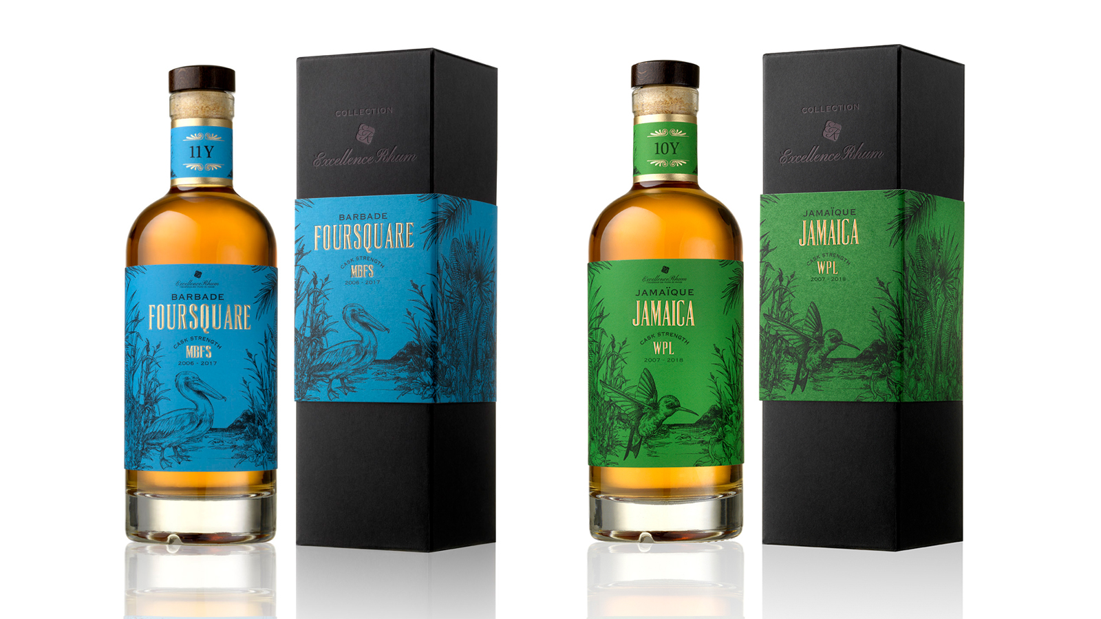
Excellence Rhum, a family company, honors the authenticity of rums from all over the world and the expertise of traditional distilleries.

For the creation of its "COLLECTION" range, we have established a brand identity and a graphic universe for the 4 first aged rum cuvees with strong tasting notes.

Our concept, based on strong elements from the 4 Caribbean islands, illustrates the history and the identity of rum varieties.

The selection of typical elements from each local culture has enabled us to represent each cuvee with an animal as an ambassador and a symbol of each island.

The use of vivid colors in delicate engraving illustrations gives to the range a real authenticity with a touch of modernity. The colors have been selected so as to highlight the different color and origin of each rum.

Assignments :                      Brand identity  
Packaging Design                  Manufacturing follow-up
SAINT JAMES - PACKAGING DESIGN


PACKAGING DESIGN

SAINT JAMES agricole rums, famous all over the world for their exceptional quality, are the fruit of a long history of passion, know-how and expertise which started in 1765. 

Elaborated from fresh pure sugarcane juice, SAINT JAMES rums have been accredited the Martinique A.O.C. ( Appellation d’Origine Contrôlée/Controlled Designation of Origin) which ensures their quality and their intimate link with the planting terroir.

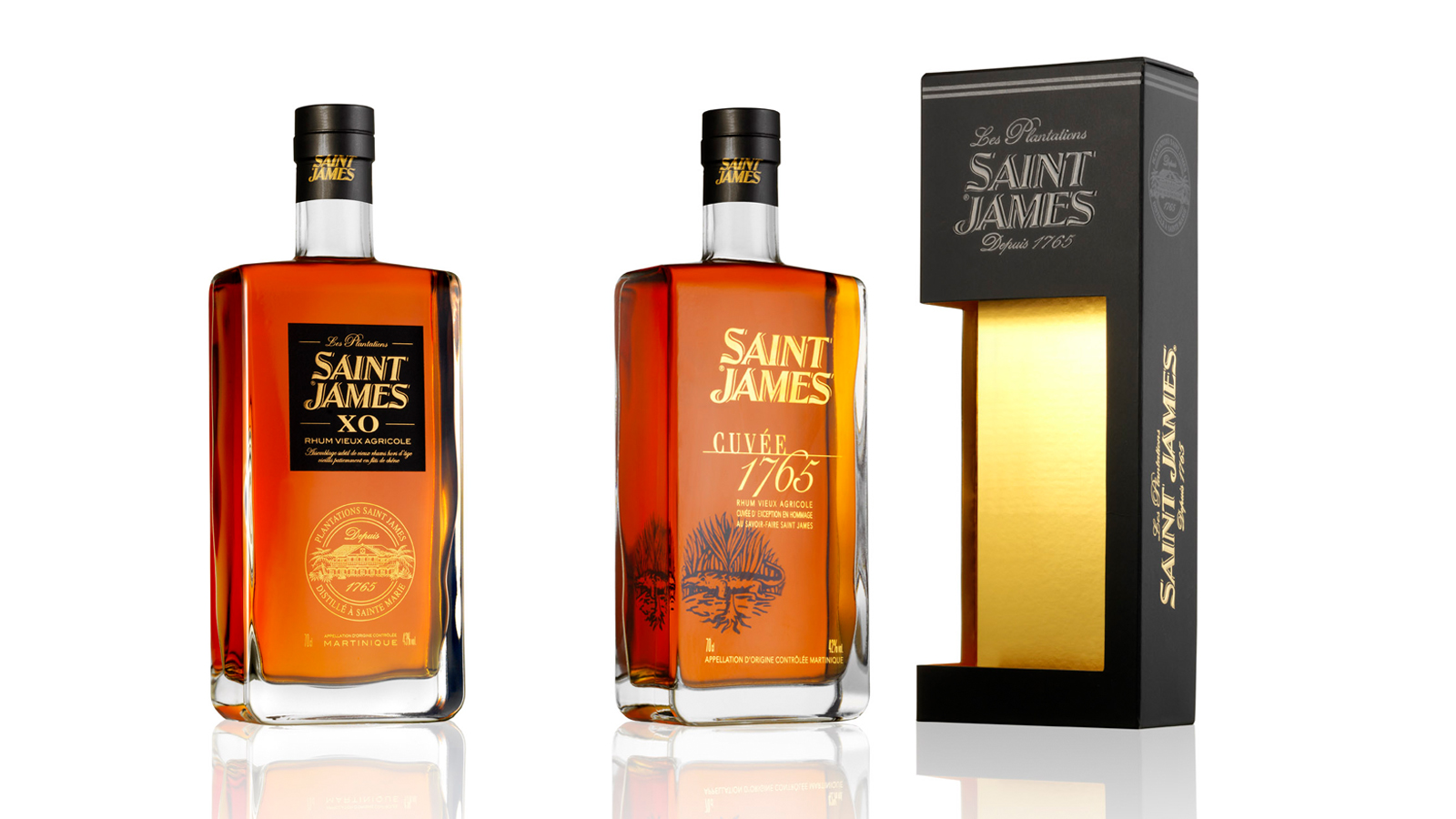
Our mission was to create a packaging common to the three different SAINT JAMES references. The packaging size was adapted to the Long Island 70 cl.  This packaging had to value the SAINT JAMES brand and to drive purchase intent across the various distribution networks: GMS, Wine merchants, Export (Duty-free).

We created a sober packaging following the codes of the luxury sector,  with a window in the box which lets the front label of the brand readable. The graphics are consistent with the packaging of the 3 decanters so as to create a range effect. The window was designed shifted and overflowing on the side of the packaging to give an identity to the packaging and emphasize the shape of the bottle.

A "Neutral" marking in a way that it is adaptable on the 3 references. - printing on matt black paper: embossing, hot gilt, selective varnish. The inner packaging was lined with gold to sublimate the color of rum drinks.

Assignments :                      Graphic & packaging design   Manufacturing follow-up

LA BALEINE A CABOSSE - GLOBAL DESIGN


GLOBAL DESIGN

Claire and Aurélien did not know anything about cocoa until the day they decided to travel to Colombia. They discovered the richness and the variety of cocoa beans. Far from industrial chocolate, they threw themselves into the “bean-to-bar” concept (which means “from the cocoa bean to the chocolate bar”). They roast, crush, winnow and grind the cocoa beans within their store in Marseilles (France) to produce their own range of chocolates. The couple, passionate about their new profession, emphasize on homemade chocolate. In one chocolate bar, there is an explosion of flavors.

It is directly from Colombia that Claire and Aurélien contacted the 2S Global Design agency to help them for their project. Our mission was to develop the global design of the brand.

Why is the brand named La Baleine à Cabosse? (which means “The Whale with the hump” in French. “Bosse” means hump and “Cabosse” means cocoa bean.) In Tumaco, when coming back from a tour of cocoa plantations, the couple saw humpback whales. Their shape immediately reminded them of cocoa beans. That is how La Baleine à Cabosse was created, a legendary creature that traverses the Pacific waters looking for boats filled with cocoa. Apparently, if you see one of these whales from the shore, you are guaranteed to have a spectacular crop the following year.

By creating the identity of the brand, we brought life to the whale “à cabosse” who carries on her back trips from different regions of Colombia, the rising star of exceptional cocoa. The warm colors and raw materials make La Baleine simultaneously traditional and modern. The concept of the brand’s identity had to break with the traditional codes of chocolate factories and sweet stores.

The design of the chocolate bar was made so as to reinforce the story of the brand. We created a thin and wavy shape, making the squares of chocolate easy to cut and enjoyable to eat.

The packaging was conceived without any glue. It is a simple folding decorated by the atmosphere and the decor of the couple’s fabulous trip to Cordoba, Arauca and Tumaco, different regions of Colombia. 3 terroirs, resulting in 3 different flavors.

The universe of the store is shimmering and colorful, combining raw materials and different flat tints in harmony with the identity codes of the brand.

Assignments:
Brand strategy
Brand identity
Packaging design
Culinary design
Communication mediums

AIKAN WHISKY - GLOBAL DESIGN AND COMMUNICATION


GLOBAL DESIGN AND COMMUNICATION

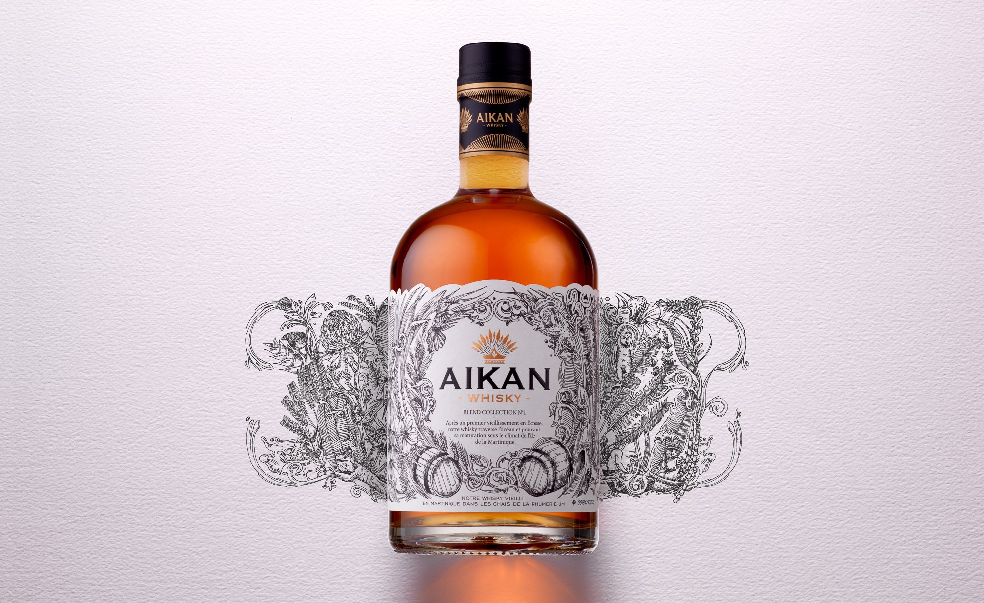
Aikan is a whisky distilled and matured in France and in Scotland, which then crosses the ocean to arrive up to the Caribbean sea.
It is on the Martinique island that the distillation is pursued, nearby a water source flowing from the Pelée mountain.
There, the whisky ages in oak barrels in JM’s rum distillery wineries.

Aikan means « wedding » in Arawak, which was the language of the first Amerindian in Martinique.
We chose that mixing would be the key element to create the visual identity of the brand, which will be applied to all of its communication mediums.

Aikan’s identity is the result of two climates and also two different times, finding its inspiration in the Amerindian era, the first ones to arrive in Martinique.

We put forward the union between these different universes, which intertwine through an illustration simultaneously ancient, contemporary and representative of the cultural union between Europe and Martinique.

The logo, which represents an Amerindian hairstyle with feathers, also incorporates a lily flower, an explicit reference to the union of these cultures.

We also added a reinforced and hidden message at the back of the facing: the representation of the union between a European woman of that time and an Amerindian man.
This is the symbol of the authentic union of two cultures (printing of a double-sided adhesive label).

Assignments:
Brand strategy
Brand identity
Packaging design
Communication mediums
Iconography
Motion design


COMTESSE DU BARRY - CHRISTMAS BOX AND ADVENT CALENDAR 2017 - PACKAGING DESIGN


PACKAGING DESIGN

CHRISTMAS BOX AND ADVENT CALENDAR 2017

Being a gastronomy expert, Comtesse du Barry is renowned for its large choice of local products and foie gras specialties.

Christmas is that special time of the year in which we give cards, letters and presents that we wrap.
Through the art of presenting gifts, we tell our loved ones how much they mean to us. Comtesse du Barry wished to develop a range of unforgettable Christmas boxes that would be up to this moment.

In 2017, Comtesse du Barry immersed in the wonderful world of origami. This theme corresponds to its traditional inheritance and its two fundamental values: gastronomy and aristocracy.

Originally, origamis were made with quality materials by aristocrats who wished to present gifts that would show their benevolence to their addressee.  

We conceived the range of Christmas boxes by developing a refined, chic and gourmet origami, like a gift that one would unwrap.
In perfect harmony with the institutional boxes of the brand, we created a combination of colors and luminous effects with a Christmas spirit.

This concept is developed on envelopes, ribbons, the press box and in particular the Comtesse du Barry Advent Calendar. The latter being an innovation for the brand, we chose to develop a noteworthy shape, linked to the main theme.

The calendar unfolds to reveal all of its graphics and its surprises in the style of a chic and gourmet origami.
Behind each square, a candy sagely awaits to be savored each day.

Assignments:
Packaging design

SHISEIDO - PACKAGING DESIGN


PACKAGING DESIGN

SHISEIDO FUTURE SOLUTION LX.

Development of a prestigious end-of-year box set. For women who want a line of global anti-aging skin care creams using the latest technologies.

Design of the box set on the origami theme in line with the brand's premium positioning. A design faithful to the SHISEIDO identity, combining discovery and folding, strongly embodying contemporary Japan.

The camellia, symbol of the brand, comes close the box. The latter is dressed a textured black paper and a gold interior.

Assignement:
Packaging design